Metallica is an American metal band that had a major influence on the development of heavy music in general. Even people far from the genre recognize their hits and logo, which is not surprising since the musicians managed to break out of a narrow niche and become the most commercially successful band in the thrash metal style. Metallica’s albums are published in millions of copies. It has long joined the Rock and Roll Hall of Fame, to this day remaining adored by countless fans around the world.
Meaning and History
Metallica was formed in California in October 1981 by guitarist/vocalist James Hetfield and drummer Lars Ulrich, after they both advertised the band’s formation in The Recycler. An old friend of Ulrich, who was going to publish a magazine, could not decide on the name – Metallica or Metal Mania. Ulrich instantly understood that Metallica was a perfect choice for his name. On May 25, 1982, a historic event took place: Metallica took the stage for the first time. “Ride The Lightning” is the second album of the band, published in July 1984. In 2009, Metallica was welcomed into the Rock and Roll Hall of Fame. Metallica managed to leave only for long breaks and never once announced the breakup. The way they hold each other is generally admirable.
What is Metallica?
Metallica is a legendary American metal band. Metallica’s albums have sold over 110 million copies worldwide, making them the most commercially successful of all metal bands. Metallica is not planning to retire and still manages to get into the Forbes list as the most profitable artists for the year.
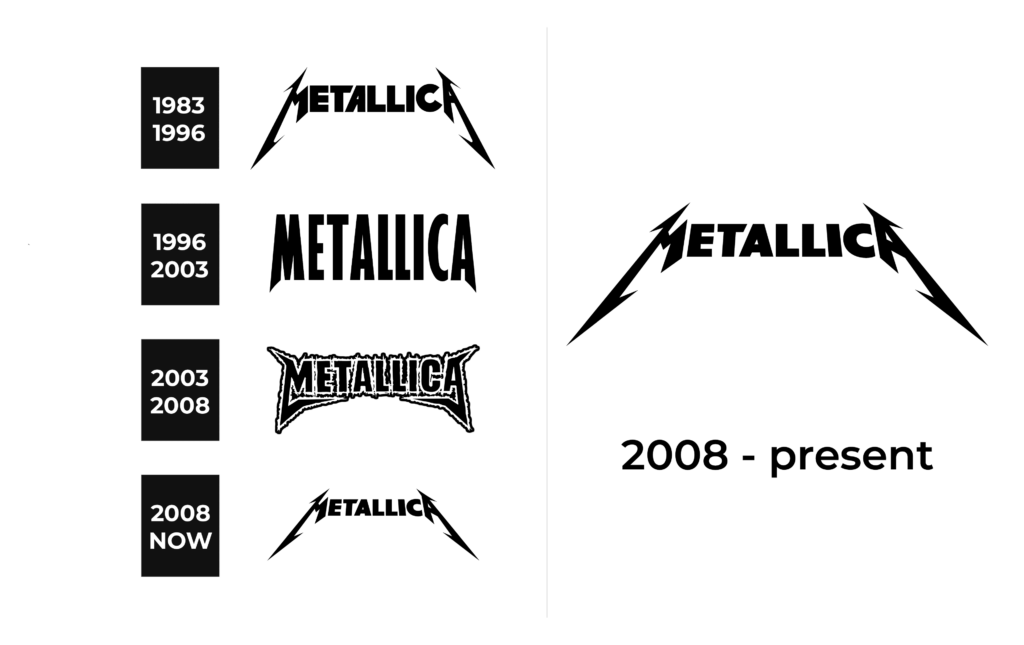
1983 – 1996
Although the logo, which consists of only the name of the band, has been custom designed, it is possible to closely reproduce it. The font used to print “Metallica” in all uppercase letters is remarkably close to a font called “Pastor of Muppets”. It was created by Ray Larbie. The unique feature of this logo is a seeming symmetry that is achieved by creating mirror image legs for the first and last letters. The sharp, pointed ends of these two letters as well as bold strokes that feature a combination of diagonal and straight cuts create a bold and provocative image.
1996 – 2003
The updated logo looks more confident and serious. The designers preserved the sharp pointed strokes characteristic of the original logo, but now they were significantly shorter. In fact, the strokes were slightly elongated and cut diagonally. The tops, on the other hand, were all cut straight just like all the other strokes. The striking effect was achieved by bold characters that were closely spaced. The new logo features a font that is very similar to Gill Sans Standard Extra Condensed Bold with the first and last letters being customized.
2003 – 2008
This logo is closer to the original than the previous version as it features lightning strikes and letters that are spaced further apart. The logo still uses a sans-serif, bold font that makes another connection to the previous logos and provides a more recognizable image. The black characters are now accompanied by a white outline with a light gray border. The edge is done in an uneven matter so the border resembles a fire. The band was surely energetic and hot during its tours and performances.
2008 – Today
The band has brought back its original logo. It was used for over ten years before being replaced by another version. This move not only create an image of a band that is going strong even almost half a century later, but also showed its dedication to its fans and its original values.
Font and Color
The band used black color for its logos with a neutral white background. The black adds mystery and at the same time creates a sophisticated image with a touch of power and authority. Moreover, it is a classic choice for many logos.
When it comes to the font choice, the band went for bold, sans-serif options. A unique feature of most of the logos was the sharp, pointed ends of the first and last characters. They reminded of lighting striking and added a stylish touch that reflected the nature of the band’s music.


