McLaren is a major racing cars manufacturer from Britain. Alongside their Italian rivals, they are one of the most relevant beacons of racing technology. They started off as racing team, and they even built their own cars. In the 80s, however, McLaren launched the dedicated company for sports car manufacturing – so, here’s the distinction.
Meaning and History
The brand was born in 1963 as a racing team of a famed motorsport prodigy Bruce McLaren. He came from New Zealand, and that’s exactly why the initial logos featured big kiwi bird native to this country. However, after the founder died, the company instead put his name in the center of attention.
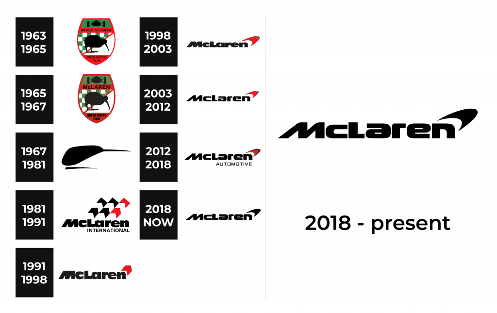
1963 – 1995

Back when the company was both a racing car manufacturer and a racing team, the key element on all logos was a kiwi bird – a national symbol of New Zealand.
The very first logo was also heavily inspired by the logos of other racing teams for this reason – it was bright, shield-like and highly detailed. The basis was a red shield, flat at the top and a bit bloated in the middle. At the very top of this shield was a green trapezoid that depicted a black silhouette of the front of a race car body.
The middle was occupied by a big black kiwi bird. Behind it was a background separated diagonally by a red line. The lower half was just white, but the top half depicted a checkered green flag (the racing colors of NZ).
Between the figures the writing ‘McLaren motor racing team’ can be seen in two parts.
1965 – 1967

The logo did not change much in 1965 and only had a slight change in the color palette as well as the inscription. It appeared as if the logo was presented in deemed light with darker green and red colors. This showed that McLaren’s racing cars are not for games and its team is true professionals. The manufacturer also made the inscription significantly bolder, cutting “Bruce” out of the name.
1967 – 1981
The detailed logo was soon gotten rid of and replaced with a very simple variant which depicted a head of a kiwi bird with a little line stroke below. The head looked to the right, and it was interestingly elongated, because the usual kiwi heads don’t quite have the aerodynamics depicted on the logo. The only color on the logo was black.
1981 – 1991
In 1981 the McLaren racing team was purchased by businessman Ron Dennis who expanded the business and used the technologies of the company to build sports cars for a larger market. The car-making enterprise had a new logotype that shares a lot of its elements with the future versions.
It depicted a word McLaren in bold thick and black letters. Out of the top right corner of it went flags with arrow-like images – two black and one red. Beneath the ‘Laren’ part was also written a thin word ‘International’.
1991 – 1998
Later, the concept of the logo was slightly changed. The arrow shapes were reduced to just one red arrow, while the word ‘International’ also disappeared. This version was the basis of all the other versions of McLaren emblems from then on.
1998 – 2003
This development saw even less change – the red arrow was turned into a kind of red flash (or a bolt) with slight grey outline.
2003 – 2012
In this version, the text was squashed from the top, because of which it was a lot shorter. Nothing else changed.
2012 – 2018
This is the last iteration of McLaren logo yet, and the changes are still pretty modest. First, the color has become a lot darker, now it’s just pitch black. Secondly, the word ‘Automative’ appeared beneath the part ‘Laren’, much like the ‘International’ before.
2018 – Today

For over twenty years, the company has been making only slight adjustments to its visual identity. This time, they removed the word “Automotive”, which was seen in the logo for six years. The color palette also lost the red color. This was quite unexpected as red was used by the company since the beginning and is closely associated with the speed and power of racing cars. Nonetheless, the company decided to follow a more minimalistic trend and create a truly timeless emblem.
McLaren F1 logo
The ‘kiwi head’ logo wasn’t universally used by all McLaren enterprises. Their car manufacturing divisions still used it, but the racing team had other plans. The main distinction of these logos is the product placement. Almost every single of these bears a name of one sponsor or another. That includes:
- 1972-1974 Yardley partnership
- 1974-1975 Marlboro & Texaco partnership (without McLaren name on it)
- 1976-1990 Marlboro partnership
- 1991-1993 Honda & Marlboro partnership
- 1993 Marlboro partnership
- 1994 Marlboro & Peugeot partnership
- 1995-1997 Marlboro & Mercedes partnership
- 1997-2005 West & Mercedes partnership
- 2006-2007 Mercedes partnership
- 2007-2013 Vodafone & Mercedes partnership
- 2014 Mercedes partnership
- 2015-2017 Honda partnership
- 2018 and 2019 – Renault partnership
The 2018 and 2019 variants aren’t too different from the contemporary McLaren Automotive logo, and there are no Renault mentions on these emblems.
Emblem and Symbol
For their modern car badge, McLaren uses different parts of its current emblem. Sometimes, it’s a standalone red bolt, but mostly they put the entire logo on it (bolt + text). In many cases, the badge is put on a black plaque and given a rich share of chroming.
The Legends
McLaren’s focus is on sports cars, but they use some of them on trek, like the ‘ultimate’ type model Senna – super light and aerodynamic, designed specifically for the best performance on trek (max speed 340 km/h). There are also many supercar types (like 720S) and sports car types (570S), the latter being the most comfortable.


