Lotus Logo
Tags: British cars | cars that start with l | Yellow Car Brands
Lotus makes its products for a specific niche of light-weight British sports and racing cars. They are fairly well-known in their own genre, but they really can’t compete with the big corporations. They exquisitely make a specific type of cars that, unless you’re interested in it, you haven’t heard of.
History and Meaning
![]()
The company itself was started in 1952, but the first logo, as well as the first racing car built by these engineers, has been created in 1948. That’s when the history of Lotus Cars begins. There isn’t a lot of sublime meaning for this logo, it’s just a bunch of corporate names attached to a badge.
Although, the brand is notorious for being only one of the few car manufacturers that use banana yellow on their logo and on many of their cars.
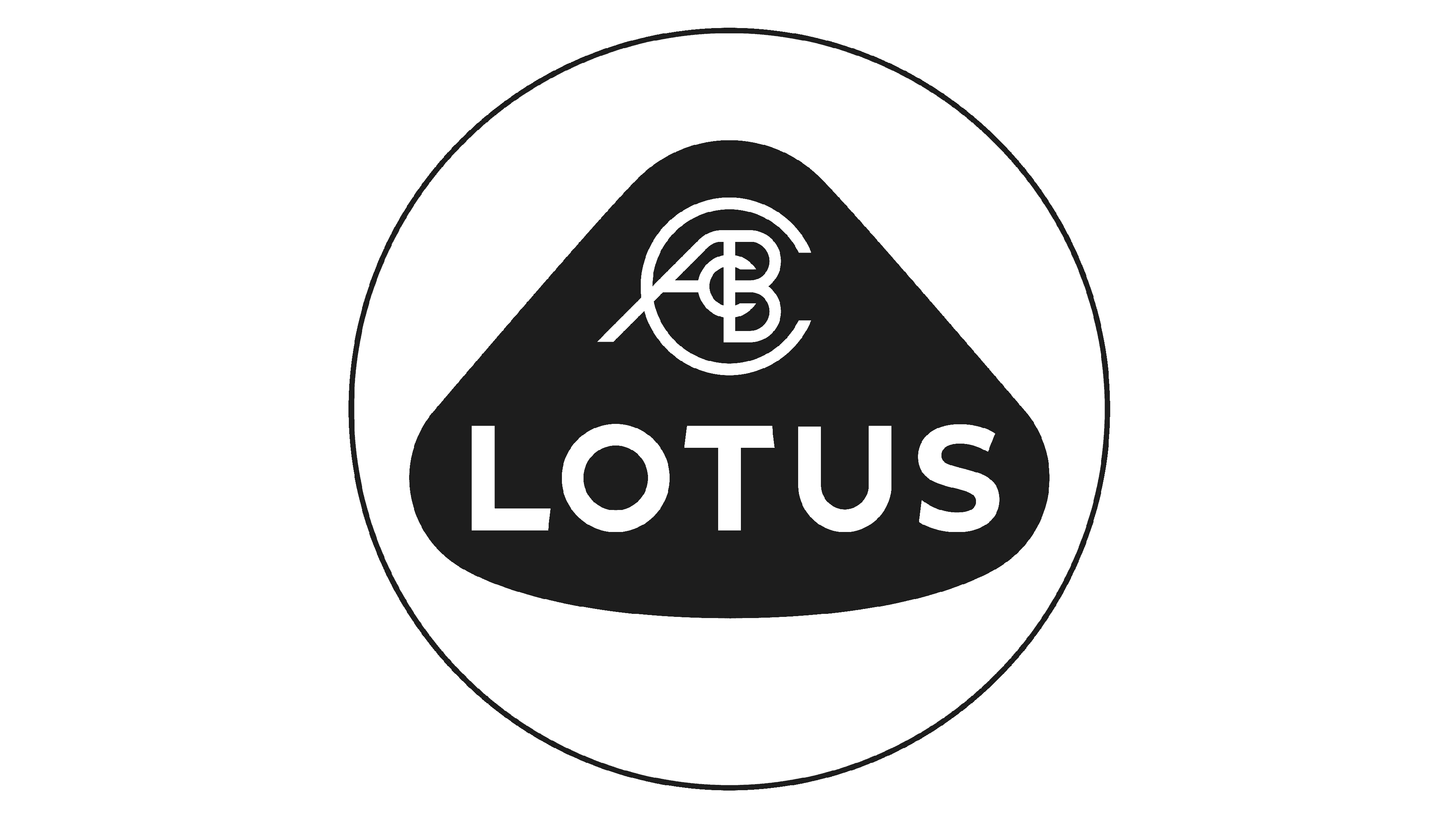
1948 – 1984
![]()
For the first ~40 years of existing, the logo of Lotus was fairly bland. There was yet no talk about bright colors. It was just a black circle with a metal outline. At the center of this logo was a type of white triangular shape with rounded corners and a noticeable bulge in the bottom side.
This shape was thin and outlined the central figures of the logo. Inside this shape, right in the middle of the logo, were two inscriptions. One was in the lower half of this fenced-off area and it spelled ‘Lotus’ in big white capital letters. There was also a formidable curve to this writing, as the word was written parallel to the bottom side.
Almost in the very center of the logo, in the upper half of the triangle, was a collection of words heaped on top of one another. In contrast to the lower bold and simple letters, these were serif. In the increasing size, there were ‘C’, ‘A’, ‘B’ and another ‘C’. They stand for Anthony Colin Bruce Chapman, the founder.
1984 – 1986
![]()
For several years, the company changed the shape of its logo from the original to a combination of an oval and a triangle, much like the inner shape from the first version, but thicker in the bottom.
It was this logo that first used the yellow and green palette, now so cherished by Lotus. Although, this palette was darker, the yellow rather looked like ocher. And there was another similar green shape inside the ocher one, but smaller.
There was just one writing now, and it said ‘Lotus’. But, much like the top writing from before, some letters were overlapping. As a result, there were almost no intervals between them. In appearance, they are yellow serif letters, like the ‘ACBC inscription.
1986 – 1989
![]()
Nothing was changed this time, except the top heap of letters from the first logo returned. They gave it a yellow color and put it in the upper part of the green shape. That was it.
1989 – 2010
![]()
In 1989, the company switched back to the 1948 logo, but this time they changed the palette to the bright yellow and dark green in places which were black before. Nothing else changed, except for the lower inscription. Its bold and simple text was given a serif font, which was now universal for the brand.
2010 – 2019
![]()
Like almost every other car manufacturer of that time, Lotus gave its logo a lot of volume and used the result throughout the 2010s. The logo now had a good measure of lighting along the bottom left to top right diagonal. As a result, there were a lot of dark spots on this logo, and the white outlines were given an intentional metallic texture.
Additionally, the text inside the logo became noticeably slimmer, while it was fairly bold on the previous version.
2019 – now
![]()
It wasn’t unexpected that Lotus would reverse to a minimalistic clean version of their logo in the later 2010s. All other car brands did the same, and theirs look great. So does the new Lotus logo.
The lighting and the 3D elements were got rid of. There are no white outlines anywhere, while the color palette changed a lot. In contrast to the 1989 logo, the yellow is much brighter. At the same time, the green element is now almost black.
The text inside was updated as well. The lower text was straightened out, and it was once again simple and bold. There were now more intervals between the letters, which improved the visibility. The positioning didn’t change, although the font is now extremely slim, which visibly only benefits the writing and emblem as a whole.
Emblem and Symbol
In comparison to some other brands that basically turn their logo metal and use the result as a car badge, Lotus uses the clean version of its emblem. The fact that the logo is so bright now makes it much easier for a bystander to spot a Lotus product out of the mass of other cars on the trek.
The Legends
Even though the brand is focusing on making race cars, they haven’t had a lot of luck in motorsport or F1 yet. For instance, their F1 Flagman Lotus E20 participated in 20 races, won only 1 and was on podium in 10 of them. The brand is still far more famous for their usual sports cars, like trusty 1996 Elise or mighty 2010 Evora.