L’Oréal is a French company that specializes in cosmetics. It was created in 1909 by one E. Schueller as a brand of hair dye, which he initially called ‘Aureale.’ In 1919, he started a company, whose name translated to English as ‘Safe Hair Dye Company of France.’ The company later became L’Oréal, named partly after the original hair dye brand Schueller created in 1909.
Meaning and History
The company was created in 1909, and by how it’s become one of the biggest cosmetics producers in the world, as well as one of the largest companies in France. The current name persisted in one form or another as the brand’s chief name since 1909. Its original form, ‘Aureale’, means ‘halo’, and simultaneously ‘beauty’. L’Oreal is simply a play on that earlier moniker, meant to sound more distinctly French.
What is L’Oréal?
L’Oréal is a major French producer of cosmetics, including the variety of makeup, hair dye, skin care and other solutions. It’s one of the biggest such companies in the world, and the biggest by far in France.
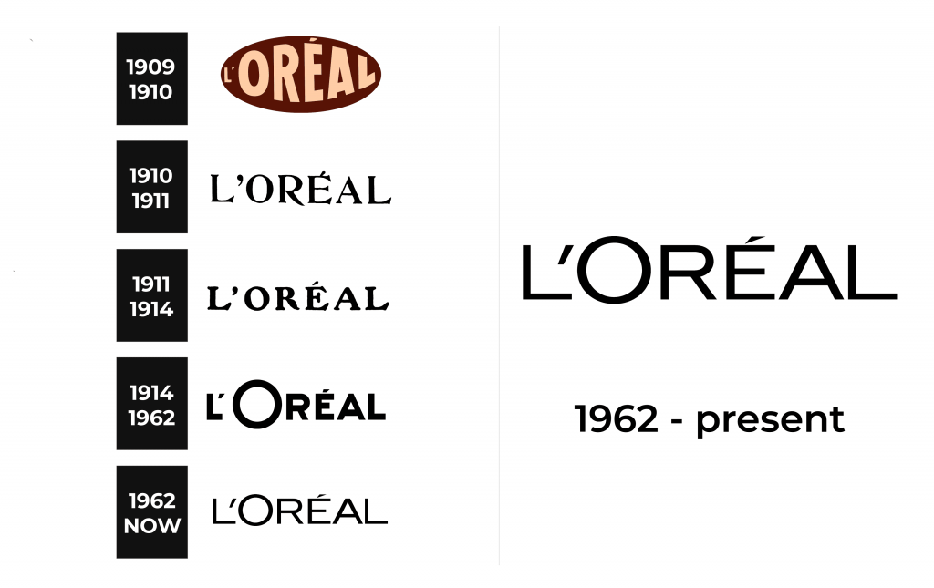
1909 – 1910
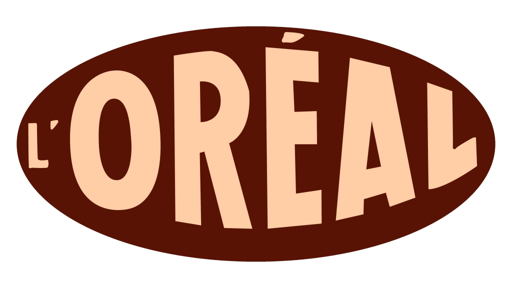
The original logotype was a brown oval figure. Inside of it, the designers placed the name of the brand – exactly as written today.
However, because of the figure’s nature, the letters weren’t all performed in the same proportions. Closer to the tips of the oval, the letters became gradually smaller, while growing bigger neat the center of the logo. The individual letters were also warped, become taller or shorter depending on the side. The characters were all colored a pinkish brown.
1910 – 1911
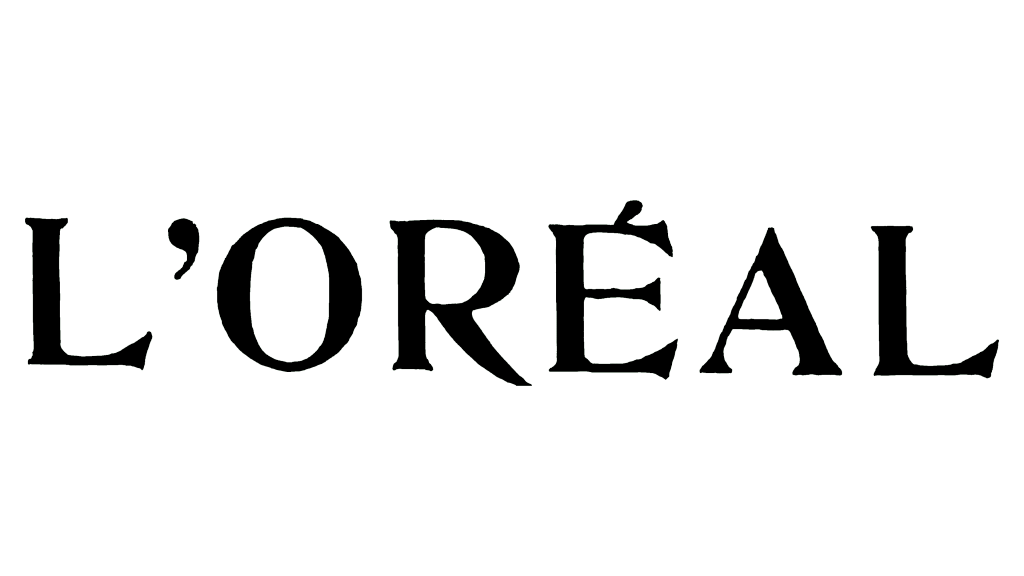
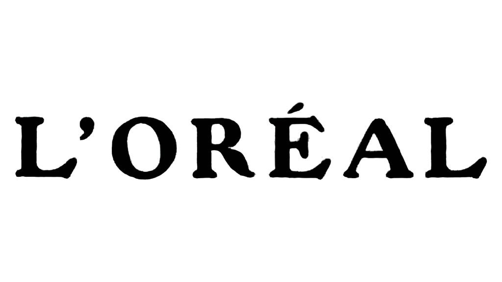
The following design was a lot more typical. It only depicted the brand’s name, written in a single line of text with the same general proportions for each letter. The characters were complete black, written in an elegant, but also strict serif typeface. They were rather fluid and soft in their appearance. The characters were fully capitalized.
1911 – 1914
The 1911 design is, in essence, similar to the previous iteration. The design of the letters changed somewhat: they became a lot bolder, while the proportions shifted slightly more towards width rather than height. This made the logotype more pronounced, but very little changed substantially.
1914 – 1962
The following update brought a log more change.
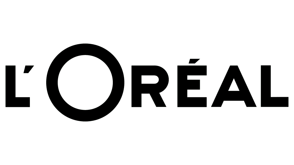
A new font was put into a place, a sans-serif variety similar to the previous installation. It meant the letters became less elegant, but simpler and even more pronounced. The characters additionally became bolder than before, while the proportions also changed slightly to make these characters appear a bit taller.
The biggest change came to the letter ‘O’, in particular, which became much bigger, and basically looked like a giant circle now. It was a reference to the brand’s original name, which translated to the ‘halo’. Like before, however, the entire logotype used black as its main color.
1962 – today
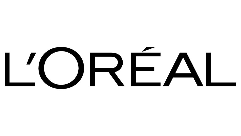
The 1962 redesign came many of the general details of the previous logotype. It was still the word ‘L’Oréal’, written in big, capitalized letters. Comparably, the letters became much thinner, although a certain degree of boldness is still clearly visible. These characters also became more uniform in terms of proportion, although the overall font changed little.
In particular, the characters became individually bigger, reducing gaps in-between to just small distances. The most prominent change is that the letter ‘o’ isn’t nearly as big anymore, although it’s still somewhat larger and unmistakably resembles a halo.
Font
The font utilized by the L’Oréal for the past few decades is a sans-serif style with few peculiar properties. However, it is well-proportioned so that all the letters retain generally similar proportions. Moreover, the thinness of these letters still makes them pretty elegant. All letters used in the L’Oréal logotypes are capitalized.
Color
The color black is used predominantly in the L’Oréal logotypes. On darker background, white is typically used, while the product packages and other brand material that contain bright colors prefer to depict the name in gold (likely in association with the word ‘or’, meaning ‘gold’ in French).
