The first lineup of musicians is childhood friends: Brad Delson, Rob Burdon, and Mike Shinoda. They are all from Southern California. They composed poems and music even before the start of the band’s official history. Over the twenty years of the band’s existence, seven successful albums were recorded. Linkin Park significantly influenced the youth subculture of the 2000s. Their music is still relevant today. The project became successful thanks to the vocals of Chester Bennington. Whether the team will be as popular with another soloist, time will tell.
Meaning and History
![]()
Three friends from high school, drummer Rob Bourdon, guitarist Brad Delson, and singer Mike Shinoda, wanted to try something different and established the renowned rock group in 1996. Originally, the group was known as “SuperXero.” The “Super” portion was thereafter eliminated. Later, the band had gone by Hybrid Theory, a reference to the mix of rock and rap sound. Following Wakefield’s resignation due to Xero’s lack of success, Chester Bennington became the band’s singer in 1999. After encountering legal issues with a very similar name, the band decided to go by Linkin Park, named after a local park. In 2000, Linkin Park released their debut album. It became one of the biggest debuts right away and was an immediate enormous success. Along with several tours and performances, there were a number of other popular records.
What is Linkin Park?
Linkin Park is an American alternative band. Its popularity exploded throughout the world after the release of its debut album “Hybrid Theory” in 2000, which was later certified multi-platinum.
1997 – 1999
![]()
This logo reflects an early name version of the band. It features a font in the style of the ancient Greek alphabet. To add even more interest to the inscription, the designers removed the right half of the “X” and vertical stroke of the “R” and placed the “E” right in the center.
1999 – 2000
![]()
Although this logo looks like some type of hieroglyph, it is a stylized monogram. Letters “H” and “T” are tilted to the left with “T” being placed over “H” in quite a symmetrical way. The logo had something mystical and intriguing about it and was a perfect match for the band. It also had something similar to the original version.
2000 – 2002
![]()
This logo is much simpler than the earlier versions. It features the band name everyone recognizes – Linkin Park. It is printed using a basic, sans-serif font with straight clean lines. At the same time, the bottom of the inscription as well as a few other spots appeared to be worn out or smudged and splattered with white paint. Along with brackets in each corner, which served as a frame, and mirrored “N”s, this added an unusual and enchanting touch.
2002 – 2003
![]()
The logo lost its streaked appearance, but the designers kept a vertical, thin, white line running across the bottom of the inscription. The brackets were also preserved, although here they look notably larger and stronger. The inscription is also bolder and stronger with diagonally cut corners and no curved strokes. The modifications reflected the changes the band was going through while preserving the recognizable image.
2003 – 2007
![]()
Not long after the logo began to look cleaner, the band brought back a version with splatters. They also added an uneven edge to the strokes but removed the horizontal line. At the same time, the logo had a lot in common with the previous version thanks to the minimally modified font, brackets, and black color.
2007 – 2010
![]()
A new design was introduced in 2007. Although it was something completely different, the designers kept a bold and daring feel of the band’s logo. The name was now printed in two lines with characters being stacked one on top of the other. Besides bold, clean strokes with straight cuts, the letters had another notable feature. It was the pointed ends of several letters that went beyond the stroke line.
2010 – 2017
![]()
Later, the band brought back a more minimalistic and modern design. It stayed pretty consistent throughout the years by using a black color and only its name in the logo. This version presented the band from a more sophisticated and professional side.
2017 – 2020
![]()
For a few years, the band used a logo with a stacked name. However, this time, the designers used a fine, sans-serif font and no pointed ends. The logo looked modern and stylish.
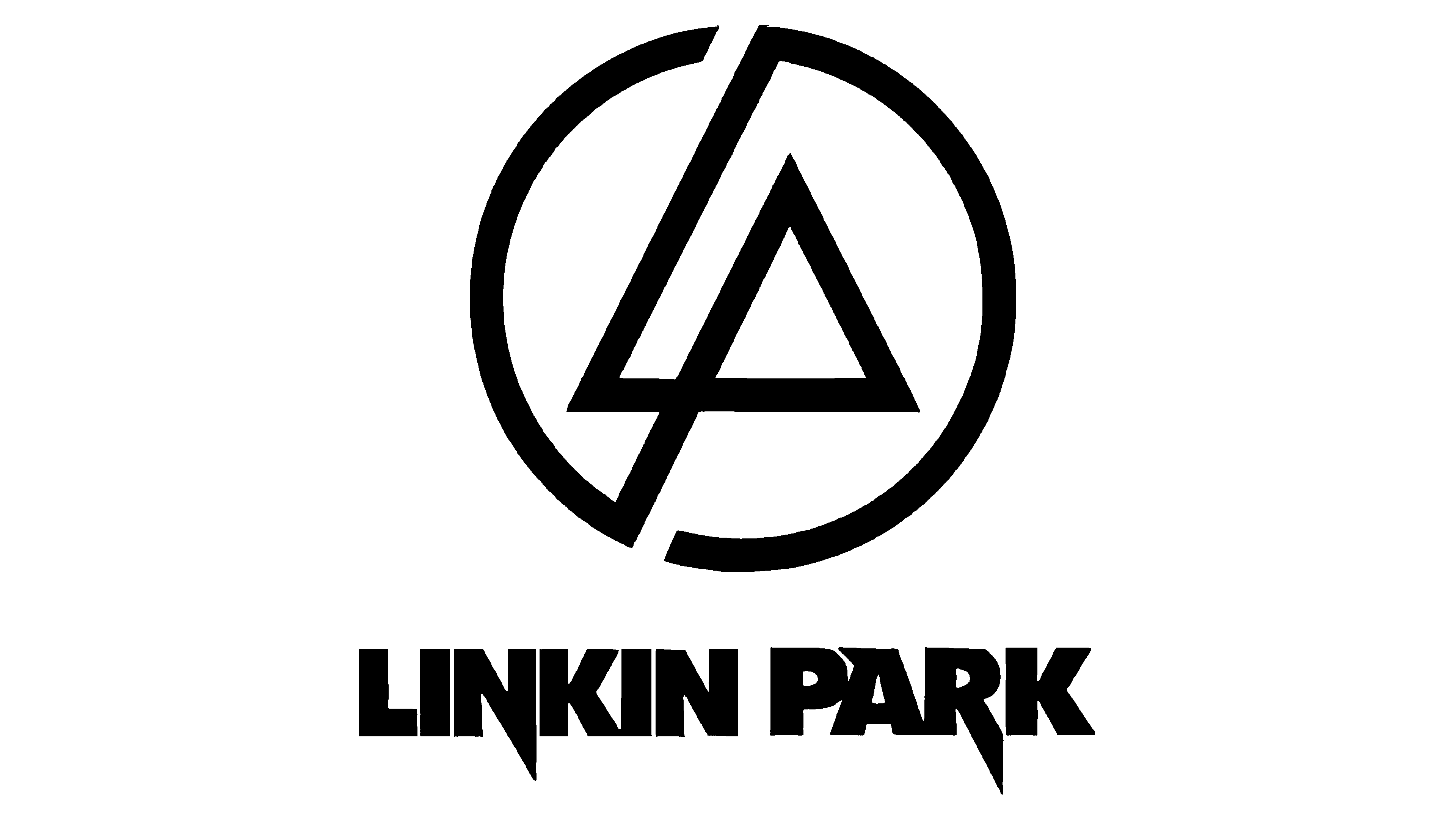
2020 – Today
![]()
The original logo with the new name, Linkin Park, was brought back in 2020. No modifications have been made. It was a perfect move to let the fans know that this is the band they have loved no matter the inevitable changes it has been going through.
Font and Color
Throughout the history, the band used black color for its logo. This classic and formal color is used for emblems and logos quite often as it is a powerful, elegant, and sophisticated color. In terms of the emotions it represents, black has a unique full-spectrum status.
Originally, the band used Japanese and/or hieroglyph style of font. Then, it moved to a simpler font with clean, straight strokes. Over the years, the font was slightly adjusted but had a lot in common with the version introduced in 2000. It was even brought back in 2020. For a few years, the logo featured a bold, daring font with thick strokes and a combination of straight and pointed cuts. There was also a version with fine, sans-serif font, which looked nothing like the band had before or after. Overall, the font choices presented the band as a solid and mysterious musical group.