Las Vegas Raiders Logo
Tags: Carol Davis | Mark Davis | NFL | USA
Las Vegas Raiders are a rugby franchise from the West Division of NFL, which was established in Oakland in 1960. The team then moved to Los Angeles in the 1980s, and then came back home. Since 2020 it is headquartered in Las Vegas, Nevada, and today are owned by Mark and Carol Davis with Jon Gruden as the head coach.
Meaning and history
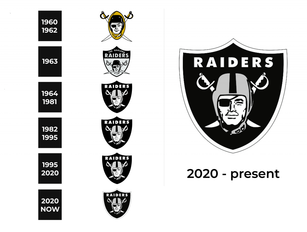
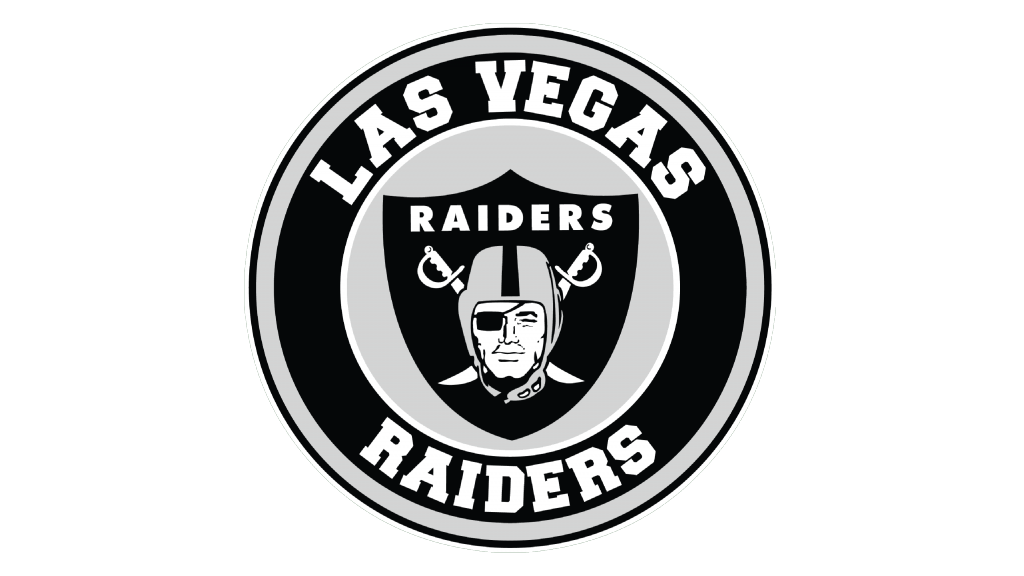
Actually, most of the Raiders’ visual identity redesigns were connected to the new home town and the team’s name changes, as the official style was set with the very first emblem, designed in 1960. Today’s logo is fully based on the earliest version but is executed in a monochrome palette, which has been in use by the franchise since 1963.
1960 – 1962
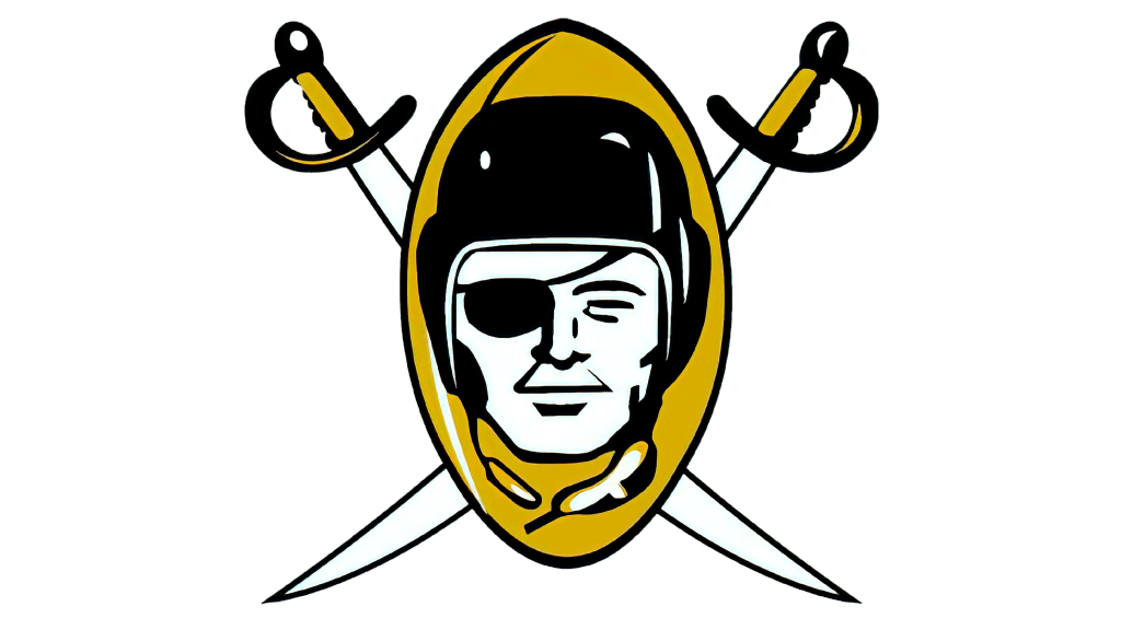
The initial logo was designed for the Raiders in 1959 and started to be used as an official one in 1960. Until today a pirate in an old-style rugby helmet and a patch on one eye is the symbol of the team, which is instantly recognizable among all the fans of American football. In the first version, the portrait of the pirate was placed on a dark yellow vertically located football, with two cross swords on the background. The handles of the weapon were executed in the same dark yellow shade.
1963
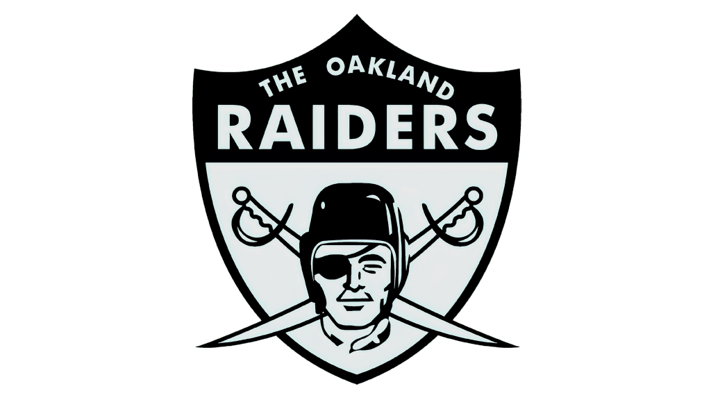
The Oakland Raiders changed their logo to a more “pirate” one in 1963. Now the mascot portrait was placed on a gray and black shield. The football was gone from the emblem and the color palette became all gray and black the name of the team was written on the top of the shield, right over its black part.
1964 – 1981
The colors in the logo were switched in 1964. Now it was a black shield with a gray image and a white “Raiders” wordmark above it. The lettering was executed in a simple yet strong and solid sans-serif typeface. Another change was made to the pirate’s helmet — it was now all gray with a thick black stripe in the center.
1982 – 1994
In 1982 the team relocated to Los Angeles, California. Keeping their previous logo as it was — there was even no need to redraw it, as the wordmark was composed of only “Raiders” part, no location.
1995 – 2019
The logo stayed with the Raiders even after they came back to Oakland in 1995. No changes were made, just a slight modification of contours, which became cleaner.
2020 – Today
In 2020 Raiders move to Las Vegas, Nevada, and the logotype is being redesigned for the first time in many years. But this redesign can not be called “major”, as the only thing that changed was the addition of a thick white outline to the iconic black shield. The pirate’s helmet gained a darker shade of gray and the black line became a little wider.
Symbol
The symbol of the team, a pirate in the football helmet, was designed by an unknown artist, but the idea came from Gene Lawrence Perry. It was a 100% choice, which can be seen today, as the symbol has never been changed throughout the long franchise’s history.
Helmets
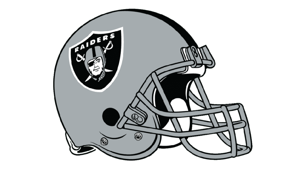
The Raiders’ helmets are designed according to the team’s logo — it features solid gray color and a thick black stripe in the middle. The iconic pirate emblem is placed on the side of it, and its white outline makes the image brighter and more visible.
Uniforms
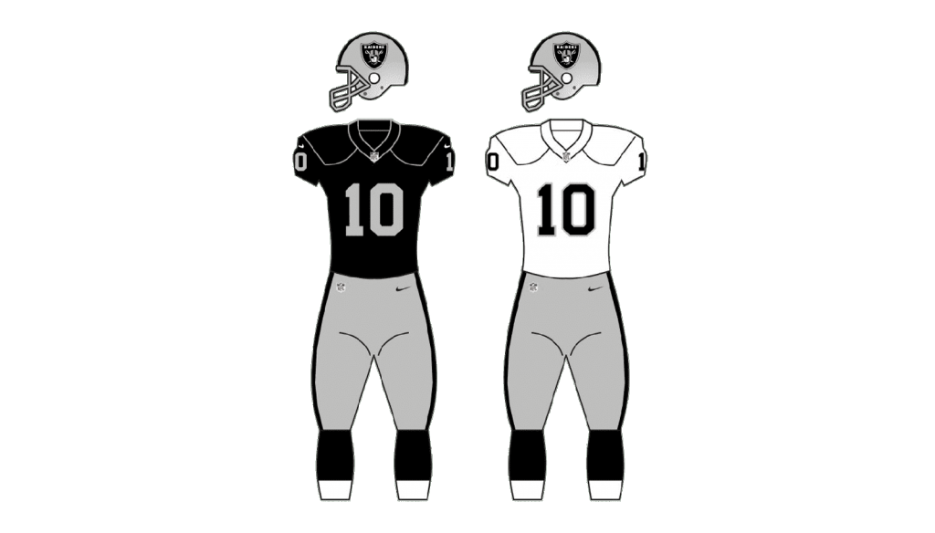
The uniforms of the Las Vegas Raiders are also executed in a black, white, and gray color palette. There are various options of mixing the shades, but the main style of the team is composed of a black jersey with gray numbers and accents, and gray pants with simple black stripes on the sides.
