Kansas City Chiefs Logo
Tags: Andy Reid | NFL | USA | West Division NFL
Kansas City Chiefs are a rugby franchise from the West Division of NFL, which was established in 1959 in Dallas and moved to Kansas City, Missouri at the beginning of the 1960s. Today the franchise is owned by the Hunt family and has Andy Reid as their head coach.
Meaning and history
Though the team was called Dallas Texans for only the first two wars since its foundation, it is still one of the important chapters in its history, so its visual identity can easily be divided into two periods — the Texans period and the Chiefs, which started in 1963.
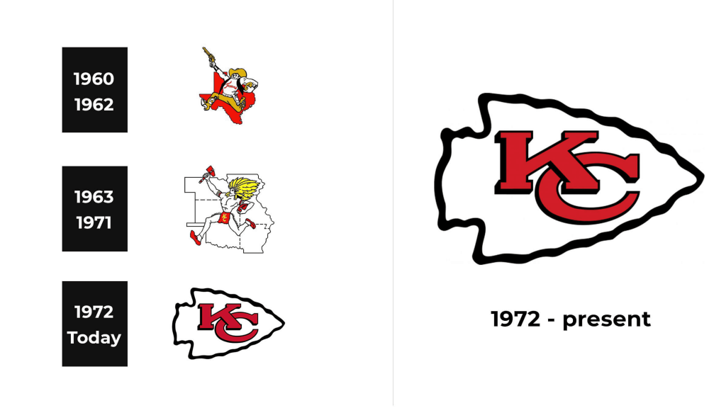
1960 – 1962
The initial logo for the team was designed in a year after the Texans’ establishment. It was a very simple and pale image, introducing the contours of the Texas state with one yellow star on it. The main color of the logo was white and the very thin outline featured black.
There was also an additional logo, which was more ornate — the running man in a cowboy hat with a gun in his hand was placed on a red background, repeating the Texas state contours. The man was holding a gun in his right hand and the football in his left. This logo became a prototype for the next version.
1963 – 1971
After the team moved to Missouri and got the new name, the need for the new logo occurred. It was designed by Bob Taylor in 1963 and illustrated a Native American man running just like the man from the previous emblem. But instead of the gun, he was holding a tomahawk and the background was now composed of the contours of six states, including Missouri. It was meant to symbolize the team’s new period and their willingness to move and progress.
The logo from 1963 was drawn in a white, black, yellow, and red color palette, re-flecting passion, professionalism, and happiness the team feels when being on the field.
1972 – Today
The completely new version of the Chiefs’ logo was created by Lamar Hunt in 1972. This logo is still in use by the team and depicts a red bold monogram “KC” placed inside the stylized arrowhead, executed in white with a black outline.
The overlapping letters feature clean and traditional lines, while the contour of the arrowhead is drawn with curves, which makes the whole look cool and memorable.
Emblem
The Kansas City Chiefs’ emblem is composed of an iconic arrowhead with the team’s initials, placed inside a red circle with a thick yellow outline, where the lettering is located around its perimeter. The arrowhead looks bright and fresh due to the use of white color, while the emblem itself evokes a sense of passion and warmth.
Helmets
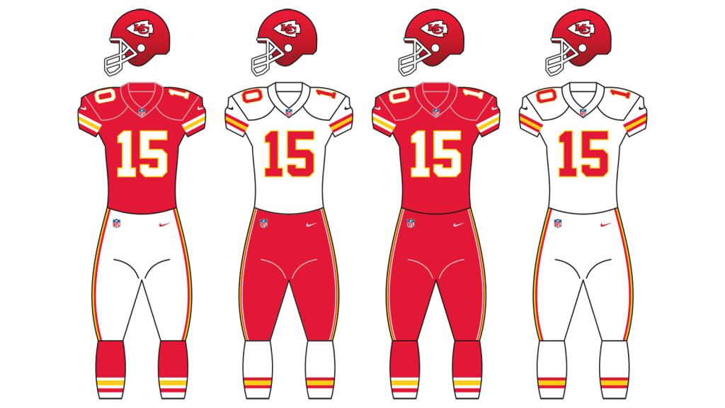
Though red, white, and yellow are three official colors of the Kansas City Chiefs, the helmet design is built on a combination of red, white, and black. The white arrowhead in a black outline is placed on a red background and balanced by a massive white grill.
Uniforms
The team’s uniform is also based mainly in white and red — the home outfit of the players includes red jerseys and white pants with red and yellow side stripes. As for the players’ numbers they are executed in white with a slightly visible yellow outline.
For the road uniforms, the team uses white jerseys with red decor elements and red pants with yellow and white thin stripes.

