Iowa Hawkeyes Logo
Tags: Division I | FBS | Iowa City | USA
Iowa Hawkeyes are a sports branch of the University of Iowa, located in the state’s capital. These are the 22 assembled male and female clubs, representing U of I in the tournaments of all main sports disciplines. Being a part of Big Ten, one of the top unions of university varsity teams, and the first (and highest) division of NCAA, the largest student’s sports association in the USA, Hawkeyes achieved multiple trophies in the nationwide tournaments of football, wrestling, rugby, tennis, and others.
Meaning and history
The original varsity clubs powered by the UI trace back from the early 1950s, to promote the university’s sport’s activities and fund the budget via sports contests and games between the universities. By that time, the university was already enrolled in Big Ten, so the teams started the tournaments partnering with the conference. Historically, football and wrestling were the most successful sports disciplines played by Hawkeyes
This nameplate was originally borrowed from a character of a mid-19 century novel named The Last of the Mohicans and written by James Cooper. This novel was then spread across the whole Iowa state, so the citizens started to call themselves with this name.
What is Iowa Hawkeyes?
Iowa Hawkeyes are a branch of the University of Iowa, established in 1953. Hawkeyes consist of 22 varsity clubs introducing the institution in various areas of sports on the nationwide championships carried by the National Collegiate Athletic Association. They compete in Division 1, alongside the country’s top university varsity clubs. Historically, the Hawkeyes prospered in wrestling, rugby, football and ice hockey, winning various awards and trophies.
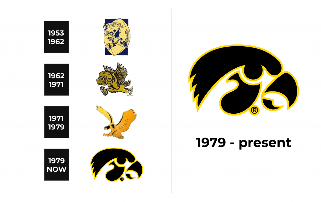
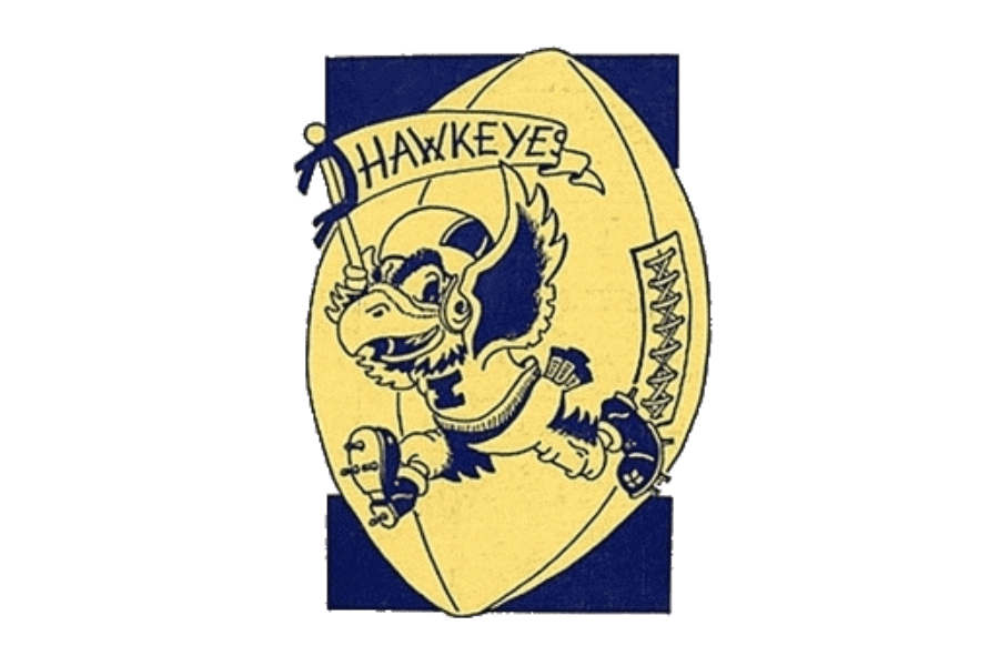
1953 – 1962
The brand’s very first logotype showed a large capitalized ‘i’ character, over which they drew a rugby ball. The ball served as a background image for a stylized hawk, equipped with a jersey depicting the bold uppercase ‘i’ letter, pants plus a helmet and boots. The bird ran somewhere determinedly, carrying a flag with the brand name. The image had a friendly and glib mood, which attracted attention ad looked stylish.
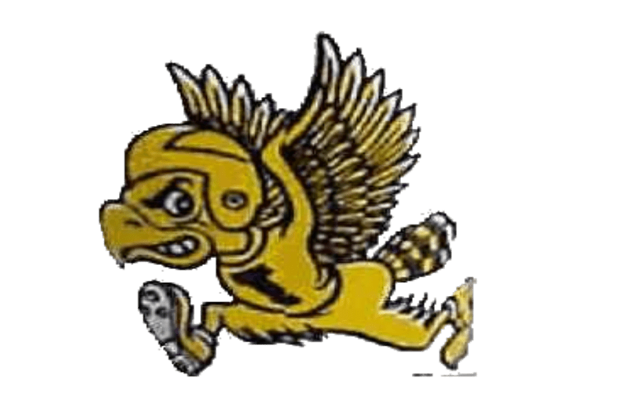
1962 – 1971
The next crest became less cartoonish and more aggressive and dangerous. The bird still ran somewhere purposefully, but it now was displayed in profile and had a furious face. It wore football gears, with the jersey showing a large ‘i’. The hawk’s wings were spread and risen up.
1971 – 1979
The 70s emblem featured a peaking hawk with widespread wings. The bird makes an impression of determination, freedom and velocity. This simple insignia features a professionalism of the team players.
1979 – today
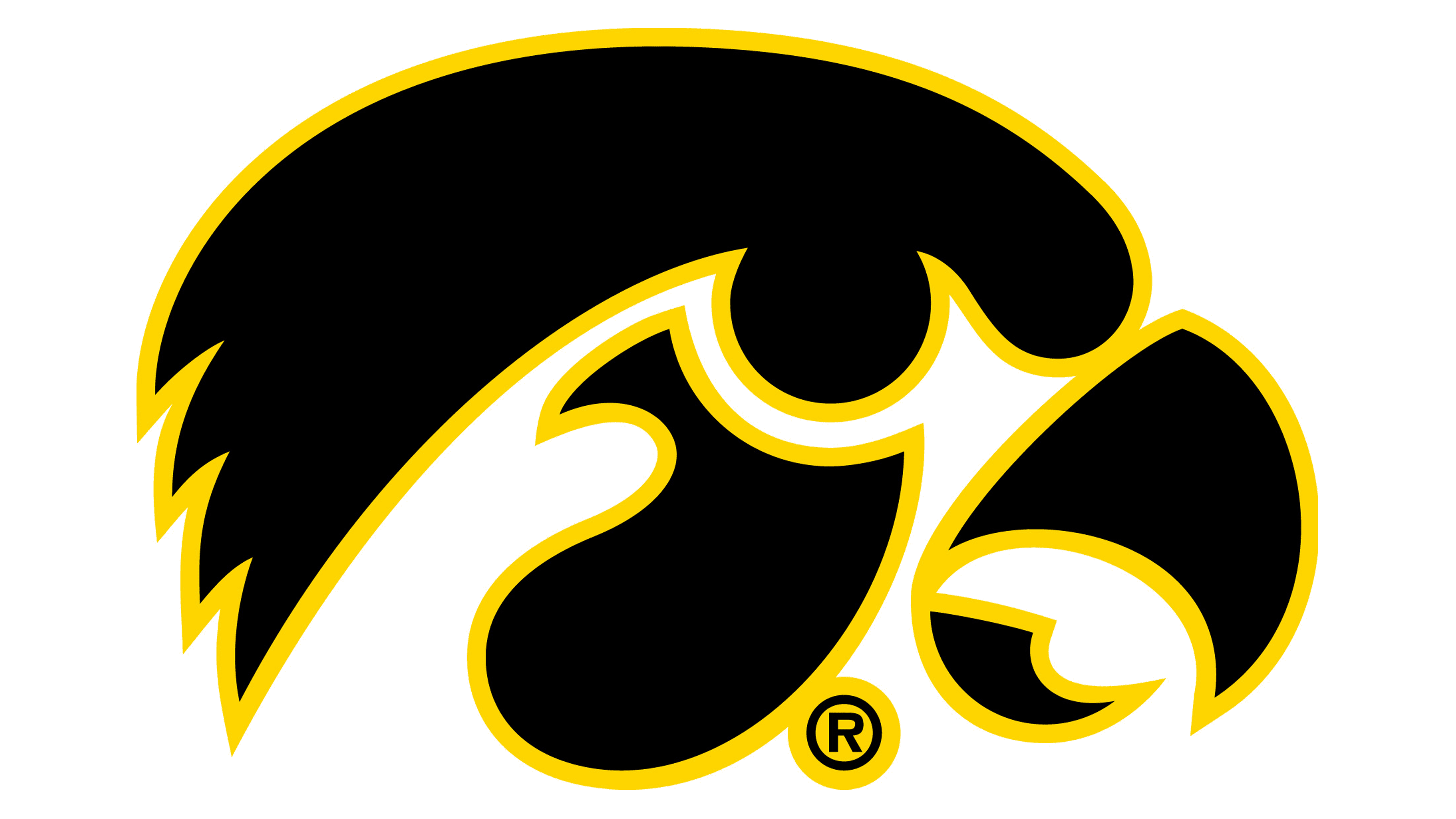
The 1979 hawk is the longest living logotype ever used by the team brand. Being a set of several geometric forms separated from one another, the logotype represents a hawk’s in-profile head. Its sharp beak is open, while a minimalistic circle serving as an eye makes the bird look like it watches its prey and waits for a right moment to attack. This image greatly reflects both the mood and the status of the Hawkeyes.
Color
The official color code of the Hawkeyes goes after the university customs. It’s composed of golden yellow and black, whereas the hawk is yellow and its background is black. In the athletics crest, the logotype can invert depending on the situation.
Font
Although the traditional logotype is shown without any words, but sometimes they add the watermark below the emblem. The ‘Iowa Hawkeyes’ or ‘Hawkeyes’ nameplate are sometimes written tilted, sometimes regular. It always has a heavy typeface with prominent serifs and bold contours of the characters.
