Indianapolis Colts Logo
Tags: AFC South | Indianapolis | NFL | USA
Indianapolis Colts is the nameplate of an athletic franchise, founded in 1953. They play American football, taking part in the National Football Conference as a franchise of its South Division. Their home matches are played in Lucas Oil Stadium. Being a team with a long history, they participated in many American-wide and worldwide games and won numerous trophies. Colts are owned Jim Irsay and coached Rank Reich.
Meaning and history
The Colts’ history can be split in two halves: the Baltimore period, lasting from the establishment in 1953 to 1983, and the Indianapolis era, going until now. The team has been contesting in NFL since their establishment, taking part in league tournaments, conference games, and division championships. In the 1980s, the club changed its stadium from Memorial Stadium in Baltimore to RCA Dome in Indianapolis, changing the name. They were consistent with their brand graphics: throughout the franchise’s history, Colts used the singe color palette, while the modern emblem was introduced in the late 70s.
What is Indianapolis Colts?
Indianapolis Colts are a sports franchise, which appeared in 1953. The club now plays football partnering with the NFL’s Southern Division. Now, Colts’ hub matches are carried in Lucas Oil Stadium. The franchise is famous for its victories in four NFL tournaments, including one Superbowl, as well as other smaller tournaments. Jim Irsay owns the Colts team, while it’s coached by Frank Reich.
1953 – 1960
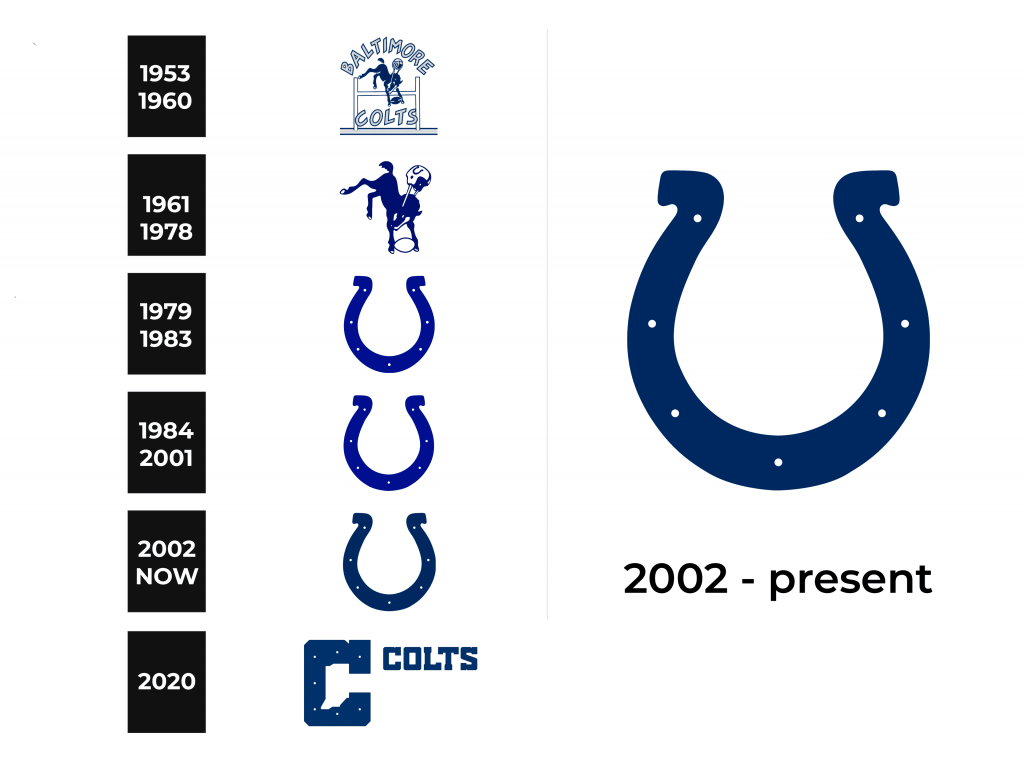
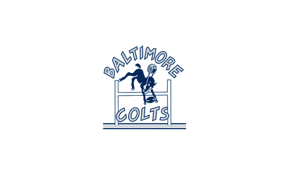
The original logotype by the Colts displayed quite an unusual picture: a dark blue horse jumps through a white ‘H’-like barrier contoured blue, carries a blue oval ball and wears a helmet, flying somewhere far from the head, but still held on with straps. Upper and lower that the steed, the designers displayed the words from the brand name shown in a capitalized sans-serif script with a cartoonish style. The letters had slim contours
1961 – 1978
Then, they removed the bar and the nameplate, remaining only the horse picture with some changes. First, the helmet form was changed, it became blue inside and white outside. The ball was recolored white with blue contours as well. One more notable part of this logotype was a horseshoe depiction located on the helmet.
1979 – 1983
18 years later, a solid blue horseshoe emblem was presented. It featured the sign of fortune and hopefulness, ornamented with 7 points located along the figure. Here’s suitable to clear up why the Colts chose the horse as the main character in their logotypes. The thing is that Baltimore, the original city of the team, is notable for horse growing and riding. To be associative with the city, Colts marketers first chose the horse image itself, and then a more minimalistic sign the horseshoe. And this sign became a brand’s symbol, just getting some modifications time to time.
1984 – 2001
One of such modifications took place in 1984. The new crest got slightly changed contours, but no serious add-ons took place.
2002 – today
With the 21st century upcoming, the franchise has changed its brand identity. The fresh shoe is repainted darker blue, which felt more reliable and expert. The points now were made more distinguished, while the whole mood of the crest became more refined.
2020
Font
Usually, they don’t use any words alongside the horseshoe.
However, sometimes they set up the wordmark below the crest or as a solid logo. It has a heavy typeface with all capitals, having prominent serifs. The symbols have small intervals in between.
Color
Traditionally, the shade code of the club’s graphical identity was dark blue and white. Blue signatures calmness, determination, and stability, while white reflects clearness and boldness. It also creates a contrast.
