International Harvester (IH) is a renowned American manufacturer primarily known for agricultural machinery and vehicles. Founded under the ownership of the McCormick family, the company has established itself as a leader in the agricultural industry. Its core business revolves around the production of tractors, combine harvesters, and other farming equipment, demonstrating a strong commitment to enhancing agricultural efficiency and productivity. Operating globally, IH has marked its presence in various continents, adapting its technology and products to suit different agricultural practices and environments. This widespread operation not only signifies its international reach but also its ability to innovate and respond to diverse agricultural needs.
Meaning and history
International Harvester (IH), established in 1902, was founded through the merger of the McCormick Harvesting Machine Company and Deering Harvester Company, along with three smaller agricultural equipment firms. This merger, led by the McCormick family, marked the beginning of a new era in agricultural machinery and technology.
In its initial years, IH pioneered several key advancements in the field of agriculture. Most notably, it developed the first commercially successful tractor, revolutionizing farming practices worldwide. This breakthrough was followed by a series of innovations in harvesting machinery and equipment, cementing IH’s position as a leading figure in agricultural modernization.
Over the years, International Harvester expanded its product line to include trucks, construction equipment, and gas turbines, demonstrating versatility and adaptability. However, the company faced financial challenges in the 1980s, leading to a major restructuring. In 1985, the agricultural division was sold to Tenneco, Inc., and became part of Case IH. Today, the legacy of International Harvester lives on through Case IH, which continues to be a major player in the agricultural sector, offering a wide range of advanced farming equipment and technology. The company’s current position reflects its historical significance and enduring impact on the agricultural industry.
What is International Harvester?
International Harvester (IH) is a historic American manufacturer specializing in agricultural machinery and vehicles. Known for its significant contributions to the advancement of farming technology, IH played a pivotal role in the modernization of agriculture. With a legacy spanning over a century, it remains an iconic name in the industry, symbolizing innovation and excellence in agricultural equipment manufacturing.
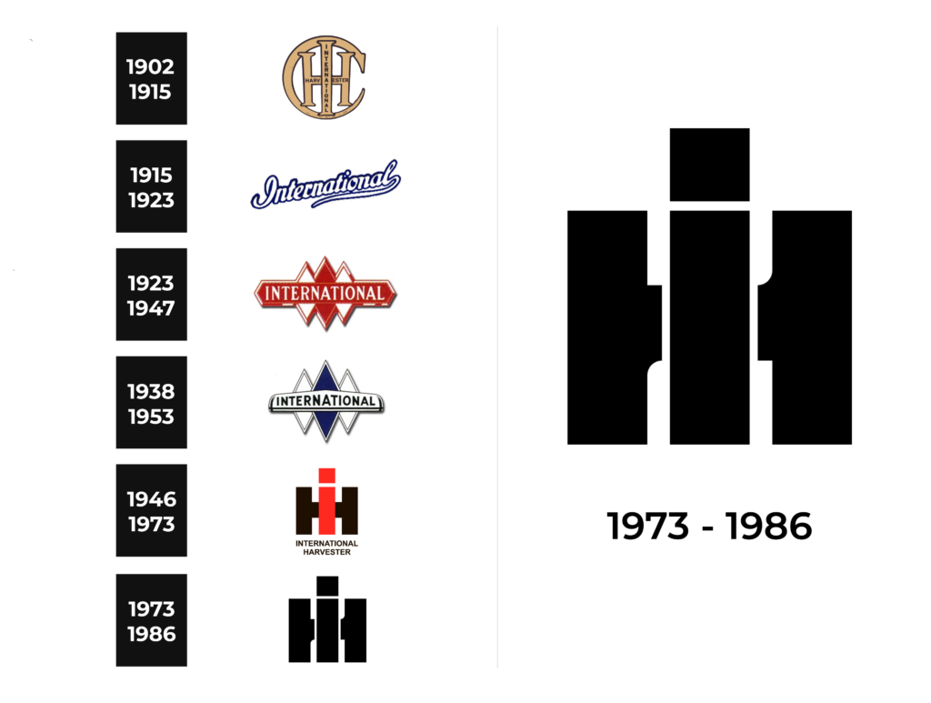
1902 – 1915
For the first logo, from 1902, it features the initials “IH” for International Harvester, set within a circular seal that suggests unity and completeness. The font is bold and stylized with serifs, giving a robust and grounded feel, reflective of the company’s industrial roots. The letters “I” and “H” are interlocked, symbolizing the integration of the company’s various endeavors. The text “INTERNATIONAL HARVESTER” is wrapped around the circle in a protective manner, which along with the claim of “REC. U.S. PAT OFF DEC 11 1909,” emphasizes the company’s established nature and commitment to innovation and quality. The color scheme of gold on a dark background conveys a sense of longevity and value, underlining the history and durability associated with the brand.
1915 – 1923
Moving to the 1915 logo, it presents a more elaborate design. The word “INTERNATIONAL” is displayed in a decorative font with intricate serifs and a shadow effect, adding depth and prominence. The lettering is blue, set against a patterned background that provides texture and visual interest. The script is reminiscent of early 20th-century design, indicative of the era’s attention to detail and craftsmanship. The stylization of the text with an underline flourishes conveys a sense of movement and progress, aligning with the dynamic nature of the period and the company’s forward momentum.
1923 – 1947
The 1923 logo demonstrates a shift towards a more modernist aesthetic. The word “INTERNATIONAL” is written in a sharp, geometric font that reflects the Art Deco movement. The font color is a bold red, creating a strong contrast against the diamond-patterned background which is indicative of industrial motifs common in that era. The symmetry and the arrow-like elements in the background suggest speed and precision, resonating with the company’s aim for efficiency and technological advancement.
1938 – 1953
The 1938 logo emphasizes a streamlined design, embracing the minimalism of the time. “INTERNATIONAL” is inscribed within a sleek, elongated diamond shape, reinforcing the brand’s identity with clarity and simplicity. The font is sans-serif, which was becoming popular in the early 20th century for its clean and readable appearance. The stark contrast of white lettering on a deep blue background adds a professional and corporate quality, mirroring the company’s evolution and adaptation to the modern world.
1946 – 1973
The logo provided is a minimalist representation of the International Harvester company’s branding from 1946. The design is striking in its simplicity, featuring the company’s initials, “IH,” in a large, bold font that stands out against a black background. The “I” is colored in a deep red, while the “H” is in a rich brown, creating a visual contrast that is both aesthetically pleasing and easy to remember. The font itself is sans-serif, modern, and clean, communicating a sense of efficiency and modernity. Below the initials is the full name of the company, “INTERNATIONAL HARVESTER,” in a smaller, capitalized font that maintains the logo’s balance. The color scheme of red and brown against black suggests the earthiness of agriculture and the ruggedness of industrial machinery, both of which are central to the company’s identity.
1973 – 1986
The logo appears to be a more contemporary evolution of the International Harvester brand, maintaining the simplicity of the previous design but opting for a stark black-and-white color scheme. The initials “IH” are again prominently displayed, but this time in a more stylized, geometric font that could indicate the company’s progression into a new era of design and perhaps technology. The symmetry and boldness of the letters convey strength and reliability, core values for a company known for heavy machinery and agricultural equipment. The absence of additional design elements keeps the focus entirely on the company’s well-established reputation, represented by the solid, unmistakable initials.


