Hennessey Logo
Tags: Black Car Brands | cars that start with h | USA cars
Hennessey is a Texas-based tuning company that is famous for its uncompromising designs based mostly on the products of the American automotive industry. But the dream of the company’s founder John Hennessey was to create his own car. He made it in 2010.
Meaning and History
![]()
American tuning studio Hennessey Performance specializes in the production of heavy-duty modifications of American cars, including pickup trucks. The first car of this company was a modified Mitsubishi 3000GT, on which John Hennessey successfully performed in the ascent to Pike’s Peak, on the Bonneville salt flats, and in the Silver State Challenge race.
In 2010, Hennessey finally decided to build his automobile. This is how the Hennessey Venom GT supercar, based on the Lotus Exige platform, came into being. In 2013, it tried to overtake the Bugatti Veyron Super Sport for the title of the fastest production car in the world but failed to enter the Guinness Book of World Records due to insufficient numbers built.
In 2014 John Hennessey announced his intention to build a new supercar, which would set a new speed record. According to the original plan, the Venom F5 was to be brought to the market in 2016 in a quantity of more than 30 units. But in the end, the production-ready hypercar made its debut only in 2020.
What is Hennessey?
Hennessey is an American automotive company specializing in high-performance vehicles and aftermarket upgrades. They are known for producing powerful and customized cars, including supercars and muscle cars, offering exhilarating driving experiences.
2010 – now
![]()
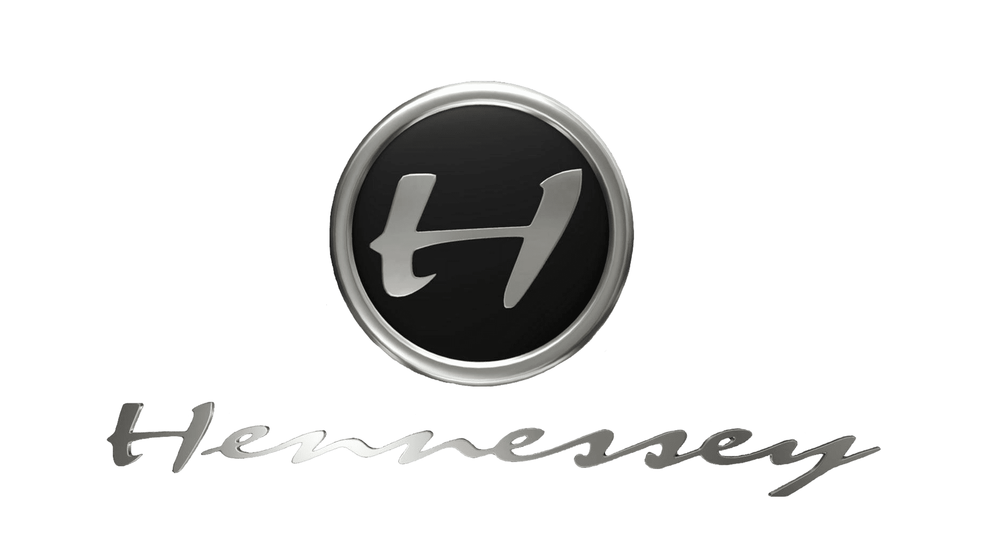
The company logo is presented in two versions. The first is in the shape of a black circle with a silver rim with the inscription “Hennessey Performance”. Inside the circle is a stylized letter “H”, which was taken from the second version of the logo – the name of the company in black color. It was as if someone had written the name by hand quickly and without much effort, which made the logo even more distinctive and memorable.
2021 – now
![]()
The logo in view is an emblematic representation of symmetry and directness, comprising of geometric figures to form a central structure. At first glance, it resembles a stylized rendition of the capital letter ‘H’, which is indicative of the brand or company’s initial. This emblem is characterized by a strong vertical rectangle that anchors the design, flanked on either side by a set of identical, inverted arrow shapes. These shapes point outwards and upwards, suggesting motion, progress, and a forward-thinking attitude.
The sharp angles and clean lines convey a sense of precision and efficiency, qualities that might be at the core of the brand’s values or service promises. This minimalist yet powerful design ensures that the logo is versatile and can be recognized at varying sizes and across different mediums, from digital screens to physical products.
The logo’s design is free from any extraneous details, making it a timeless piece that would not succumb to the changing tides of design trends, ensuring the brand’s visual identity remains strong and consistent over time.
Emblem and Symbol
One of the main elements of the company logo is the font used. It reflects the exclusivity and originality of the company. The use of this style of writing emphasizes the reliability of the transmitted information and inspires the confidence of buyers. The emblem is made in black and white tones that go well with any color. Therefore, the emblem will look great on any surface.