Georgia Bulldogs Logo
Tags: athletics | championships | USA
The Georgia Bulldogs represent the University of Georgia in NCAA athletics, particularly noted for their football team. As members of the Southeastern Conference, they’re a formidable force in college sports. Their history is rich with numerous conferences and national championships since beginning in 1892.
Meaning and History
Their football team is the most celebrated, playing home games at the iconic Sanford Stadium in Athens, Georgia. Known for their distinctive red and black colors, the Bulldogs are supported by their famous mascot, Uga, an English Bulldog that embodies the team’s spirit. Beyond football, Georgia’s athletic program includes basketball, baseball, gymnastics, and more, all contributing to the university’s athletic prestige. These teams collectively enhance the Bulldogs’ reputation as a powerhouse in collegiate sports.
What is Georgia Bulldogs?
Georgia Bulldogs is the athletic wing of the University of Georgia, founded in the 1920s. They compete in the highest collegiate championships in the United States with impressive expertise, skill, and performance. The program’s most celebrated team is the football one, playing home games at the iconic Sanford Stadium in Athens, Georgia.
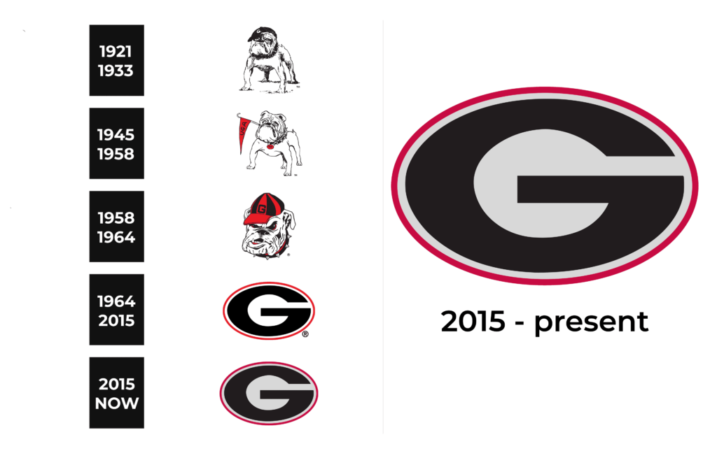
1921 – 1933
The earliest logo features an image of a standing bulldog, facing left with a serious, stoic expression. The illustration is monochromatic and detailed, emphasizing the muscular build and characteristic folds of the breed.
1945 – 1958
This iteration introduces a forward-facing bulldog, still in monochrome, with a more animated expression. There is a flag in the dog’s mouth that reads ‘UGA’ diagonally and the number ‘1’ on its jersey.
1958 – 1964
The 1958 design shifts to a bulldog’s head only, now sporting a red and black cap with the letter ‘G,’ symbolizing the University of Georgia. The bulldog’s expression is fierce, with a snarl and furrowed brow, indicating a more aggressive sports mascot.
1964 – 2015
This period marks a departure from the bulldog imagery to a simple ‘G’ inside a black oval with a red outline. The letter ‘G’ is white with a black shadow, creating a bold and clean graphic element.
2015 – today
The latest logo retains the oval ‘G’ motif but simplifies it further. The black shadow is removed, and the red outline is thickened, resulting in a crisp, modern emblem that balances tradition with contemporary design aesthetics.
Color
Color-wise, the evolution of the Georgia Bulldogs’ logos reflects a shift from detailed monochrome to the prominent use of the university’s official colors, red, black, and white. The earliest logo (1921-1933) is entirely in black and white, emphasizing the illustration over color. As the logos progress, red gets more dominant, particularly from 1945 onwards, where it is used in the flag held by the bulldog and the number on its jersey.
By 1958, the red and black cap introduces the school colors directly into the bulldog’s design. The oval ‘G’ logos of 1964-2015 and the 2015 foreground the red and black color scheme even more, with the latter simplifying the colors for a bolder, cleaner look, with the white ‘G’ standing out against the black background encircled by a red outline.
Font
In terms of font, the earliest logo uses a classic serif typeface typical of the early 20th century. This gives way to a bold, block-like sans-serif font in the 1945-1958 flag, suggesting a transition to a more assertive and sports-oriented style. The ‘G’ in the bulldog’s cap from 1958-1964 moves to a geometric sans-serif font, indicating a modernization of the design to a simpler, more graphic look that aligns with athletic branding.
The oval ‘G’ logo from 1964-2015 features a heavy, possibly custom sans-serif font that exudes strength and stability. This design is refined in the 2015-now logo, maintaining the sans-serif, bold ‘G’ but without any shadow effects, streamlining the font for a contemporary and straightforward presentation.


