Gain Logo
Tags: detergent | laundry products | USA
The Gain brand, now synonymous with vibrant and long-lasting scents, was introduced by Procter & Gamble in 1969. Initially launched as a stain-fighting detergent, Gain quickly gained traction for its powerful cleaning abilities, making laundry day much easier for many households.
Meaning and History
![]()
Gain is a popular laundry and home care brand known for its distinctive, long-lasting scents and powerful cleaning capabilities. Owned by Procter & Gamble, Gain made its debut in 1969 as a laundry detergent and quickly earned a loyal following for its ability to deliver both freshness and stain-fighting performance. What truly sets Gain apart is its focus on fragrance, with its signature scent becoming a beloved hallmark of the brand. Over the years, Gain has expanded its fragrance portfolio, offering a variety of scents that make laundry not just a chore, but an enjoyable, sensory experience.
Beyond detergents, the Gain product line has grown to include fabric softeners, scent boosters, dryer sheets, dish soaps, and air fresheners, all infused with the same attention to vibrant, long-lasting scents. Gain’s products are designed to provide an immersive experience, ensuring that clothes and linens come out clean, soft, and smell delightful. Often marketed with playful energy, Gain has positioned itself as the brand for those who love their laundry to smell as good as it looks.
With a reputation for combining effective cleaning power and fresh, bold fragrances, Gain has become a go-to choice for consumers who want their laundry to not only be spotless but also burst with a scent that lasts for days.
Gain is a brand that truly lives up to its name, delivering gains in freshness and scent like no other. Known for its vibrant and long-lasting fragrances, Gain turns laundry day into a very pleasant event. From classic scents to delightful new blends, Gain offers a scent experience that lingers on your clothes, lifting spirits and sparking joy.
What is Gain?
Gain is the name of a well-known laundry and home care brand recognized for its powerful cleaning abilities and vibrant, long-lasting scents. Launched by Procter & Gamble in 1969, Gain quickly became a favorite among consumers for making laundry feel fresh and enjoyable.
In terms of visual identity, Gain is laconic, stable, and powerful. The concept of the brand’s logo stayed unchanged throughout the years, but some details and lines were modified.
1969 – 2002
![]()
The original logo was created for the Gain brand in 1969. It was a flat bright-red uppercase lettering in a sharp geometric sans-serif typeface, placed diagonally against a transparent background. The letter “I” was slightly out of the line, placed a bit higher, and slanted to the right.
2002 – 2005
![]()
In 2002 the Gain logo was redesigned with a wider color palette and a lot of volume added to the lettering. The main shades were changed to orange; while the white outline and blue shades made up a strong framing. The style of the inscription got more modern and brutal, with wide contours of the stable characters.
2005 – 2012
![]()
Another redesign was held by the brand in 2005. The thin gradient strokes were added to the bodies of the characters, making the whole inscription three-dimensional. Also, the line of the wordmark got a bit arched, creating a delicate playfulness.
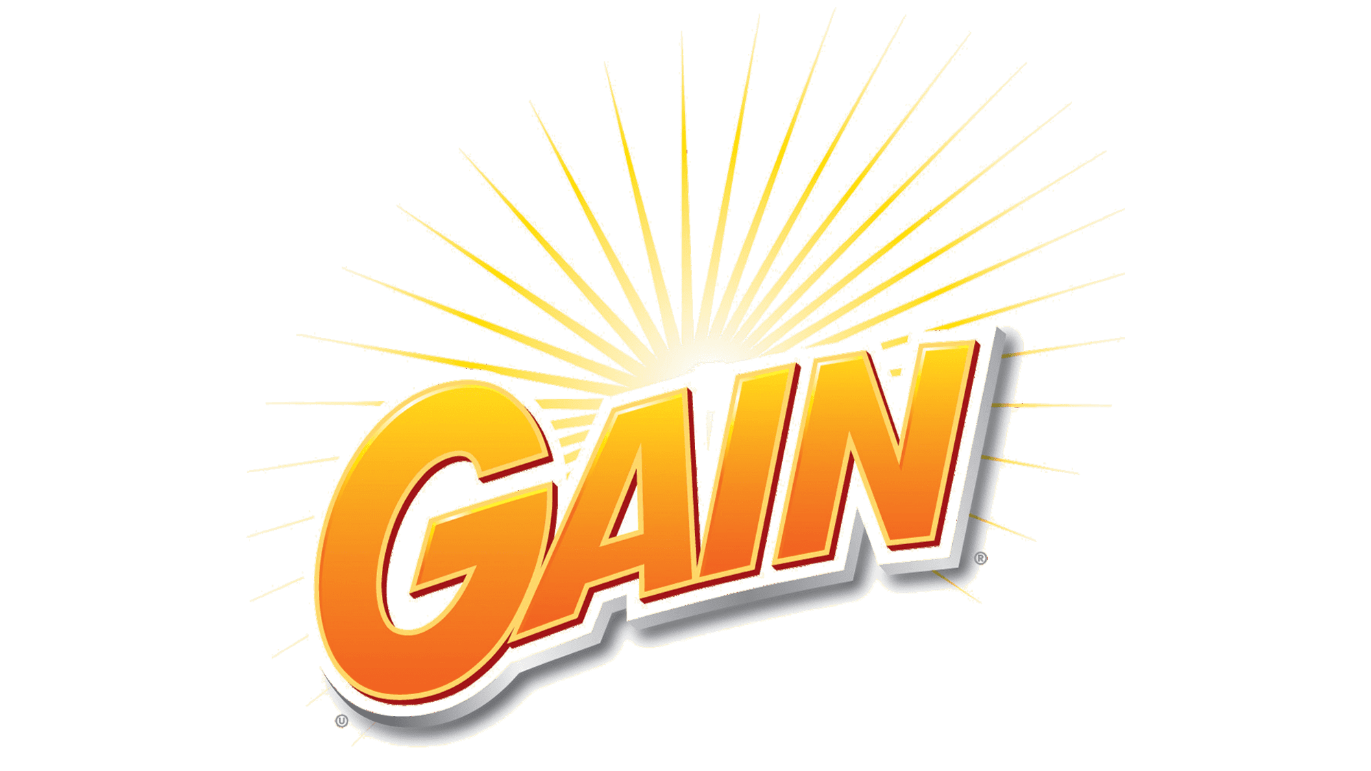
2012 – today
![]()
In 2012 the logo of the Gain gained a significantly different look. First of all, the color palette was changed to orange, white, and green. Secondly, the wordmark was rewritten in flat strokes, with no gradients, using a smooth bubble-styled typeface. Thirdly, the dot above the “I” was surrounded by barely visible sharp and long rays, which stand for cleanliness and freshness.
Colors
The color palette of the Gain logo has orange as its central shade, which is a warm and joyful shade. Two additional colors here are white and green, where the first one represents cleanliness and the second — well-being.
Fonts
The bold title case inscription, which makes up the main part of the Gain logo, is executed in a cool designer typeface with thick smooth lines and softened contours. The weight of the characters is compensated by the rounded ends of the bars, which create a very friendly look.