Fiat Logo
Tags: cars that start with f | Italian cars | Red Car Brands
Fiat Group is an Italian manufacturer of passenger cars, commercial vehicles, engines, and auto parts. The company was founded in 1899 by a group of investors, including Giovanni Agnelli, and began assembling cars under Renault’s license. Since 2011, the company has been split into two subsidiaries: Fiat SpA, which manufactures passenger cars, and Fiat Industrial, which manufactures industrial vehicles.
Meaning and History
Official documents indicated the name Societa Anonima Fabbrica Italiana Automobili Torino, and if you pay attention to the first letters of the last four words of this phrase, it becomes clear that Fiat is an abbreviation. Well, today’s company logo is both similar and unlike most of the previous ones. It still has the same red background and round shape, but there are plenty of changes in it.
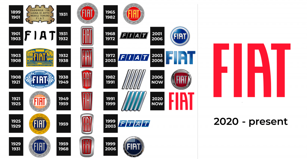
1899 – 1901
The first logo was a stylized ancient parchment with the company’s full name on it.
1901 – 1903
In 1901, the emblem took on a radically new look. It was a blue-enameled plate, in the center of which was the Fiat name with the characteristic way of writing of the letter A.
1903 – 1908
The Fiat badge, designed in 1903, was the most ornate and bright among all the versions, created throughout the years. It was a gradient blue and yellow banner with lots of details and a bold yellow inscription in the middle, placed on a horizon-tally located rectangular element colored in a darker shade of blue.
1908 – 1921
The redesign of 1908 changed the shape and the color palette of the logo. Now it was a horizontal oval in blue and white, which still had thin elegant ornaments sur-rounding the emboldened white logotype of the brand, which was placed on a dark blue rectangle in the middle of the emblem.
1921 – 1925
The first circular Fiat badge appeared in 1921. This is when the company also in-troduced a new color palette — white, orange and red for the main part, and silver-gray for the framing with leaf ornament. The middle part of the logo was horizontally divided into three segments — two orange ones (with dotted pattern) placed above and under the white part with a bright red inscription on it.
1925 – 1929
During this period, the logo changed a lot again. It became round, acquired a red background, on which the abbreviated name of the company was written in white letters. The emblem was framed by a stylized wreath of laurel leaves, which symbolized the victorious participation of Fiat cars in the first car races.
1929 – 1931
In 1929 the badge remained the same, but the color palette was changed. Now the lettering and the framing were executed in two shades of gray, and the background turned dark blue. This new combination looked elegant and strong, evoking a sense of loyalty, safety, and professionalism. Though the badge only stayed with Fiat for a couple of years.
1931
Blue was switched to scarlet red in 1931. Although it was the last circular badge of this period, the color palette stayed with Fiat for many years and became iconic and associated directly with the Italian automaker.
1931 – 1932
In 1931 the Fiat circle was replaced with a vertical rectangle, that had its angles softened. The overall concept remained the same — dark red background, silver-gray framing, and lettering, but because of the new shape the inscription became narrower, and the badge started looking more stylish and memorable.
1932 – 1938
The emblem acquired the shape of a shield, which allowed it to fit much better into the radiator grille of the company’s new models.
1938 – 1949
The shape was changed again in 1938. Though there was nothing dramatic, the new crest-line vertically stretched badge looked different from the previous versions, and had its framing thinner and sharper, evoking a sense of style and sophistication.
1949 – 1959
The redesign of 1949 switched the crest shape of the Fiat badge to trapezoid, with the narrow part at the bottom, and the wide one — on top. The red background got more dark gradient shades, which made it look darker and more powerful.
1959
In 1959 the Fiat logo was refined again. This time the changes were about the frame of the emblem — it got thick and smooth. The letters of the wordmark got its contours refined and straightened, and the silver color of the palette got a lighter shade, enhancing the contrast.
1959 – 1968
Another version of the logo, created in 1959, stayed with the brand for nine years. It was the same style and color palette as the vertically oriented badge, but with its silver frame thicker and smoother than on the previous version. The gradient red background got a thin striped pattern, which added volume and motion to the whole emblem.
1965 – 1982
In 1965 the company brings back the circular badge from 1931, but adds a new color, yellow, which is now used for the lettering. This new palette makes the logo more dynamic and young, showing the marque from the other side and opening its new sides to the customers.
1968 – 1972
The logo became diamond-shaped, with a blue background and white letters.
1972 – 2003
In 1972 the monochrome parallelogram Fiat logo was refined and modernized. The color palette got switched to dark blue and white. The shapes got cleaner, and the lines — more distinct. The four elements of the badge were placed on a plain white background and had no framing unlike the version from 1968.
1982 – 1991
The logo consists of five oblique parallel stripes with a 3D effect. The sloping stripes were gray.
1991 – 1999
The logo, used by Fiat from 1991 to 1999, was the most abstract and minimalist of all the versions. It was a turquoise blue parallelogram with five diagonal lines, in-clined from the upper right to the bottom left corner. It was a stylized interpretation of the previous geometric Fiat badge, but a very cool and contemporary one.
1999 – 2003
The Fiat logo, created in 1999, was based on the geometric badge from 1972 but executed in a three-dimensional manner. The blue segments got a lighter shade and white gradients, and also gained more space between them. As for the lettering, it became thinner and more elegant. The whole composition was airy and light.
1999 – 2006
In honor of the 100th anniversary of the company, it was decided to return the emblem to the look it had in the 20s. At this time, the logo had a blue background, chrome letters, and a slightly simplified laurel wreath.
2001 – 2006
It was a round logo. It was blue in the center and white on the rim with a thin blue stripe. The name of the brand was written in the center of the blue circle. The brand name was with a 3D effect.
2003 – 2006
The logo was in the form of three-dimensional letters from the name of the logo. All letters were with 3D effect and blue color.
2006 – now
The last change was the replacement of the color of the circle from blue to red and getting rid of the wreath framing the logo. Now in its place, there is only a metal frame.
2020 – Today
The redesign of 2020 kept the minimalist logo from 2016, but refined the lines and added some space between the letters of the Fiat inscription. The color palette was also changed to a brighter one and now the logotype is written in a light shade of classic Scarlett red color. It looks energetic and fresh, just like the cars of the brand.
The Legends
The Fiat 124 Sport Spider convertible made its debut in November 1966 at the Turin Motor Show, after which it almost immediately entered mass production. Since 1982, its release has continued under the name Pininfarina Spider. As for the Fiat 124 Cabriolet C4, it flaunted at the 1966 Turin Motor Show under the name “C4 Touring Superleggera”, where about a thousand applications for the car from individuals and dealers were received.

