Denver Broncos Logo
Tags: NFL | USA | West Division NFL
Denver Broncos are a rugby team from the West Division of the NFL. The professional American football club was established in Colorado in 1960 and is considered to be one of the most popular and successful rugby teams in the United States. Today the team is the property of Joe Ellis and has Vic Fangio as the head coach.
Meaning and history
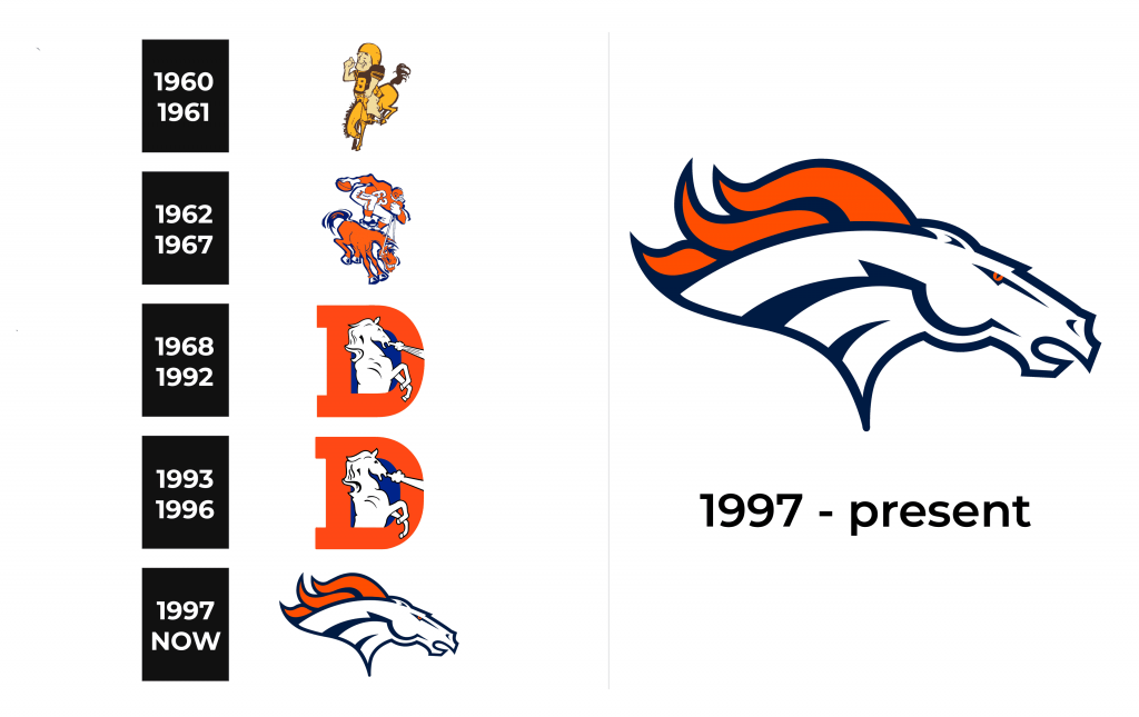
The history of the Denver Broncos’ visual identity has always been connected to the horse theme. Bronco has been on the team’s logo since the very beginning. For the first seven years in was drawn with a man riding it, but after 1968 the graceful horse became one and only hero of the emblem.
1960 – 1961
The initial logo for Denver Broncos was introduced in 1960 and only stayed with the team for a year. It was a yellow and brown image of a relaxed man riding a bronco. The man was wearing a football uniform and calmly sitting on the back of a jumping horse. The big teal low letter “B” was placed on the center of his brown jersey
1962 – 1967
In 1962 the riding man was redesigned. He was now standing on the horse’s back and holding a football in his right hand. The image was much more sporty than the previous one, but still a bit cartoonish. The color palette switched from yellow and brown to dark orange and blue, with some white accents.
1968 – 1992
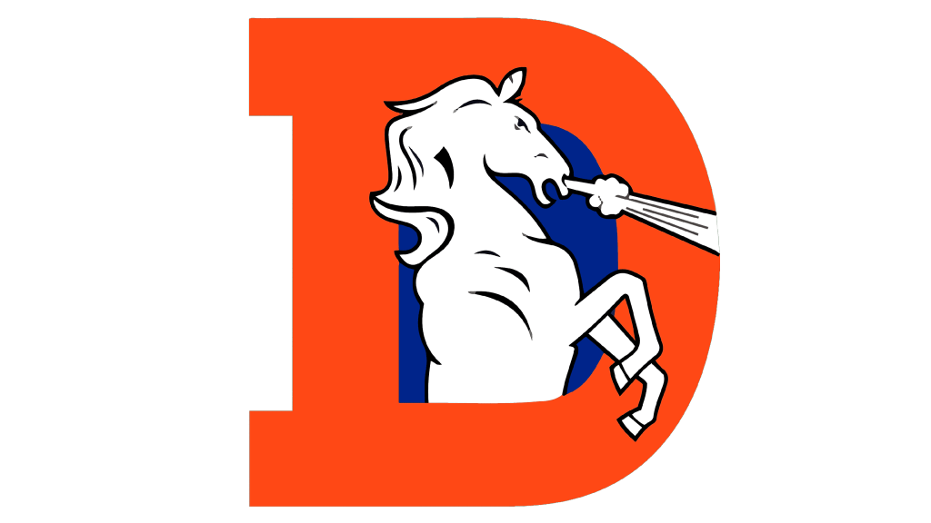
In 1968 the man was removed from the logo and replaced by a bold bright orange letter “D”, standing for Denver. The elegant and powerful bronco in white was coming out of the letter and the electric blue background of its negative space. It was a beautiful and very strong emblem, which stayed with Broncos for 24 years, quite a long period.
1993 – 1996
The color palette was changed to a calmer orange in 1993, the silhouette of the horse was refined and gained a more modern tone and character. Less detail in the animal’s portrait made the whole logo more stylish and sleek. This was the last version of the visual identity with the letter “D” on it.
1997 – Today
The logo the whole world knows and loves today was designed in 1997. It is now composed of only the bronco’s profile, facing left. The lines of the horse’s head have a futuristic and a very powerful character, reflecting the strong team’s spirit and their progressive approach. The color palette remained the same — orange, white, and blue, but white now is the main color, symbolizing reliability and loyalty of the team to their fans.
Symbol
The white bronco with thick blue lines and fire-orange crest and yes is the symbol, that is instantly recognizable. The horse stands for freedom and speed, while its smooth and sleek lines point on quality and expertise. The color palette of the image represents passion and love for rugby along with the professionalism of the team and the value of its fans and audience.
Emblem
For the emblem, Denver Broncos use the iconic horse’s head placed on a white background with the blue and orange lettering under it. It is a fresh and crispy image, perfectly reflecting the fighting mood and willingness to win.
Helmets
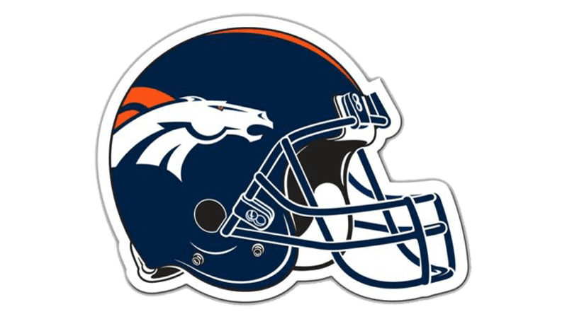
The Denver Broncos helmets look powerful and aggressive — the horse’s head is placed in a dark blue, almost black background. The grill of the helmet is also executed in blue-black, which makes the look balanced and adds a sense of danger and aggressiveness.
Uniforms
The main color of the Broncos’ uniform is orange. For the home games, the team wears orange jerseys with blue accents and white pants with wide blue side stripes and delicate orange elements. The road uniform of the team consists of a white jersey with blue numbers in orange outline, the pants are also white, repeating the same style as the home ones.
