Chevrolet Corvette is a brand of cars produced by Chevrolet since the 50s. There have been about 9 consecutive generations of this car – each given its own logo. They evolved in time, but each version was a high-performance sports car that was highly cherished by its creators.
Meaning and History
![]()
The first Corvette was launched in 1953. Right off the bat, this variant set the canons for the future Corvette logos – two flags with the name of a car somewhere nearby. There were many changes over the years, but these details stayed.
1953 – 1955
![]()
The first logo was a white circle with the black outline. Inside were two crossed flags – one ginger, and the other was a standard checkered flag. On top of the left ginger one was a pair of images. The closest depicted a French lily, a traditional symbol of the French.
This choice was most likely associated with the heritage of the founder, Louis Chevrolet, who was a Swiss Frenchman. The more distant image depicted a logo of Chevrolet.
Another two details included the words – ‘Chevrolet’ above and ‘Corvette’ below. The letters were pretty unremarkable, standard and curved to fit the circle. However, the lower word was peculiar, as if written in one go.
1955 – 1962
![]()
These flags were given a new metallic texture. There were also two cones that faced the directions of both flags, as if a tick image. It’s unknown what they represent. The left flag also changed color to resemble the flag of Switzerland
1963 – 1967
![]()
The chroming and the metallic look were taken away, as well as the cone construction. The new red color remained, however.
In addition, now the entire text part was in the bottom of the circle. The writing said: ‘Corvette (in cursive, signature look) Sting Ray (in bold letters placed inside a black rectangle)’. Stingray was the name of this specific Corvette generation.
1968 – 1982
![]()
The metallic badge-like look made a comeback, both for the flags and the text beneath. There was now no ring around the emblem, however, and the text only spelled one word – ‘Stingray’. It was now one chromed word, but the font changed little.
1982 – 1996
![]()
The circle was added back, and the flags were downgraded to the point where they now resembled a big wide trapezoid, divided into two halves with flag images on them. They were swapped, however. The red flag was now on the right, and it only depicted a golden symbol of Chevrolet.
1997 – 2005
![]()
They returned the flags for this one, and they again allowed the place for two images. The lily returned, but it was now distant, while the Chevrolet symbol was closer to your eyes. Each flag had a strict shape and a think black outline. They also had a slight white outline each.
2005 – 2014
![]()
This positioning was carried on into the 21th century, but there were minor changes.
First of all, the circle was once again removed. Then, the flagpoles were turned the color of their respective flags, while being attached together in the middle rather than crossed. Thirdly, the additional black outline was added, which amounted their number to three. Lastly, the white details on a red flag were repainted golden.
Also, below the flags was a word ‘Corvette’, which was now a mess of strokes and lines that reflected the futuristic spirit of the new era.
2014 – 2019
![]()
The logo was fundamentally unchanged in this next iteration, save for two main changes. The first change resulted in a metallic overhaul of the emblem and the text. The multi-layered outline was replaced with a thick silver frame, while the flags themselves became noticeably shiny. The text also changed to silver.
Then there was a flag angle. Usually horizontal, they now faced rather upwards, which was the result of the thinning and vertical stretching of the emblem.
2019 – Today
![]()
Not much changed for the last generation, except the flags now face even more upwards, and the red color became a bit brighter than before.
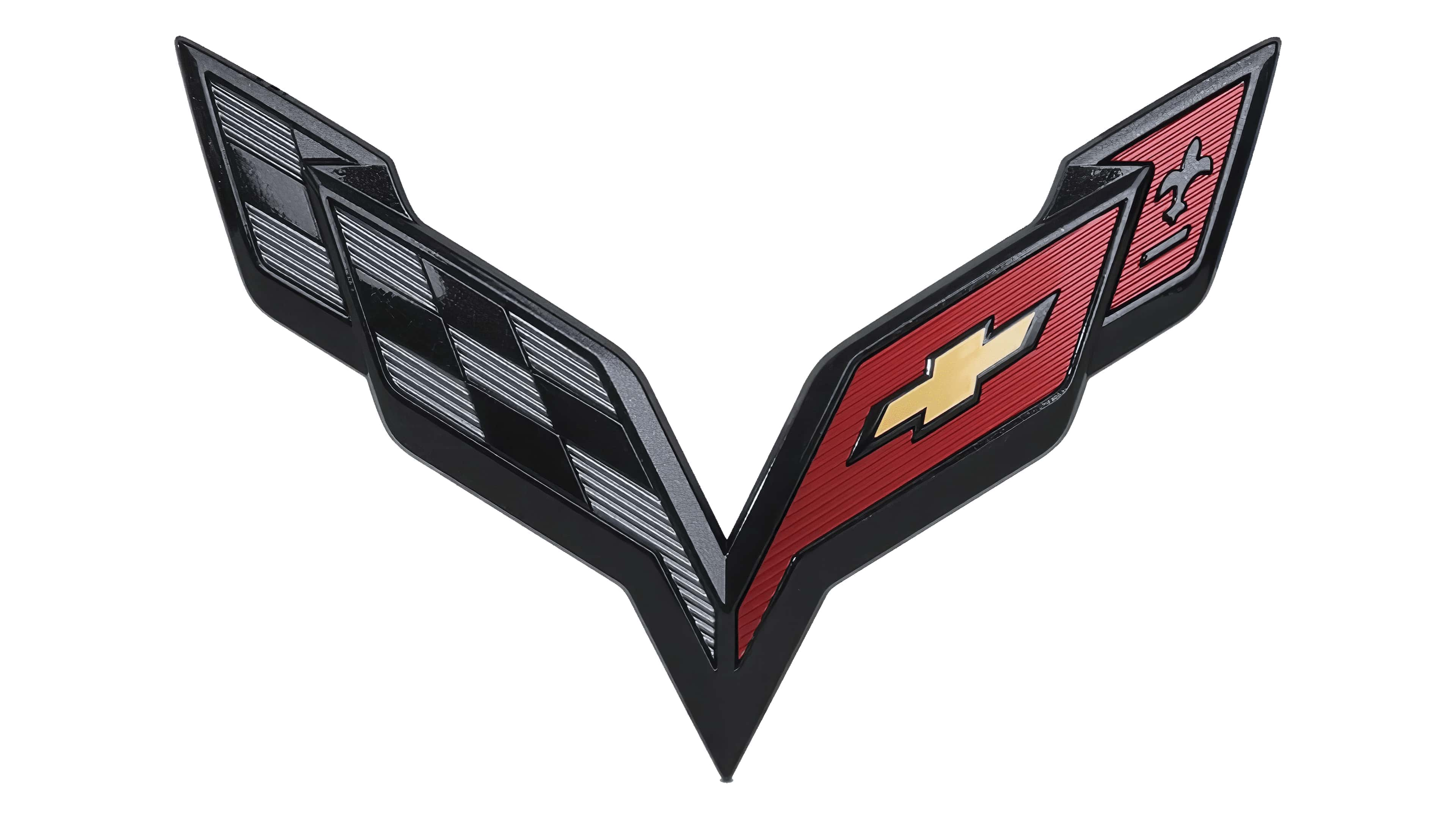
2020 – Today
![]()
Although all the shapes, font, and position of the logo elements were preserved, the updated color palette gave the logo a completely different impression. Such drastic change was achieved by replacing the light silver in the lettering and elements of the flag with a black gradient. The darker color palette gave the emblem a bolder, stronger, and more serious feel. It is a perfect representation of powerful sports cars.
C6 logo
The 2005 generation was the only one to get to variants of the logo.
This model was also called a ‘Stingray’, and they wanted to show it. The logo depicted the usual emblem (minus the text), and to the left of it stood a bit silver word ‘Stingray’ in the same font as the ‘Corvette’ word on the everyday variant. There was also a silvery shape of a stingray fish in the right bottom corner.
Emblem and Symbol
The flag emblem is also used by Chevrolet to decorate the cars of this range. They are mostly used without the text. To distinguish the cars, they give them additional badges on the side with the number of their generation (C5, C6, C7 and so on).
The Legends
The very first Corvette was almost a failure. It was one of the few real sports cars of its time, but the sales weren’t too high. The Corvette history could end there, but the bosses decided to use the same tech, but fix the issues. The resulting Stingray was a huge success.