Burberry Logo
Tags: footwear | London | luxury fashion
Burberry is one of the most famous British luxury clothing and accessories brands, the history of which began in the middle of the 19th century. In the first years of its existence, the company produced outerwear for soldiers of the British army.
Meaning and history
The company was founded by Thomas Burberry, a former fabric sales assistant, in 1856. A significant year in the history of the brand is 1879 when Thomas Burberry invented gabardine, a heavy-duty, waterproof yet breathable material. Gabardine was ideal for outerwear, and in 1888 its production technology was patented. British soldiers were the first to appreciate the quality of Burberry gabardine, followed by travelers and pilots.
In 1891, Burberry opens his wife’s store in London, and already in 1901, the Burberry brand acquired a logo, familiar to this day. It shows a knight on a horse with a spear and a banner in his hands. The flag bears the Latin word for “forward”. This is the unspoken motto of the brand – the relentless movement towards innovations and future victories.
In 1910 the first women’s clothing collection was launched. The legendary Burberry Four-Color Cage print was created in 1924 and was used exclusively on the lining. But 35 years later, the print would move from interior trim to the place of the main fabric in the brand’s collections.
In the 70s, the brand reaches America and the first store opens in New York. In 1977, Rose Marie Bravo becomes Burberry’s executive director. Under her leadership, new product lines are created and the assortment is expanded.
Today Burberry clothing and accessories are the bright representatives of the refined taste and traditions of the English fashion world, known to fashionistas all over the world.
What is Burberry?
Burberry is one of the most recognizable British fashion brands. The legendary brand is the true embodiment of British elegance and sophistication. To date, the Burberry brand produces several lines of men’s and women’s clothing, a collection for children, underwear, accessories, and perfumes.
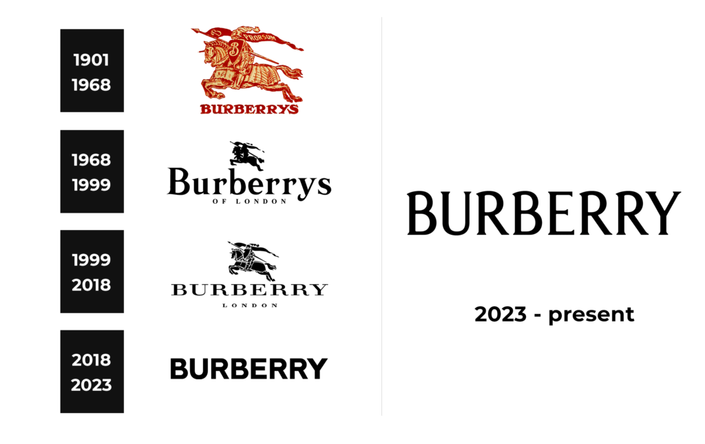
In terms of visual identity, Burberry has managed to represent its development and progress with the redesigns of the logo. For the first decades of the brand’s existence, the badge looked very traditional and ornate, while the latest version is set in a minimalistic style with just the lettering present in the composition.
1901 – 1968
The original Burberry logo, introduced at the beginning of the 20th century, was set in a warm burgundy color palette and depicted a knight on a horse. The knight was holding a shield with the elegant letter “B” on it, and a long narrow flag with the “Prorsum” inscription. The emblem was accompanied by bold uppercase lettering in a fancy handwritten typeface.
1968 – 1999
The redesign of 1968 strengthens the logo of the iconic fashion brand. The emblem got smaller and was now executed with no details, just the black silhouette of a knight. As for the lettering part, it got enlarged and rewritten in the title case of an elegant serif font with small sharp details on the bars of the characters. The logotype was underlined by the uppercase “Of London” tagline set in a traditional serif font.
1999 – 2018
With the redesign of 1999, the emblem becomes larger and gets white accents, making the knight more visible and distinctive. The lettering was completely rewritten, getting all characters capitalized and switching the typeface to an extended serif one, with thin elegant lines. The “Of London” tagline was replaced by “London”, and its font became more modern. As for the color palette of the Burberry logo, it remained the same, black and white.
2018 – 2023
In 2018 the brand introduced its most minimalistic version of the visual identity. The graphical part was completely removed, and so was the tagline. Now the logo featured only a bold and stable uppercase “Burberry” inscription in a heavy geometric sans-serif font, with no small details or colorful inserts.
2023 – Today
With the redesign of 2023, the uppercase lettering from the Burberry primary logo gained a new typeface, a very elegant and sleek one, with arched lines and small playful serifs at the end of the bars. The badge is still composed of just the wordmark, with no graphical additions or taglines. The modern minimalistic approach here is brilliantly combined with the traditions and heritage of the brand.
Font and color
The bold uppercase lettering from the primary Burberry logo is set in an elegant serif font, which does not recruit any graphical accompaniment. The closest fonts to the one, used in this insignia, are probably, Schiller Antiqua RR Bold, or Majesty Regular, but with some significant modifications of the characters’ contours.
As for the color palette of the Burberry visual identity, the primary logo of the brand is set in plain black lines and is usually placed on a white or beige background. However, the brand uses more colors in its super recognizable checkered pattern, which has already become as iconic as the logo of the brand.


