BMW is one of those rare surviving companies created by Germans before the 1920s. Look at it now – it’s one of the Germany’s top brand and also the biggest business in Bavaria. It’s very well-known that BMW makes some of the most advanced, powerful and well-made cars in the world.
Meaning and History
Bayerische Motoren Werke prides themselves on their Bavarian heritage. It’s even featured on their logo – blue and white elements are taken from the flag of this German region. They put the Bavarian colors on their logo back in 1916, and they never removed them since. In fact, they rarely changed the logo at all.
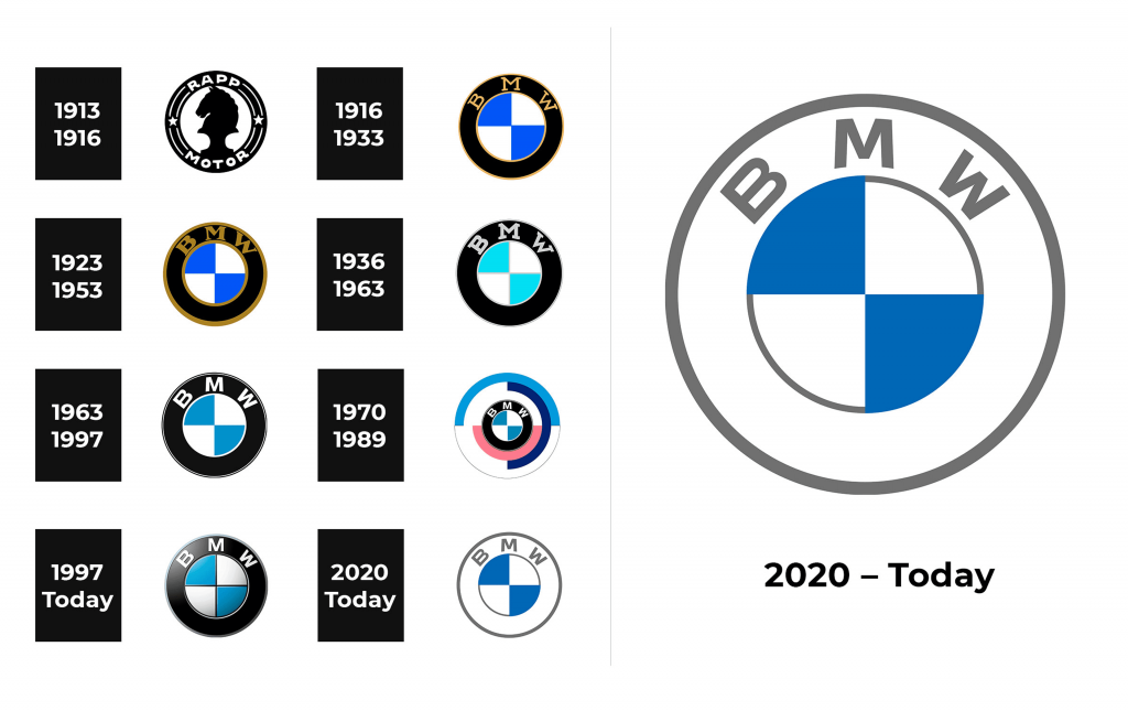
1913 – 1916
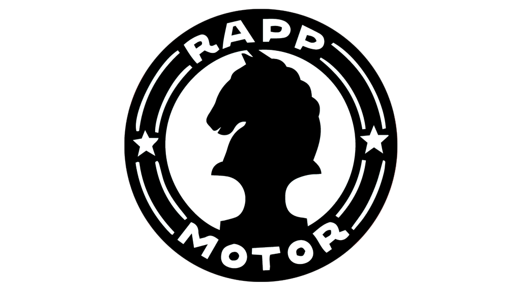
The first BMW logo appeared in 1913 – 1916: two intersecting perpendicular lines symbolized the propeller (a reference to the original brand’s business).
The central circular sector of the BMW logo was divided by two equal perpendicular lines into four identical segments. And these quarters, in turn, were staggered in saturated blue and white shades. The element was surrounded by a wide black circle, and there is a yellow BMW inscription at the top.
But what did the BMW logo mean? Regarding the color scheme, there were several options for interpretation:
- the white and blue sectors of the BMW logo meant the sky;
- the shades broadcasted the flag of Bavaria. That point of view was held by the “Bavarian Motor Plants” themselves.
1916 – 1933
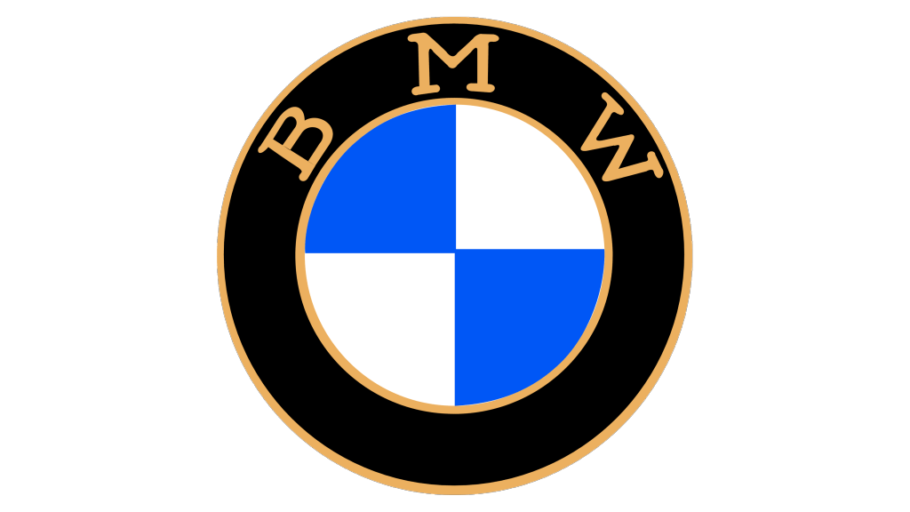
When the company was truly created in 1916, its logo had the same exact composition it has now. BMW of course stands for ‘Bavarian engines factory’ in English. They put these letters into the top of a thick black circle and painted them gold. Both edges of the circle were also painted in this color.
Being proud Bavarians, they put the colors of the Kingdom of Bavaria (also the colors of the modern Bavaria) inside the circle. The whole composition looks very much like a wheel – it was such a successful image that they never really changed it.
1923 – 1953
For some time, BMW used several logos simultaneously. One of such logos was this one. The only real change was the thickness of the golden elements – the text and the borders. Previously thin serif letters became much bolder, and the lines grew in size too – although the outer one was considerably bigger.
The logos never used the golden/bronze styling after this version.
1936 – 1963
On some cars, the logo had a lighter palette. The golden parts became silver, and the blue became lighter blue. The outlines returned to the previous thinness, but the letters remained, rightfully so, bold. The font, however, changed. The serifs noticeably became blocky.
1963 – 1997
This version had quite a few stylistic changes.
First, the blue color became azure – a moderately bright hue. In addition, the black ‘tire’ changed to dark grey rather than all-out pitch-black. The silver lines and letters had a grayish tint before, but not anymore. From then on, they were completely white.
Second, the letters got rid of serif notches, and this design is used even now. It’s strict, linear, but flexible when necessary.
Third, the lines changed. The inner border line grew in width and took on the Bavarian white, which means they merged. The outer border pretty much had the same width, but it was divided into two layers: the closer white and far black.
1970 – 1989
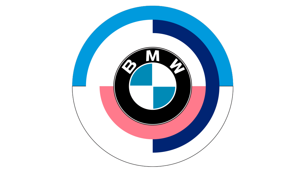
This version was used on less frequent occasions. It had pretty much the same look, but was given additional three rings around it. They were all the same size as the black circle on the logo itself, although their coloring differed.
The first layer was horizontally divided into a pink lower part and the white upper part. The following one was vertically divided into the dark blue on the right and the white on the left. The final was Bavarian blue on the top and the white at the bottom. It might be used on the white background, so they’ve given the last one an additional grey outline.
1997 – now
The modern logo is a development of the 1963 version. The designers took a realistic approach for this one, as was the fashion then. It means they’ve given it a bit of lighting (in this instance, it comes from someone above and to the left. There were stylistic changed, too.
They were minor. The far outline became completely grey, the Bavarian parts inside were separated on all fronts by slim black lines, which meant there is now an additional circle of outline that separates the white ring from the blue-white checkers inside.
2020 – now
As per tradition, BMW continues to use multiple logos at the same time. This one is meant for the uses on everything barring the cars themselves.
The lighting vanished, and the palette changed yet again. There are now just two outline rings – both bordering the thick tire that was black before. The tire is now white, and the borders are grey, as are the letters.
The inner outline is a bit slimmer, and it contains the iconic Bavarian checkers, although the blue components are now darker, and there are no more separating lines inside.
As expected, BMW created a clean logo for general use. Other manufacturers do the same thing, and they can’t seem obsolete even in such small matters as a logo design.
Emblem and Symbol
The discussion about the meaning behind the BMW logo is still relevant. They started the business by creating aircraft engines, but it’s clear the company didn’t intend to just stop on aircraft.
The general idea is that this logo was inspired both by an aircraft rotor and a wheel, not to mention the Bavarian colors. How they pulled this design off is simply commendable.
The Legends
The models that larger audience generally considers to be ‘classic BMWs’ are the E30 models that start with 1982 E30 and end with 1995 E39. They were different types: luxury, compact, executive and so on – but they interestingly all looked the same.
The iconic BMW look is characterized by cold colors (grey, white or black), double round light at the front and a strict sedan form, and the 90s BMWs all qualify to that.
