Baltimore Bombers Logo
Tags: NFL | rugby team | USA
Baltimore Bombers were an NFL proposed rugby team from the 1990s. The team was a finalist of the Baltimore proposal list but lost their place because of Cleveland Browns moving to Maryland and starting playing as The Baltimore Ravens.
Meaning and history
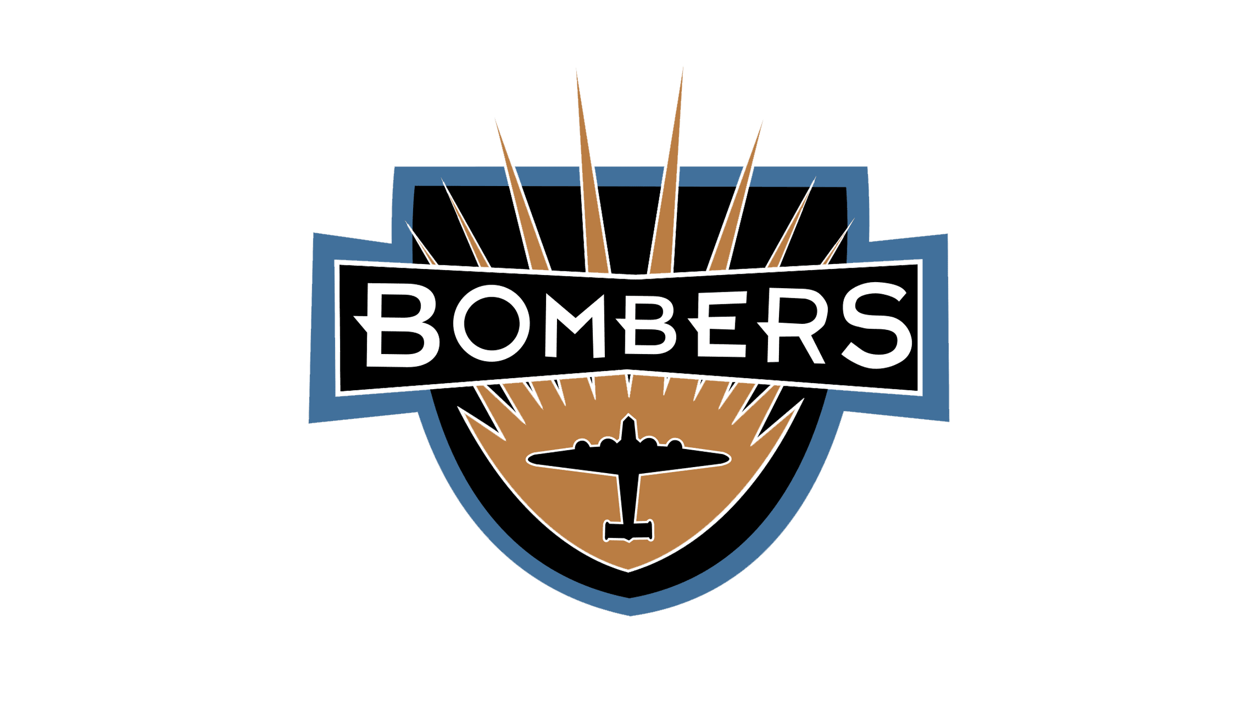
The one and only logo for the proposed Baltimore team was created in 1993 as a concept and has never been used, as the team never happened and even the uni-form design wasn’t officially introduced.
The strong and colorful logo was composed of a shield with a horizontal insert, where the “Bombers” wordmark was placed. The shield featured a solid black background and an orange flash, with the plane, placed vertically and executed in black.
The white inscription in a custom sans-serif typeface was balanced by a thin white outline of the flash, and a thick blue frame of the whole logo.
The spikes of the flame and contrasting colors were creating a sense of movement, progress, and power, representing fighting spirit and willingness to play and win.
Colors
Orange is a color, symbolizing passion, which works perfectly in combination with black, reflecting courage and determination, while white and blue accents add a sense of loyalty and reliability, showing how much the fans and their support mean for the team.
Symbol
The vertically located plane stands for eternal movement and progressive approach, which the team was ready to show in their strategy and playing manner. This feel-ing is supported by the flash or flame, which is the brightest and the most visible part of the emblem, representing passion, love, and energy.
Font
The custom typeface of the inscription, set in all capitals, boasts straight and simple lines, yet is complemented by strongly elongated tails of letters “B”, “E” and “R”, which add uniqueness and individuality to the wordmark along with its uneven writ-ing.


