Bajaj Auto Logo
Tags: Blue Car Brands | Indian motorcycles | Kawasaki
Bajaj is the third largest motorcycle manufacturer in the world. It sells vehicles under its own logo, but also produces for brands such as KTM or Kawasaki. Since 2008, Bajaj Auto Limited also owns 48% of the shares of KTM Power Sports AG, which owns the KTM and Husqvarna brands.
Meaning and history
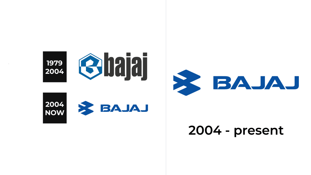
Throughout its existence, the logo has changed only once, and the changes were not so significant.
1979 – 2004
The first company logo consisted of two elements: a symbol and a text part. The symbol was in the shape of a hexagon, the top of which was painted white, and the bottom was painted blue. Inside the hexagon was a stylized ‘B’ (the first letter of the company name). The letter was made entirely of straight lines and was horizontally divided into two equal parts. The top of the letter was blue and the bottom was white. As a result, it turned out that the blue part of the letter was on the white part of the hexagon, and the white part of the letter was on the blue part of the hexagon. On the right side of the symbol was the name of the company in dark gray lowercase letters. The font was bold and had slight curves. The font and symbol were almost identical in size.
2004 – present
In 2004, the logo changed slightly. It still consisted of two parts: a symbol and a text part. The symbol has become modernized, denoted speed, and even somehow resembles the wings of a bird. The company name is also positioned on the right side of the symbol and is now capitalized. The font became stricter, sharp lines and corners appeared. Both the symbol and the company name are now blue. There is another version of the logo in which the company symbol is large, and the company name is located below it and is much smaller.
Emblem and symbol
Everyone associates motorcycles with high speed; therefore the modernized symbol of the company describes the main ideas and priorities of the company much better. Blue is one of the most popular shades in logo design, so it’s no surprise that the company chose to make both the logo and symbol blue. It inspires trust among customers, speaks of the reliability and honesty of the company.


