Austin Logo
Tags: Black Car Brands | British Car | cars that start with a
Austin was founded in 1905 by Herbert Austin. Austin owes its greatest market success to such models as the Seven and Mini (produced together with the Morris brand within the British Motor Company, and later British Leyland Motor Company). In the 1980s, the company’s name was changed first to Austin Rover Group, and then to Rover Group. Today the rights to the Austin brand are in the hands of the Chinese Nanjing Automobile Group.
Meaning and history

The main element of the company logo is the text with the company name. For writing, a curved handwritten font was used, and the text itself is located slightly diagonally. The first letter of the name is capitalized, and the rest are written in lowercase. There is an underscore underneath the entire name that joins the last letter.
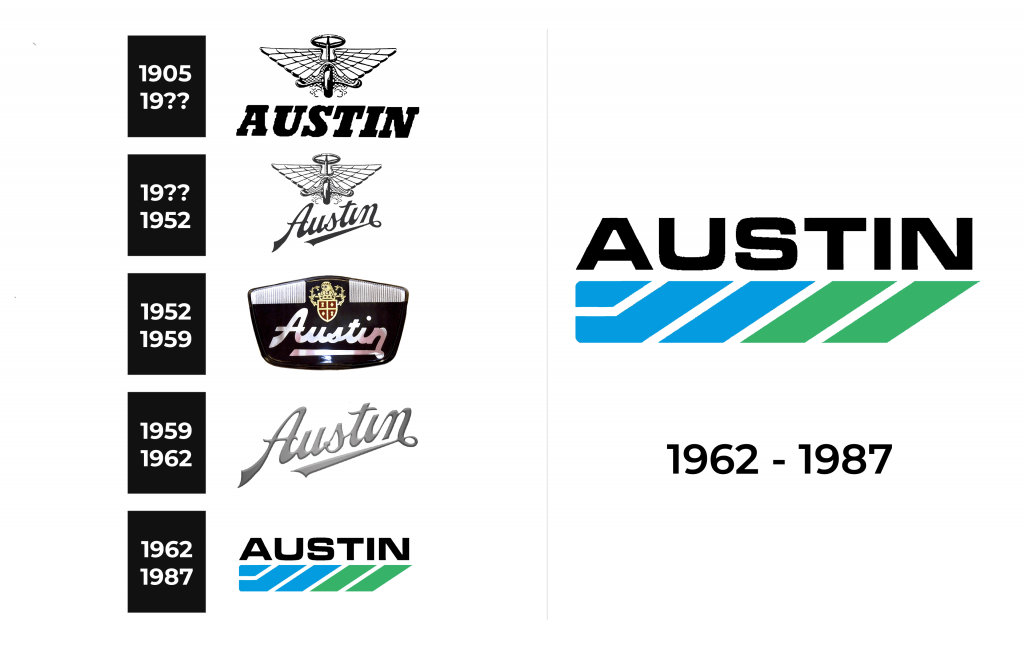
1905 – 19??

The first logo featured the brand name printed in large, bold, italicized, uppercase letters with slab serifs. This inscription instantly created an impressive look. The emblem above it added to the sophisticated feel. It was a steering wheel set on a wheel with two outspread wings separating the two. The vehicle looked like it is going to take off any moment. This winged emblem was quite detailed and did not look flat.
19?? – 1952

For this brand image, the designers used the previous logo but changed the font choice. Here, the name is printed at a diagonal and features elegant, sans-serif cursive writing. The last letter “n” curves and underlines almost the whole word, adding a finishing touch to the emblem. This font gave the logo a completely different feel, so the brand looked more luxurious and classy.
1952 – 1959
A winged emblem was replaced by a coat of arms with golden and red elements. The top had a crown and other golden decorative elements, which showed that the brand was targeting the upper class as well as royals. The shield was divided into four red parts by a golden cross and each section had a small, golden geometric shape. The inscription underneath looked like a simplified, non-italicized version of the one seen in the previous logo.
1959 – 1962

The new logo looked familiar although it had just the name of the brand. The reason for this was the use of the diagonal inscription used until 1952. It is meant to symbolize the company’s growth and improvement as well as a road going into the horizon that one can travel on Austin automobiles. Although the lettering was exactly the same, the color was no longer plain black. The designers gave it a light gray color with a gradient that created an appearance of volume.
1962 – 1987

Unlike the previous logo, this version has very little in common with other versions. The name of the brand was printed in black using all uppercase letters. The font had thick strokes and straight cuts and resembled MicroSquare Bold Extended or Petualang font. This font choice gave the logo an impression of a strong and solid brand. Underneath, there were blue and green mainly diagonal shapes that created a rectangle with rounded corners on the left and diagonal cut on the right. This color block not only grabbed the viewers’ attention but also added personality and associated the brand with the positive symbolism of both of these colors.
Emblem and symbol

Sometimes there was an emblem above the name of the company, which looked like a steering wheel on a stick with a wheel at the end, and on either side of this stick, there were six-layer wings.

