Atlanta Falcons are a famous rugby team from the United States, established in 1965 in Atlanta, Georgia. The club is one of the most well-known teams in the NFL, having a winning record and one of the strongest players. Today The Atlanta Falcons is the property of Arthur Blank, and their head coach is Dan Quinn.
Meaning and history
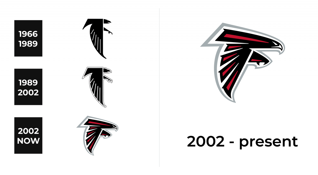
Atlanta Falcons is one of the teams, whose visual identity history doesn’t have any dramatic curves and changes. Once created in the 1960s, its logo has only been modified throughout the years, and this fact makes the team look constant, confident, and strong.
1966 – 1989
The original logo for the team was designed in 1966 and depicted a stylized falcon bird in profile, looking right. The bird featured strong and clean lines, and the elon-gated wing, pointing down, was the main part of it, adding a sense of abstract mas-terpiece. The falcon was drawn in black, with thick white lines, accenting of the wing, and a double outline — the white one and the thin and delicate red.
Another remarkable thing about the Falcons’ logo is that the bird is placed in the shape of the letter “F”, celebrating the team’s name and making the visual identity even more unique.
1990 – 2002
The first redesign of the Falcons’ logo was held in 1990. There was only one chance in the team’s visual identity — it’s the color palette. The red outline of the bird was replaced by the black one, as in the same year the color of the Atlanta Falcons helmets was changed I black (it was red before). As for the composition itself, the original style and shape remained the same.
2003 – Today
The redesign of 2003 brought the logo we all know today. Created by Verlander Design, the falcon now looks super modern and powerful. It is executed in black and red and has a double white and light-gray outline, which adds style and sophistication to an aggressive and strong image. The silver-gray color symbolizes professionalism and authority, while the combination of black and red shoes the fighting spirit of the famous rugby team, accenting on their strength and speed.
With the modified contours of the image, the F/shape of the falcon became even more visible, and today the flying falcon is one of the most outstanding sports logos ever created.
Symbol
The stylized Falcon bird symbolizes the modern approach to sports, year reflects the team’s value of its roots and heritage, resembling the original logo and keeping the strong connection with the past. The falcon is moving to the right, into the future, which represents the courage of Atlanta Falcons and their willingness to move forward and win.
Emblem
For the emblem, the team uses its iconic bird placed on the red background. Due to the bright and strong contrast, the emblem looks confident and bold, and it perfectly reflects the character and mood of the Atlanta Falcons. The emblem is sometimes accompanied by a wordmark, executed in a custom modern font with the upper left part of all the letters elongated and pointed. The inscription elevated the aggres-siveness and fighting spirit of the visual identity, making it instantly recognizable.
Helmets
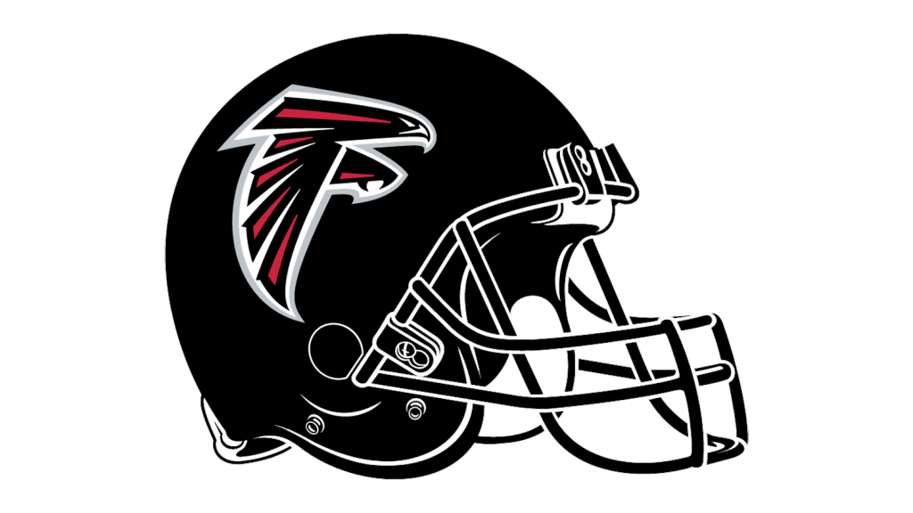
Starting 1990, Atlanta Falcons use black helmets with the iconic bird emblem on the side. Today’s design, created in 2003, comprises a black helmet with white inner straps, and a big falcon image in black and red, with a thick white outline. The thickness of white lines makes the image more visible and the whole helmet balanced and cool.
Uniforms
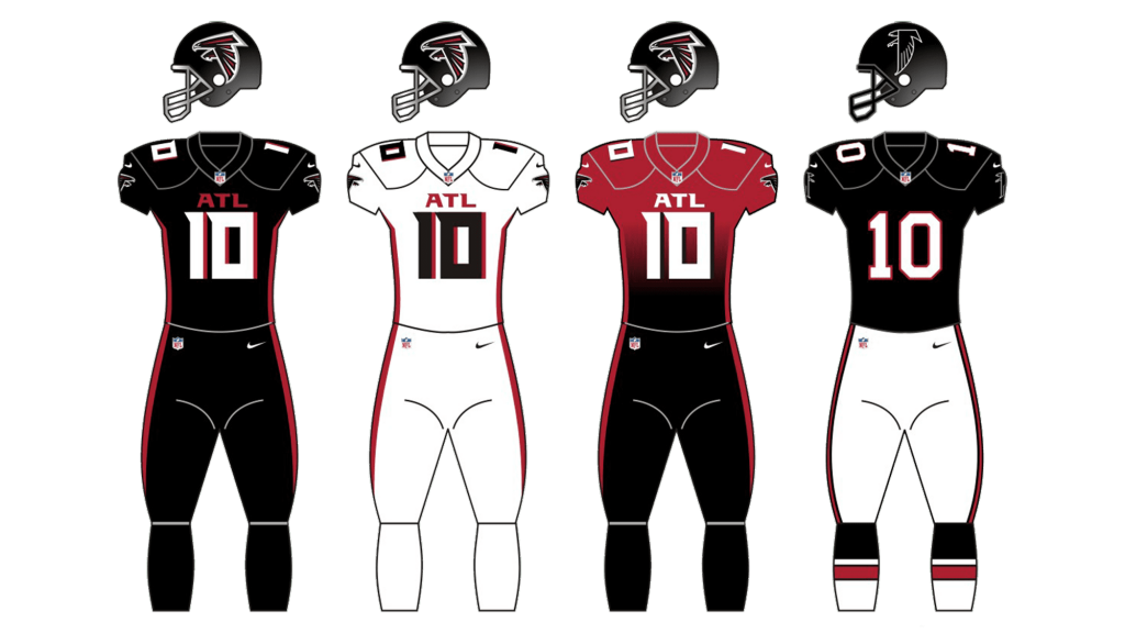
It’s interesting, that the team has had more changes in their uniform style, than in the logo. There have been red-white, black-white, and even red-gray color combinations, but the current style was created in 2020 and is composed of a black jersey with a white player’s number and thin red details and outlines, and the pant of the same color. The black uniform with the black helmets makes the team look dangerous and powerful on the field and looks truly impressive.
For the road uniforms, the team chooses a completely different look — the jerseys and the pants are white with small red details.
