Agip Logo
Tags: Italy | oil products | petrol
Agip (Azienda Generale Italiana Petroli) is a commercial brand of the Italian group ENI. ENI (Agip) is the main producer of petroleum products in Italy and the world’s largest oil companies operating worldwide. Currently, the ENI concern is present in 72 countries of the world.
Meaning and History
The Italian company Agip has been operating since 1926. In the 1950s, Agip Petroli began active work around the world (oil production, exploration, organization of a distribution network, etc.) The ENI group appeared in 1953, and Enrico Mattei was its first manager. Agip drilled its first well a few years later in 1959. In the 1990s, ENI acquired the status of an open joint stock company, and at the beginning of the 21st century, Agip Petroli and ENI jointly integrated to form the Eni S.p.A. Division Refining and Marketing.
What is Agip?
Agip Petroli is the parent company of the ENI concern in the field of supply, processing, and marketing of oil and oil products. From the beginning to the present day, the company has been developing at an unprecedented rate, admirably implementing projects that seem unrealistic to others.
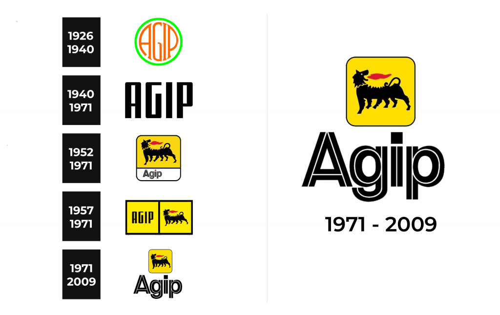
1926 – 1940
A round emblem with a neon border and the name printed on a white background was the earliest version of the Agip logo. A unique feature of this logo was the fact that the letters filled the whole shape, repeating its form and leaving only a thin white border. The name was done in a lively red and featured smooth, elegant strokes and serif.
1940 – 1971
This logo looks very contrasting to the previous version. The black color, bold strokes, and enlarged letters not only reflected the powerful and strong position of the company but also echoed the harsh war times. The logo consisted of only the name printed using a font similar to a sans-serif, geometric font called Stage Show JNL Regular with straight strokes and cut and curved corners.
1952 – 1971
The six-legged dog breathing fire is only seen on ENI products. This symbol embodies the ideas of energy throughout Italy and in the world and was created by Luigi Brogini (who, by the way, never recognized his authorship). Such a pattern seems unusual but at the same time incredibly symbolic. It represents the combined symbiosis of four automobile wheels and two driver’s legs – a unique, fast, spectacular combination. This interesting animal was placed on a yellow background with “Agip” printed underneath on the white portion of the square.
1957 – 1971
This logo is a combination of the two previous logos. The designers took the logo introduced in 1940 or rather the name of the company and placed it inside a yellow square with a black frame. Another yellow square was placed right next to it. It had the six-legged dog, which first appeared in 1952. It was a perfect combination of two bold and impressive logo elements the company had so far.
1971 – 2009
This logo is an updated version of a logo created in 1952 and used until 1971. The company decided to bring more accent to its name. The inscription was taken outside the framing and significantly enlarged. The red square (dot) above the “i” was made black to create a more cohesive image. The dog was centered in the square with rounded corners similar to the logo seen earlier.
Font and Color
The company used several different typefaces. There was one uniting feature in all of them as each inscription create an image of a strong and influential company. For instance, two of its logo featured a font similar to Stage Show JNL Regular, while the other had the name printed using a font that resembled Rhein Alt Black Inline.


