Yamaha Logo
Tags: Japan | motorcycles | musical equipment
Yamaha is a leading Japanese manufacturer of musical instruments and equipment. Besides that, they have a portfolio of many other products, including even motorcycles. It’s a big conglomerate with multinational presence, headquartered in Japan. They are particularly known for their line of pianos, bass guitars, drums and motorcycles (made since 1955 by Yamaha Motor).
Meaning and History
The company was started in 1887, when they began manufacturing the reed organs. In 1900, Yamaha started making pianos, and the list continued to expand ever since. The motorcycles entered production in 1955, while the latest addition into the family was the 2001 Yamaha Entertainment, a record company. Yamaha has numerous subsidiaries scattered all over the world.
What is Yamaha?
Yamaha is a big Japanese conglomerate known throughout the world for their musical equipment and motorcycles. They include a large number of subsidiaries scattered all over the globe.
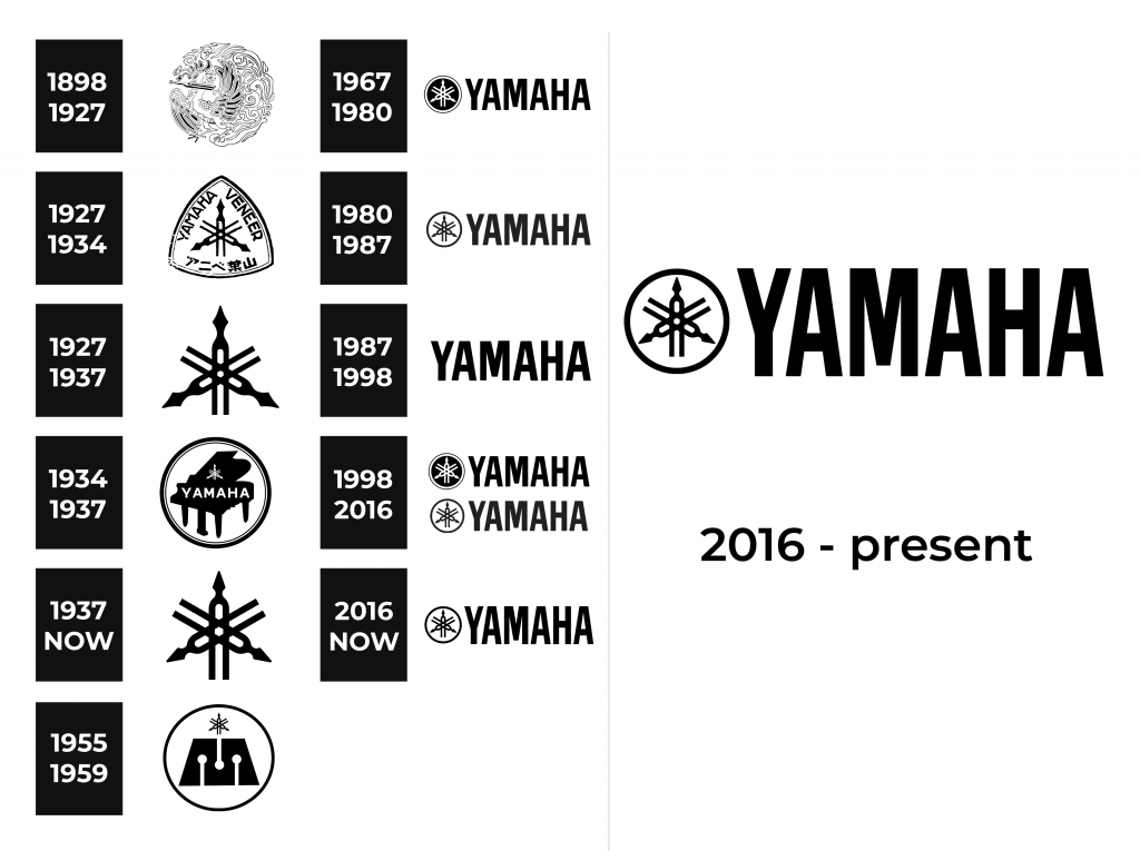
1898 – 1927
They originally used a very ornate, complex picture of a peacock holding a tuning fork in its beak as an emblem. It was at the time when they haven’t yet reach the scale necessary to adopt an easily-printed logotype. The picture is drawn using thin black lines. There are lots of wave-like and flame-like patterns in this image, and the drawing is overall very elegant and sophisticated.
1927 – 1937
In 1927, they’ve introduced the emblem that remains in use even now. It depicts three tuning forms, arranged in a triangular pattern. They are supposed to represent – in Yamaha’s own words – production, technology and sales all in one cohesive system. They are all completely black.
1927 – 1934
It’s an alternative version used mostly at the same time. It depicts the same emblem, except placed in the middle of a plectrum shape. It was white with black edges. Along each side, they’ve placed words ‘Yamaha’, ‘Veneer’ and the Japanese name of the company – all in black.
1934 – 1937
That’s the second alternative logo, adopted after the previous one was phased out. This one uses a circle, in which they’ve placed a black silhouette of a piano. In its middle, they’ve written the word ‘Yamaha’ in big white letters, as well as placed the usual emblem right above, also white.
1937 – today
When 1937 came, they scrapped all the existing logos and created a single primary emblem. It’s almost identical to the previous primary emblem, except the turning forks are a bit longer and bigger. This logo is used even now, although several secondary emblems were introduced later on.
1955 – 1959
This alternative logo also uses a circle at its base. In the middle, they’ve placed a black trapezoid with three white silhouettes of drumsticks cut out from it. Right above it, they’ve placed the main symbol, but much smaller than usual.
1967 – 1980
The 1967 design includes the emblem once again, colored white and placed inside a black circle. That circle, for its part, is outlined in white, and then encircled by a thin black contour. On the immediate right from this symbol, the word ‘Yamaha’ is written in tall, black letters. They are bold, thin and all capitalized. They’ve used a similar design in many following editions.
1980 – 1987
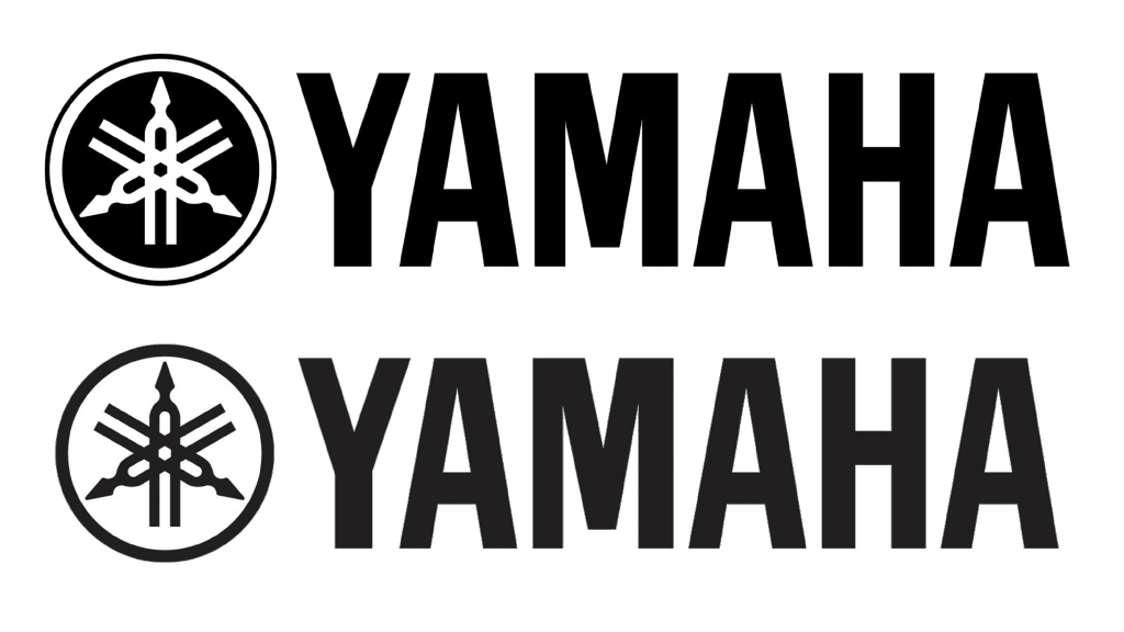
The key difference of this logo is that the tuning forks are black, placed inside a white circle with a bold black contour. Everything else is identical. The other difference is that the color black became more like dark grey in this design.
1987 – 1998
This design is just the name, written as in the previous two editions, without the emblem. It’s become black once more.
1998 – 2016
The 1998 design is identical to the logo from 1967: black circle with white forks.
2016 – today
The 2016 logo is also more of a comeback from the past. It’s similar to the 1980 design (the white circle with black forks), except the letters are much thinner and taller.
Font
The font used in the recent Yamaha logotypes is a fairly basic sans-serif script with thin, tall and bold letters. There’s nothing peculiar about them.
Color
The main two colors used in the primary logo versions of this brand are white and black. However, there are plenty of alternative colored variants, including the purple, red and other variations of the same logotypes.
