TVR Logo
Tags: Black Car Brands | British cars | cars that start with t
TVR is a British brand with a very complicated history. For several years, TVR has been in the hands of a young Russian oligarch who has not fully specified his plans for the brand. One undeniable fact is that no new model has been presented to the eyes of the world since 2006. The company was bought by the British company TVR Automotive Ltd in 2013.
Meaning and History
What is TVR?
TVR is the name of the British automobile brand, which was established in the 1940s and is known for its super-luxury sports cars. Though the company has changed several owners throughout its history, it still managed to survive by today.
1946 – 1961
The very first TVR badge looked elegant and stylish. It was a monochrome composition with the triangle pointing down as the main shape of the crest. The crest had its contents rounded and was outlined in thick white and thin black lines. In the middle of the black triangle, there was a white stylized “TVR” lettering set inside a white circle with two horizontal lines coming out of it to the sides and one vertical — down. The main element of the logo was the letter “V”, which had its bars elongated and stylized as two wings.
1961 – 2010
The redesign of 1961 brought a new concept of the TVR logo to the brand. The badge was composed of silver and blue shadowed badge, formed by three connected letters in the uppercase. The stylized inscription featured thick smooth lines and looked vivid and cool in the metal and blue color palette.
2010 – 2017
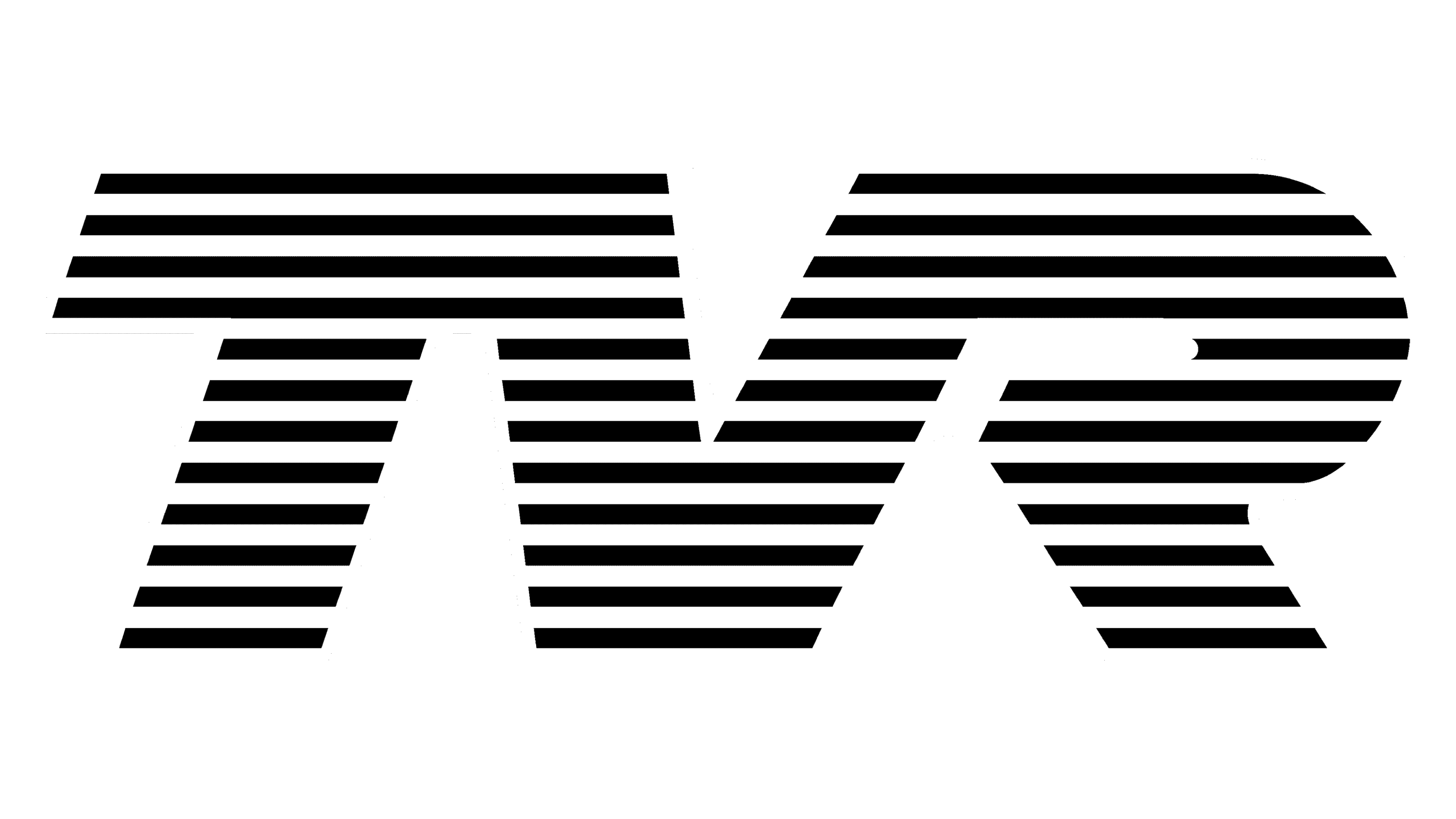
In 2010 the blue horizontal stripes on the TVR logo were switched to the black ones. The stripes also became thinner and gained more gloss on the silver ones. The new badge looked more balanced and professional, and the monochrome color palette added a sense of timeless elegance and power.
2017 – Today
The company logo is an acronym consisting of three letters: T, V, and R, which symbolize the name of the owner of the company, Trevor Wilkinson. The logo itself is quite unique and memorable. All three letters are interconnected and form one solid element. It is made in white, has a thin black outline, and is evenly covered with thin black horizontal stripes over the entire surface.
The logo emblem uses straight lines and shapes to convey a sense of strength, professionalism, and efficiency. A lot of horizontal lines and angular types are associated with stability, calmness, and order. The black and white combination is used by the brand to convey neutrality, calmness, and balance.


