Sublime Logo
Tags: aggressive punk | music band | rock-steady | USA
The band began by playing music and singing at house parties in Long Beach, California, and selling cassette tapes. Eventually, Sublime became one of the most popular bands in America. It gained fame thanks to songs that were a mixture of rock, reggae, hip-hop, and other musical styles. It is partially explained by the fact that the leader listened to a wide variety of music as a child. Bradley loved hardcore punk such as The Circle Jerks and Black Flag and also listened to Run DMC, BDP, and KRS-One. Sublime is distinguished by its ability to create a truly punk drive without losing melody and amazing, touching feeling both in lyrics and in music.
Meaning and History
Brad Nowell, Bud Gough and Eric Wilson formed Sublime in 1988. Eight years later, lead singer and guitarist Bradley died of a drug overdose, which led to Sublime’s second wave of popularity. Although Brad struggled with addiction, his main passion was still music, so without the heart of the band, the group fell apart. Thirteen years later, the band tried to reunite, but right before a concert at the Smokeout festival, its musicians had to stand trial. The judge took the side of Nowell’s heirs, who protested against the use of the band’s former name. This did not stop the members and they got together under a new name – Sublime with Rome.
What is Sublime?
Sublime is an American band. A mixture of dance-hall and rock-steady with aggressive punk features appealed to its fans from Long Beach, California, and beyond. Sublime gained popularity in the early 1990s as the grunge movement grew since its music was nothing like the popular bands were offering at the time.
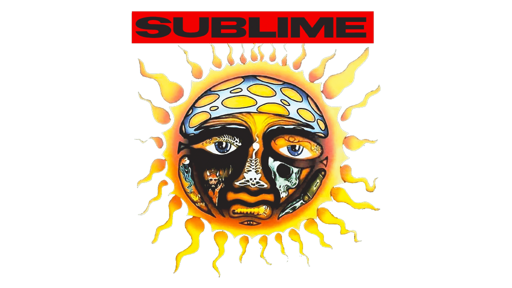
1992 – 1994
The first album of the band had a California hot sun on a black square background. It was not a typical happy sun one might imagine. The star looked very sad and had black tears running down its face. The mouth was also distorted, while the nose had no flesh on it, just the bone structure. the ray of the sun resembled small flames, which enhanced the look of a hot and at the same time suffering sun. This image was accompanied by a name printed in black, uppercase, sans-serif letters. It was placed on a red, rectangular background and set above the sun.
1994 – 1996
The second album had a very minimalistic logo that consisted of only the name of the band. It was printed in black using all lowercase letters that were widely spaced apart. The font had bold strokes with uneven edges and bracketed slab serifs. The logo would look stylish and sophisticated if it was not for the strokes that seemed to be carelessly drawn, creating a more or less sloppy look.
Font and Color
For the first album, the band went with a bold, geometric font that featured a combination of straight and diagonal cuts. The second logo seems to be using Prestige 12 Pitch Bold or similar font. Although there were bright and seemingly happy yellow and orange colors, the designers brought out their negative side that is associated with ruins, desolation, illness, and madness. The addition of black, brown, and red colors made the color palette rather gloomy.


