Oldsmobile Logo
Tags: cars that start with o | Grey Car Brands | USA cars
Oldsmobile has been among the first American car manufacturers, so its history begins even before the 20th century. Naturally, it’s been a very prominent producer of luxury and standard cars throughout the previous century. Unfortunately, the brand was ended in 2004 by its owner, General Motors.
Meaning and History
The latest history of Oldsmobile has revolved around rocketry, and thus the previous three variants of their logo depicted some kind of upward movement, one way or another. But they also reflect the company’s nature as a car manufacturer, because these same logos have been styled specifically to resemble the road.
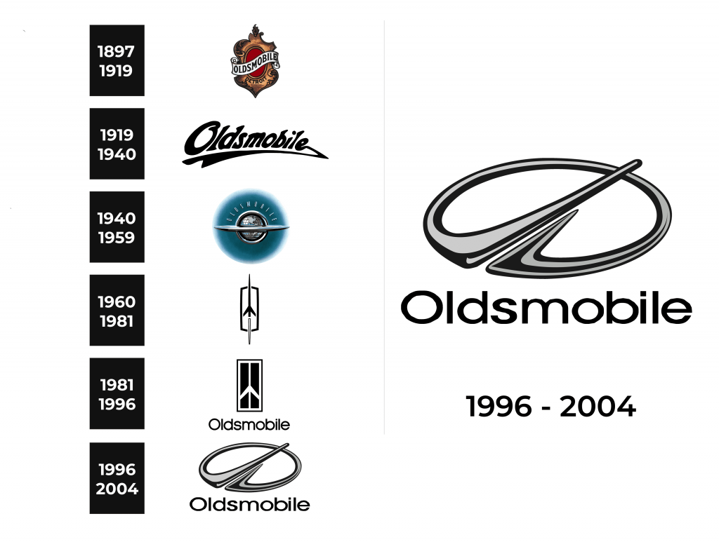
1897 – 1919
The company started in 1897, and they were known as ‘Olds Motor’ (the creator was called Ransom Olds). Perhaps because of the name’s literal meaning, it was decided to design the logo as something old and fancy.
Thus was born the first logotype, which looked like a vintage bronze mirror with the red circle in the middle. Across the mirror stretched a white ribbon that said ‘Oldsmobile’ in capital serif letters. Additionally, in the bottom of the mirror frame stood just one curvy word in the similar font that said ‘Detroit’, which is the birthplace of the brand.
1919 – 1940
22 years after the creation, the company logo was changed. It has become fairly simple and now just depicted a company name, albeit in a very artistic way. The letters were curvy (as was the word itself), and they had different sizes and were written in smudges, rather than in strict lines.
From the last letter and all the way to the first one went a underlining stroke that also resembled a smudge, or a flood of some liquid. The color of the whole logo was brown to black, a lot like a color of oil.
1940 – 1959
In 1940, the company changed their logo to a depiction of a globe encircled in a silver ring and separated in the middle by a horizontal plate-like object. There was also a greenish blue unfocused circle emanating from the planet, which was meant to symbolize the atmosphere.
Parallel to the curve of the globe, there was a company name above the planet itself, which was a thin, bold and blue font. The entire logo gives away an iconic cosmic style that Oldsmobile tried to embrace. Interestingly enough, it was years before the start of the space age when they adopted this logo.
1960 – 1981
When the space started getting attention in later 50s and early 60s, Oldsmobile were evidently inspired by the idea. They’ve started calling their new V8 engines the ‘Rocket engines’ on account of their might and innovation. But another element of the company that changed because of the rocketry was the logo.
The new logo that launched in 1960 depicted a slim black rocket heading upwards. From the bottom of it spurred a thin white cone outlined in black. This one is meant to resemble the exhaust that comes from the bottom of the rocket.
But there’s another meaning. The entire rocket image is centered above the rectangle shape that, together with the other two elements, really looks like a highway with an arrow on it.
1981 – 1996
In 1981, they doubled down on the whole highway concept – probably because the theme of space lost its spark by then. Instead, they focused of the parts of the rocked that were inside the rectangle. Then, they completely switched the colors – the rocket and the borders became white, and the background became black.
Furthermore, the angles of a rectangle were made right, and the borders were merged with the rocker. And they also added another layer of outline for the entire logo, another black border.
Then, they also added a company name beneath the image, the font was pretty slim and round, which complemented the style.
1996 – 2004
The logo Oldsmobile used for the last 8 years of existence isn’t really different from the earlier versions. Compositionally, it has become a chromed metallic ring with an additional appendage, the positioning of which gives the logo a lot of volume and depth.
This appendage consists of the two lines that start from the opposite ends of the gap in the lower left part of the ring. From there, they turn right and up in such a way, that it looks like a road with a dividing line in the middle. The right side ends in the center of the ring, but the left one goes on and even beyond the metallic circle.
They also left the text alone, but gave it more size and a bit more thickness. The result wasn’t their best work, but it definitely suited the fashion of the day and didn’t necessarily destroy the spirit the company tried to cultivate since the 60s.
Emblem and Symbol
Except of the last version of their logo, the Oldsmobile rarely used their logo as car badges. In fact, they rarely used car badges at all. They might put a big ‘OLDSMOBILE’ mark on the hood, but that’s about it.
The 1996+ version, however, could be used as a logo in many different colors – including the usual silver, bronze, even golden variants.
The Legends
Oldsmobile created a lot of powerful and fascinating cars over the decades. However, probably the most prominent car range they made was Cutlass. That’s a big family of cars they continued making through the 60s, 70s, 80s and 90s.
There were about 5 complete generations of them, and they all shared slick design, efficient aerodynamics and mighty V8 engines. These included the famed ‘Rocket’ engines from the 60s which were the top of their game back in the day.
Different modifications were made over the years, but they were all generally luxury cars, high performance cars or standard autos.


