Nissan Logo
Tags: Black Car Brands | cars that start with n | japan cars
The company was founded in 1933 through the merger of such car companies as Tobata Imono and Nikon Sangyo. In 1934, the company name was changed to Nissan Motor Co., Ltd. In 1958, the company began shipping cars to the United States. In 1962, deliveries of cars to Europe began. And in 1964, Nissan became the first Japanese company to enter the top ten auto importers in the United States.
Meaning and History
The formation of Nissan is the result of a merger of several large and small car companies. And the meaning of the emblem is intuitive to almost everyone. The brand name, written in the circle, symbolizes the rising sun. The word Nissan itself was derived from “Ni” from “Nihon” — Japan, “san” from “Sangio” — industry.
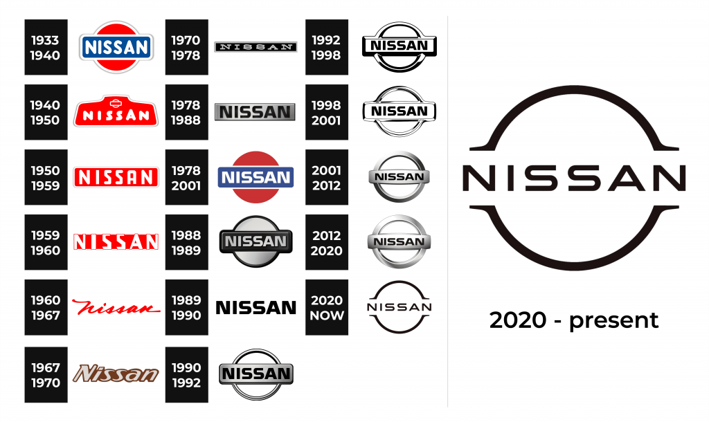
1933 – 1940
The very first version of the Nissan logo was a red circle — a symbol of the rising sun and sincerity. And in front of a circle was a blue rectangle with the company’s name, which was a symbol of the sky.
1940 – 1950
The first redesign of the Nissan logo happened in 1940, and the new emblem, exe-cuted in a shortened red and white color palette, stayed with the Japanese brand for ten years. It was a solid red badge with a thick rounded sans-serif lettering in white, and the iconic circle with a horizontal banner on it, executed in thin white lines and placed above the inscription.
1950 – 1959
The redesign of 1950 introduced a simplified version of the previous badge, with the same color palette, and the more geometric lettering placed on a red rectangular banner, with no additional emblem on it. It was simple, yet powerful and recogniza-ble, and has been in use by the brand for almost ten years.
1959 – 1960
The lettering of the previous badge got refined in 1959. The lines became thicker, and the contours — sharper and more distinct. As for the color palette, it remained untouched, as well as the composition, though the inscription got enlarged and now there was less red color on the logo.
1960 – 1967
In 1960 the brand decides to go more elegant and starts using a handwritten title case logotype in red, placed on a plain white background. It was delicate and so-phisticated, and completely different from all the previous Nissan logos.
1967 – 1970
The redesign of 1967 introduced another experiment. This time the Japanese au-tomaker decided to use a new color palette — cream and chocolate-brown. The let-tering was executed in an italicized custom typeface with sharp elements and full shapes. The light letters were placed on a dark brown background, which repeated the contour of the wordmark.
1970 – 1978
In 1970 the logo was changed again. Now the badge was executed in a black and silver color palette, with the silver lettering in the uppercase of a typewriter-style font, placed on a thin black horizontally oriented background with an elegant silver framing. This version of the visual identity stayed with Nissan for another eight years.
1978 – 1988
In these years, the Nissan logo was executed in a gray-black scale. It consisted of a gray square text box, inside of which the brand name was written in black capital letters.
1978 – 2001
The very first Nissan logo was brought back with some modifications in 1978. With the red sun, blue banner, and white lettering, everything was in its place, though the contours were modernized and cleaned, and the lettering became more confident and contemporary. This is for sure the most recognizable logo of the Japanese car brand.
1988 – 1989
During that year, the Nissan logo remained in the same color scheme. The circle was addes to the text box. It was located behind the text box. The angles of the text box were rounded. The text box became darker; the name of the make became lighter.
1989 – 1990
During this period, the Nissan logo was greatly simplified and consisted only of the brand name written in black bold capital letters.
1990 – 1992
The Nissan logo returned to the 1988-1989 version. Only the text box and the circle behind it brightened, and the Nissan inscription on the contrary turned black.
1992 – 1998
The logo still consisted of a die and a circle. The color scheme became black and white. And a 3D effect was added to the image.
1998 – 2001
The logo design did not undergo significant changes. The die and the circle remained in place, just there was more white color in the logo and less bold black contours. The font of the inscription changed. The inscription became neater.
2001 – 2012
In fact, the same circle and text box remained in the logo, only the circle became larger, and the text box became narrower. The logo became voluminous. Shadows and penumbra played on it. Tones and semitones appeared. All this created the effect of metal, on which the brand name was indicated.
2012 – 2020
During this period, a circle was added to the brand’s logo again, but this time it became silver and hollow inside. And in front of the circle appeared a rectangle again, also silver, on which the inscription “Nissan” was located.
2020 – Today
The redesign of 2020 introduced the minimalist version of the iconic Nissan badge — with the recognizable circle, drawn in two black lines on a white background, and a stylized uppercase Nissan logotype placed between the lines, also in black and on a white background.
Nissan Titan Logo
The full-size pickup truck Nissan Titan, which debuted in 2003, became the first model of the brand in this class. A car intended for the American market was produced in the United States, at a plant in Mississippi.
The logo of this car is different from the main logo of the company. It consists of a large silver inscription “Titan”, under which a large silver letter “t”, more precisely, only its outline is situated.
Nissan Skyline Logo
The Nissan Skyline has become iconic with the GT-R R34 coupe. And also the GT-R coupe, which is considered the most affordable supercar in the world. But 50 years ago it all started with a simple sedan, which was produced by the Prince Motors company.
The logo of this model is quite simple. It represents the name of the model, written in regular black font.
Nissan GT-R Logo
The Nissan GT-R managed to gain immense popularity although in the first 18 years of its existence it was not officially produced with left-hand drive. Moreover, it could only be bought outside Japan in Hong Kong, Australia, New Zealand, and the UK.
The logo of this model is a combination of 3 letters “GT-R”, which is just the name of a legendary coupe. A large red letter “R” with small silver “G” and “T” above it.
The Legends
GT-R34 Nismo Z-tune
Only 20 machines of this exclusive micro-series were created, and they were all handmade. They were made for the 20th anniversary of the line of executive cars, the modification of which was treated with great attention of the company.
Nissan GT-R SpecV
In January 2009, at a car show in Tokyo, the Japanese company Nissan showed the public a special version of the GT-R supercar called the SpecV. The coupe, based on the standard model of the 2009 model, entered the market in limited quantities.


