Kia Logo
Tags: cars that start with k | Red Car Brands | South-Korean car
Kia – Korea’s oldest automotive company that produces passenger cars and vans. It started its activity in 1944, but then it operated under the name of Kyungsung Precision Industries and was involved in the production of bicycle parts. After 7 years, it was decided to produce their own bicycles – then the company’s name was changed to Kia Industries.
Meaning and history
1953 – 1964
The first logo symbolized the machine industry and the chemical industry. The logo consisted of three rhombuses connected at one end. In the middle there was a gear with 15 teeth, inside which was a hexagon, inside it was a rectangle with the name of the company.
1964 – 1986
The 1964 emblem is designed to celebrate the company’s 20th anniversary. The logo resembled an inverted green letter “Q”.
1986 – 1994
Another change comes in 1986. When the company started to cooperate with foreign markets, it was decided to change the logo. It now consisted of the name of the company and the top line of the “K” was in a waveform, symbolizing a bright and innovative future for the brand.
1994 – 2012
For the 50th anniversary of the brand, the logo we know from today’s cars was chosen. And the letter A without strikethrough made the logo even more recognizable.
2012 – 2020
This logo is very similar to the previous one. Only the color has changed, which has become more saturated and the oval around the text has become narrower. The logo was done in red and white, but there are also black and chrome versions for a more sophisticated look.
2020 – now
The logo is noticeably different from the previous one; it has a flat design, like many logos of new 2020 cars. This stylish version of the logo symbolizes the dynamism and ingenuity that electric vehicles should be associated with. All three letters in the title are now connected and written in red with a slight slant. Also there is no oval around the text.
Emblem and Symbol
The oval in the emblem symbolizes the earth, and the way in which the text is depicted within it expresses the dynamic growth on the world stage. The sleek oval and red color represent the brand’s dynamism and sophistication.
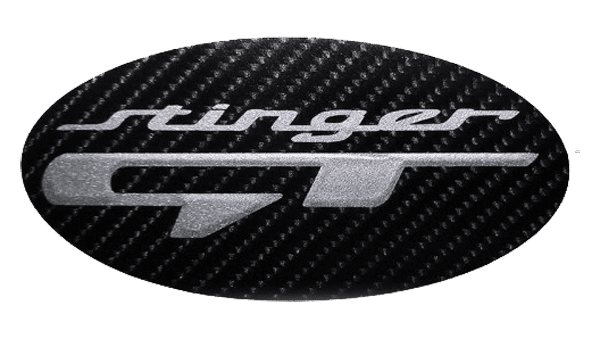
Kia Stinger logo
The logo is presented in the form of a black circle with a gray and thick rim. A gray “E” is depicted on a black background, and the “Stinger” inscription is located at the bottom of the rim. The logo is directly related to the main theme of the company “Built with excellence”. In addition, it stands for “exclusive, exquisite and evolutionary” and symbolizes the new line of premium vehicles.
Kia Soul logo
The minimalistic car logo is the brand’s name depicted in black. All four letters of the “Soul” are interconnected, and the letter “S” is stretched out to the sides.
Kia Optima logo
The company’s logo includes the brand’s name made written in capital letters in gray chrome color.
The Legends
Kia Ceed
The Kia Ceed is the successor to the Cerato model. It was designed at the Kia Motors Design Center in Russelsheim. The name Kia Ceed refers to the place where the car was made – the European Union (CE – Community of Europe) and the European customer (ED – European design).
Kia Sportage
Huge interest in the compact crossover is due to the aesthetically drawn body, the relatively wide range of power units and the practical interior for a family with holiday luggage.
Kia Niro
The Niro – a new hybrid low-emission crossover – is the first Kia car to be built on a platform designed for the needs of an entire family of cars with low fuel consumption.


