Kappa Logo
Tags: athletic apparel | Italy | sportswear
Kappa, a distinguished entity in the sportswear realm, is a subsidiary of BasicNet S.p.A., a corporation rooted in Italy. This brand has carved a niche for itself by creating athletic apparel that strikes a balance between aesthetic appeal and practicality, catering to a diverse clientele that ranges from professional athletes to fashion aficionados. The geographical footprint of Kappa is impressive, spanning continents from Europe to Asia, and extending its reach into North America. Its product range is comprehensive, covering a spectrum from sports jerseys to stylish footwear, each item reflecting a commitment to comfort, longevity, and fashion-forward design. Additionally, Kappa’s reputation has been bolstered through partnerships with various sports teams globally, which has not only broadened its market but also cemented its status in different sports circles.
Meaning and history
Founded in the heart of Turin, Italy, in 1967, Kappa emerged as a subsidiary of Maglificio Calzificio Torinese (MCT), created by Abramo Vitale. The brand swiftly made a mark in the sportswear industry, distinguished by its inventive designs and superior quality. One of Kappa’s pioneering achievements was the creation of its logo, symbolizing mutual support and equality, a concept that resonated deeply within the sports community. The brand’s journey saw it outfitting renowned sports teams and athletes, a testament to its quality and appeal. The “Kappa Authentic” line, a blend of sports functionality and street style, was a trendsetting move in the industry. The 1980s and 1990s marked a period of exponential growth for Kappa, as it expanded its influence globally. Presently, Kappa stands as a titan in the sportswear industry, maintaining its innovative edge and cultural impact, particularly in football, skiing, and athletics. Its global presence and brand recognition are a reflection of its enduring legacy and contemporary relevance.
What is Kappa?
It’s a dynamic sportswear brand originating from Italy, recognized for its innovative, stylish athletic apparel and accessories. Kappa caters to sports professionals and fashion enthusiasts alike, blending functionality with trendy designs.
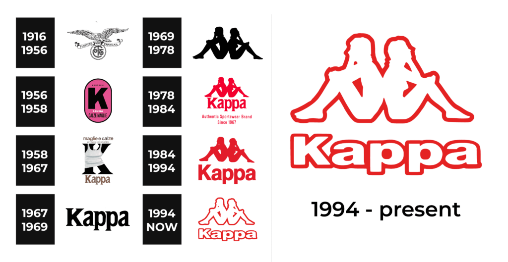
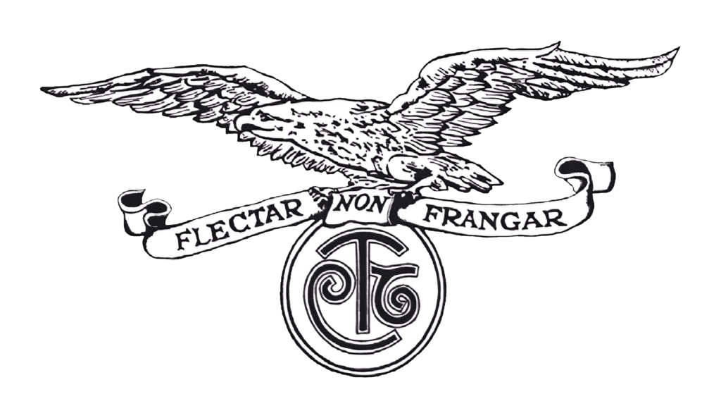
1916 – 1956
The inaugural emblem of Kappa, originally known as Maglificio Calzificio Torinese, was a testament to classic elegance. It featured a regal eagle in mid-flight, its wings spread wide, clutching a meticulously designed circle emblem. This emblem bore the monogram “MCT”, intricately woven into its design. The logo’s sophistication and style perfectly mirrored the fashion sensibilities of its time, making it a distinguished symbol in the textile industry.
1956 – 1958
A significant evolution occurred in 1956 when the company rebranded as Kontrollen. This transformation was marked by the introduction of a new logo, prominently featuring the letter “K”. This emblem was distinct, comprising an oval-shaped shield with a backdrop of bright pink. Against this vibrant background, a bold and assertive “K” stood out in stark black. This design choice was a statement of the brand’s bold vision and confidence.
1958 – 1967
The next phase in Kappa’s brand identity included a notable name change and logo redesign. The logo now proudly displayed the name “Kappa” underneath a striking black “K”, which was uniquely depicted wearing a white tank-top. The “Kappa” wordmark was crafted in a traditional serif font, imbued with a rich, dark golden color. This redesign was not just a visual change but a reflection of the brand’s evolving identity and its commitment to blending tradition with modernity.
1967 – 1969
The era of Kappa’s official registration saw the introduction of a new logo that was both minimalist and impactful. It consisted of a bright red wordmark, characterized by thick, confident lines. This simple yet powerful logotype encapsulated the brand’s minimalist approach while conveying a sense of strength and contemporary style.
1969 – 1978
This period marked a defining moment in Kappa’s visual identity. The creation of the renowned “Omini” emblem represented a groundbreaking shift. Featuring two silhouettes, a man and a woman sitting back-to-back, this emblem was born out of a fortuitous moment during a swimwear catalog photo shoot. Rendered in solid red on a pristine white background, this logo stood apart for its absence of a wordmark. It was a bold statement on the brand’s commitment to equality and mutual support between genders.
1978 – 1984
The year 1978 brought another evolution to the Kappa brand identity. The emblem now included the wordmark “Kappa Sport”, situated below the iconic “Omini” sign. This new addition was executed in a thin, elegant red sans-serif font. However, in a strategic move in 1981, the word “Sport” was removed from the logo. This decision laid the groundwork for what would become today’s iconic visual identity of Kappa.
1984 – 1994
In 1984, the Kappa wordmark underwent another transformation, adopting a bolder and more robust typeface. This change made the logo appear more powerful and contemporary than ever before. It was a reflection of the brand’s growing influence in the fashion industry, a celebration of its commitment to producing high-quality, stylish fashion items, and a tribute to its unique design philosophy.
1994 – Today
The 1994 redesign of the Kappa logo marked a significant shift towards a more modern aesthetic. The logo was reimagined with a white emblem and wordmark, both outlined in a striking red hue. This lighter, more refined design exuded contemporary elegance and confidence, showcasing the brand’s rich heritage and its legendary approach to fashion. This redesign was more than just a visual update; it was a testament to Kappa’s enduring legacy and its status as a trendsetter in the fashion world.


