Geely Logo
Tags: Blue Car Brands | cars that start with g | China cars
Geely is a Chinese car brand that has existed since 1986. The first Geely car was released in 1998. Since then, the company has gone from being a follower to one of the leaders in the scientific and technological field.
Meaning and History
The idea for the name and the first logo is believed to have come from the founder of Geely Group Co., Ltd, Li Shufu. Translated from Chinese, “Geely” (吉利) means “happiness”.
1986 – 1998

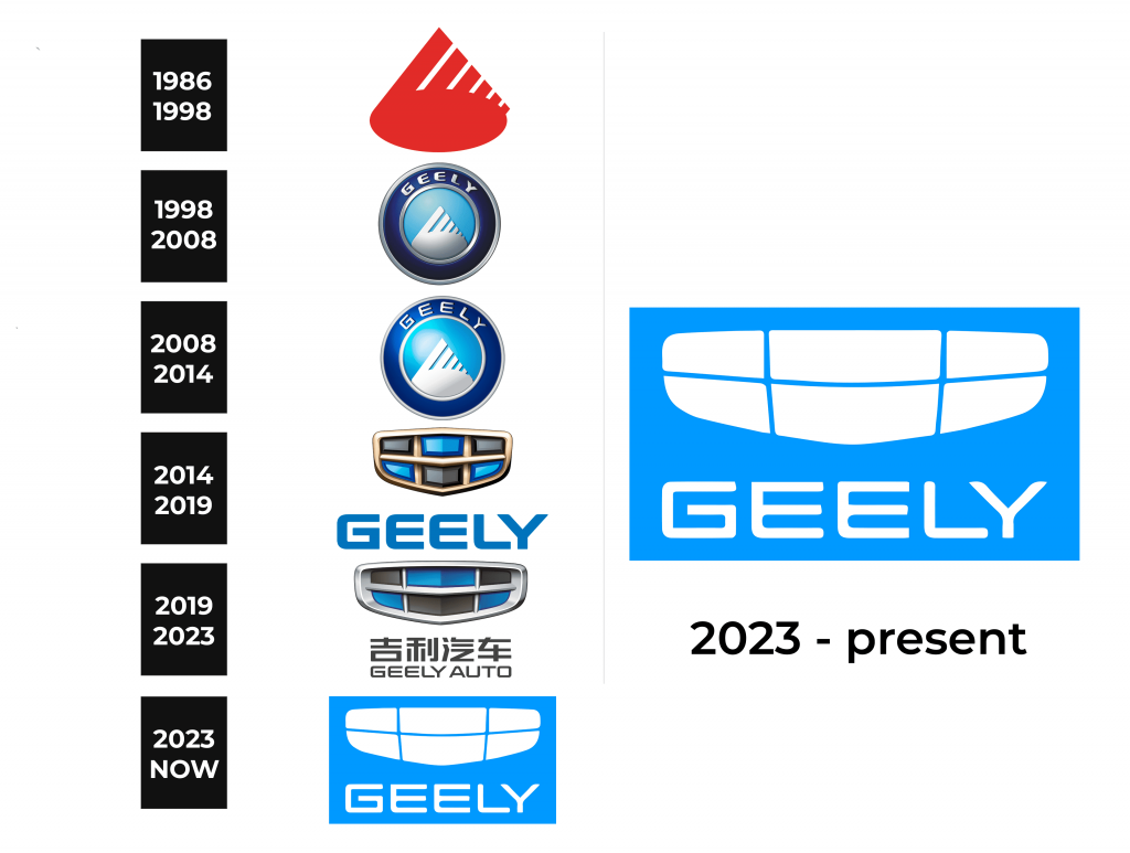
The original logo of the brand somewhat resembled a triangular drop shape with slits on the right. It is said to be a mountain top or possibly a bird wing. The emblem was done in reddish-orange color. It surely looked unique, which is probably one of the reasons it was part of company logos until 2014.
1998 – 2008

For the next sixteen years, the company used a round emblem with a few modifications. In the center circle, the logo featured a white mountain top against a blue sky. The border around it was done in dark blue with a metallic silver outline on both sides. The name of the brand was printed across the top and left no doubt to whom this logo belonged. In general, the round form of the logo has not only given the association with wheels but is also widely used by companies across all industries. The choice of the color palette, on the other hand, created an image of a trustworthy and reliable company.
2008 – 2014
The original logo of the year 2008 depicts a white mountain hill against a blue sky. But according to another version, this is the white wing of a bird. Such nuances on the emblem are quite logical, considering that China is called “the Celestial Empire”.
2014 – 2019
However, since 2014, all cars have the same emblem, which was on Emgrand, but in a changed color scheme: red was replaced by blue, and black by gray. Under the badge is located a name of the brand, colored in blue. For the first time, the new logo was presented on the Emgrand Cross hybrid model during the international exhibition in Beijing.
2019 – 2023

In 2019 the company bring some changes to the previous type of logo. In fact, the cells became more oblong and the partitions thinner, while the contour acquired volume. The colors of the cells remained unchanged, while the lattice changed its color from golden to silver.
2023 – Today

The updated brand image looks very modern and graphical. There is no more three-dimensional effect. Instead, the “grille” is now simply a white silhouette of the previous version with thin blue dividing lines. The name is also printed using a font similar to the one seen in the 2014 logo, but using slimmer strokes with the “E” having a straight angle at the top.
Emblem and Symbol
Despite some changes that happened with the logo, its aim always remains the same – to show the brand’s values of quality and design, as well as its influence on the market. Nowadays, Geely Automobile shows strong growth, selling its vehicles on all continents.
The Legends
The most famous and popular model of the Geely brand can be called ATLAS. In China, Boyue / Atlas entered the market in March 2016 and quickly became a bestseller. The crossover has a modern design and is equipped with intelligent safety, health protection and communication systems.


