Daewoo Motors Logo
Tags: cars that start with d | Silver Car Brands | South-Korean car
Daewoo is a South-Korean car brand with a very difficult history. They are essentially a pretty old company – the foundation dating back to before the war. The brand called ‘Daewoo’, however, only appeared in 1967. They mostly built compact cars since then and until their dissolution in 2016.
Meaning and History
The name ‘Daewoo’, like many other Korean company names, indicates the goals the company set for itself. In this case, it was most likely a desire to finally achieve a stable footing in business (the enterprise wasn’t too successful). The word means ‘treatment’ or ‘healing’.
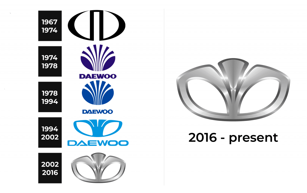
1967 – 1974
The emblem of those years was uncomplicated, black and white. It was oval in shape.
1974 – 1978
Daewoo image doesn’t really have any deeper meaning, it seems. Different variations resemble flowers, and it would be pretty fitting, but it wasn’t confirmed.
Anyhow, the first logo variant used the blue flowery image (five radiating lines and two eye-like forms on each side) as well as the company name to the right of it. The letters visibly touch each other and intermingle, which gives then a very solid and cohesive look. The entire writing was also blue.
1978 – 1994
Many sources say that a shell was chosen as the emblem. Still, the version with the lily is more plausible. If we compare the company’s emblem with the Fleur-de-lis, which is heraldic in nature, they are very similar. This is not surprising, because “Fleur-de-lis” is literally translated from French as “lily flower”. Among other things, this flower is considered to be a symbol of purity, greatness and innocence.
1994 – 2002
At the close of the century, the entire logo was slightly reworked.
For one, the ‘flower’ had only two radiating lines now and two hollow leaves on each side. The color was changed – it was now absolutely black, save for the white space inside the leaves.
Not much changed about the text. It was placed below the logo image now and was a bit squashed from the top, but it generally retained its look. The writing was black, in solidarity with the image.
2002 – 2016
For the last stage of their logo, they changed it a bit again. For instance, the two lines were now united into one flower, although the leaves remained as they were. The most noticeable change is that this image became metallic now and received a lot of chroming.
As long before, the text returned to the place to the right of the flower image. The font changed to a more boring and strict type of letters. The color, moreover, was repainted dark blue.
Emblem and Symbol
Most cars wore a flowery emblem on their fronts as a badge. It wasn’t the only one, however. There were several exclusive symbols, like a circle with the crown inside for the ‘Royale’ range of cars and others. The earlier cars are also known to bear simply the name of the company in a visible place, as well as maybe their model name.


