Cadillac Logo
Tags: Black Car Brands | cars that start with c | USA cars
Cadillac Motor Car Division is a department of the General Motors concern that specializes in the production of passenger luxury cars. The founders of the company are precision machine engineer Heinrich Leland and entrepreneur William Murphy. The company was originally called the Cadillac Motor Car Company, after Detroit founder Antoine de la Mothe Cadillac. Nowadays the brand is represented in more than 50 countries around the world.
Meaning and History
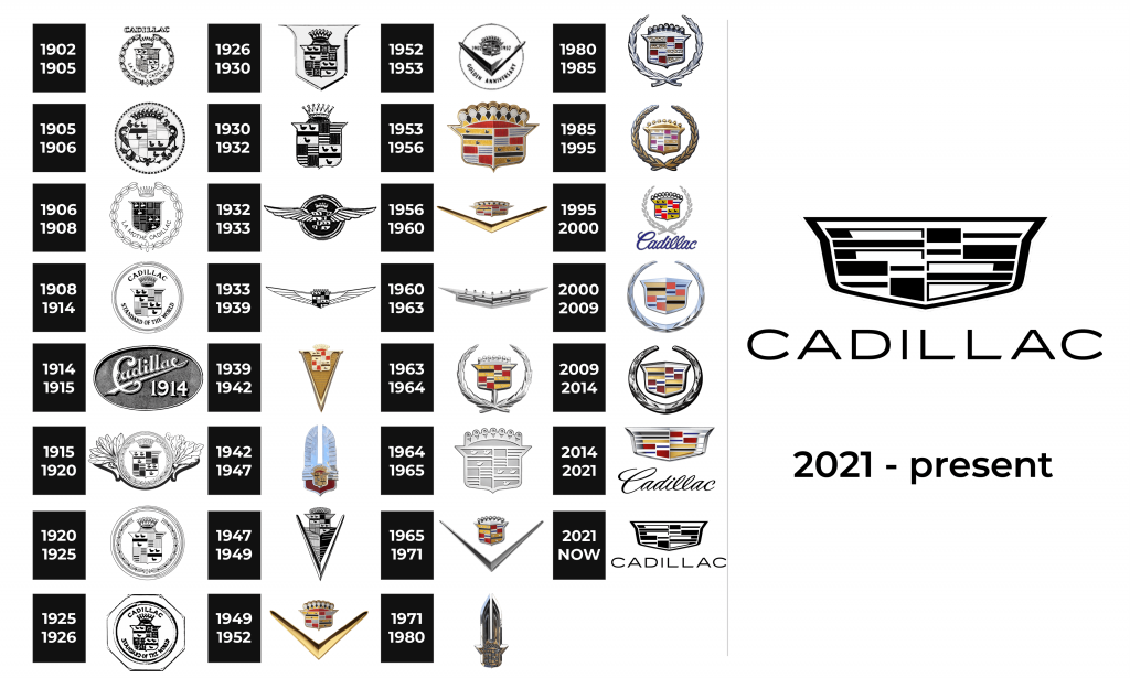
The Cadillac emblem is one of the few car symbols that really correspond to a noble name. It represents the family coat of arms of the ancient genus de la Mothe Cadillac. The Cadillac logo first appeared in September 1902, although the trademark itself was officially issued in 1906. Throughout its 111-year history, the logo has changed about forty times.
1902 – 1905
From 1902 to 1905 the logo looked quite simple. Just Cadillac name was installed on cars of this brand as a golden inscription.
1905 – 1906
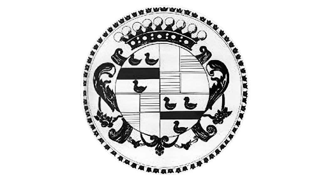
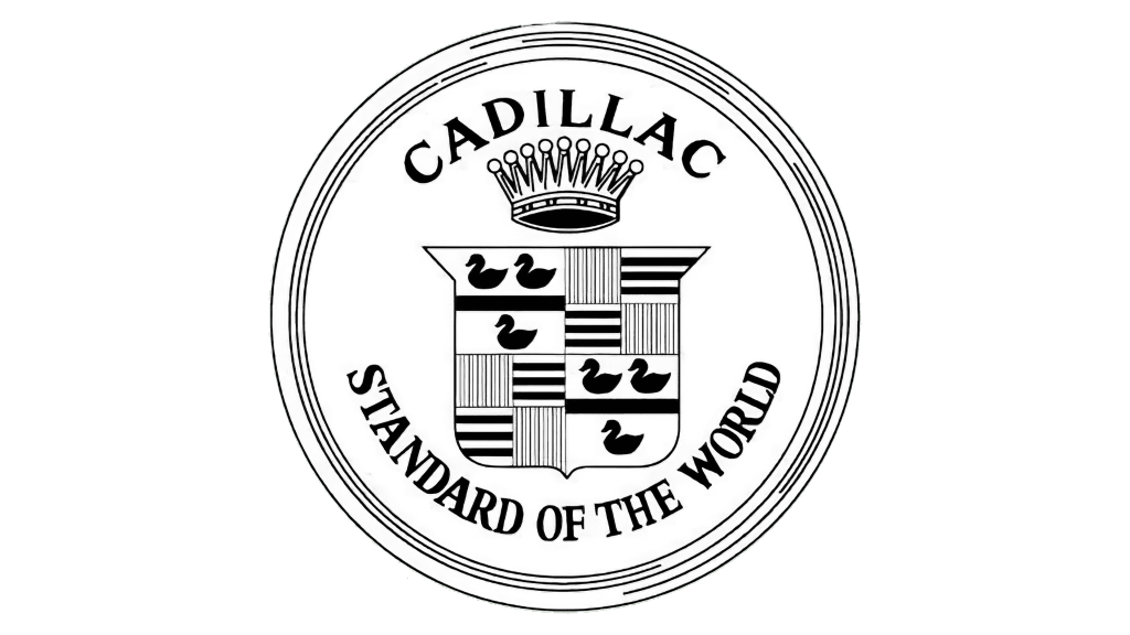
Since 1905, the family coat of arms of a noble genus de la Mothe Cadillac has become a new company logo. The crown on the coat of arms directly indicates French origin, and pearls testify to the six oldest counties of France. The seventh was probably added for aesthetic reasons. In 1908, after winning the prestigious Dewar Trophy, which was given for high quality in the automotive world, the inscription “Standard of the World” appeared on the logo.
1906 – 1908
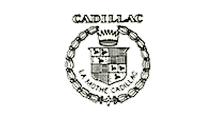
Almost nothing changed during that period. The only difference was the adding of the name of the genus — de la Mothe Cadillac to the logo.
1908 – 1914
At first, the icon looked like a wreath that surrounded four fields of different colors: black, red, blue and yellow. The Cadillac logo means the stylization of the coat of arms of Antoine de la Mota Cadillac, after which the company was named The coat of arms was registered as a trademark in 1906. Up to this point, its decoration was a gilded flourish.
1914 – 1915
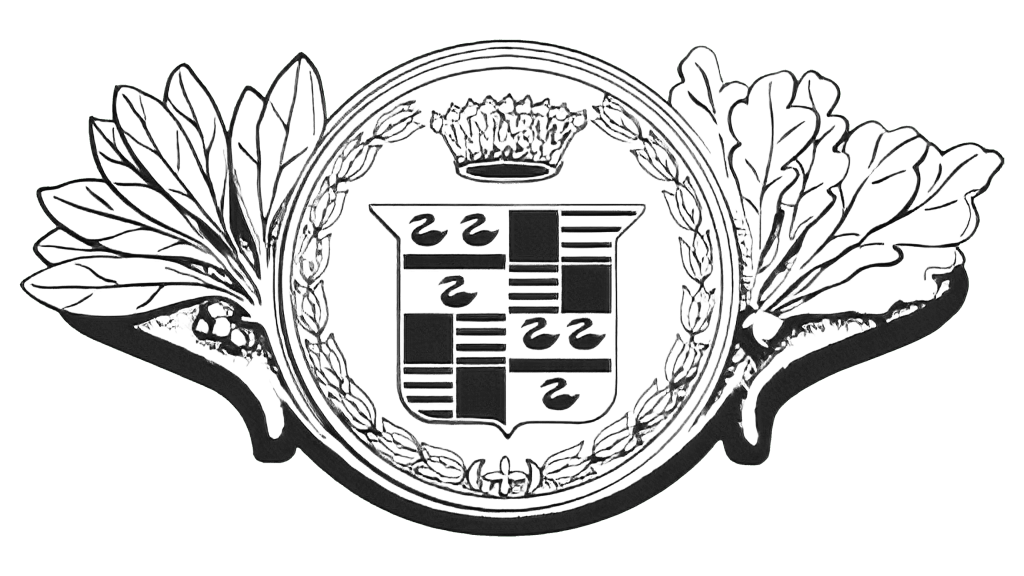
The 1908 logo was slightly modified in 1914. The inscription “Cadillac” was replaced by a massive and elegant image of the crown. An additional curved inscription at the bottom of the badge was in the form of an exquisite wreath of leaves. The round medallion was placed between two wing-like elements consisting of elongated leaves of different shapes.
1915 – 1920
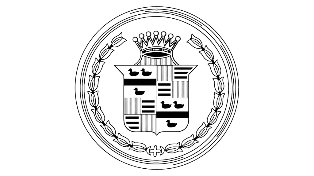
There was a wreath of tulips surrounding the crown with 7 prongs, which symbolized strength and nobility, and the coat of arms of Antoine de la Motte Cadillac.
1920 – 1925
The inscription was removed from the Cadillac logo in 1920. The decorative ring in the form of a tulip from the emblem of the first brand was added, and the crown was slightly changed. . The spine itself remained almost untouched, only slightly modified.
1925 – 1926

For a short period of time, the logo of the company looked very similar to what it had back in 1908. There were only a few differences. The crown was connected to the coat of arms. In addition, there was an additional border around the emblem in the form of an octagon.
1926 – 1930

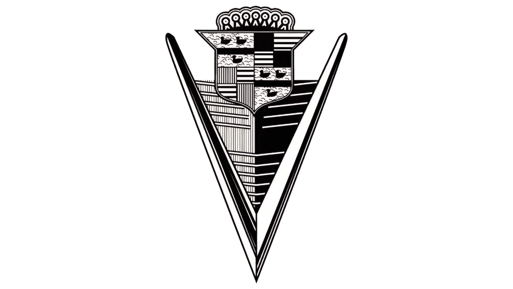
The updated logos still had a crown and coat of arms as the main element. There were no inscriptions, though. The frame resembled the shape of the coat of arms with a “V” like bottom.
1930 – 1932
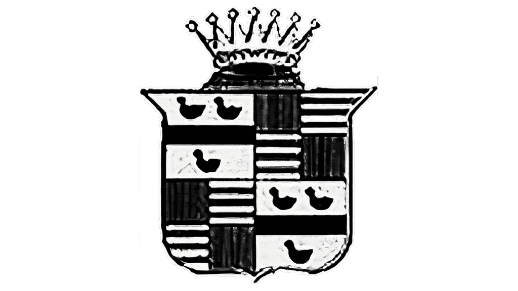
The company did not introduce anything drastically different in 1930. The only noticeable change was the complete removal of any of the frames. The crown also looked a bit different. In general, the company stayed true to its original brand image.
1932 – 1933
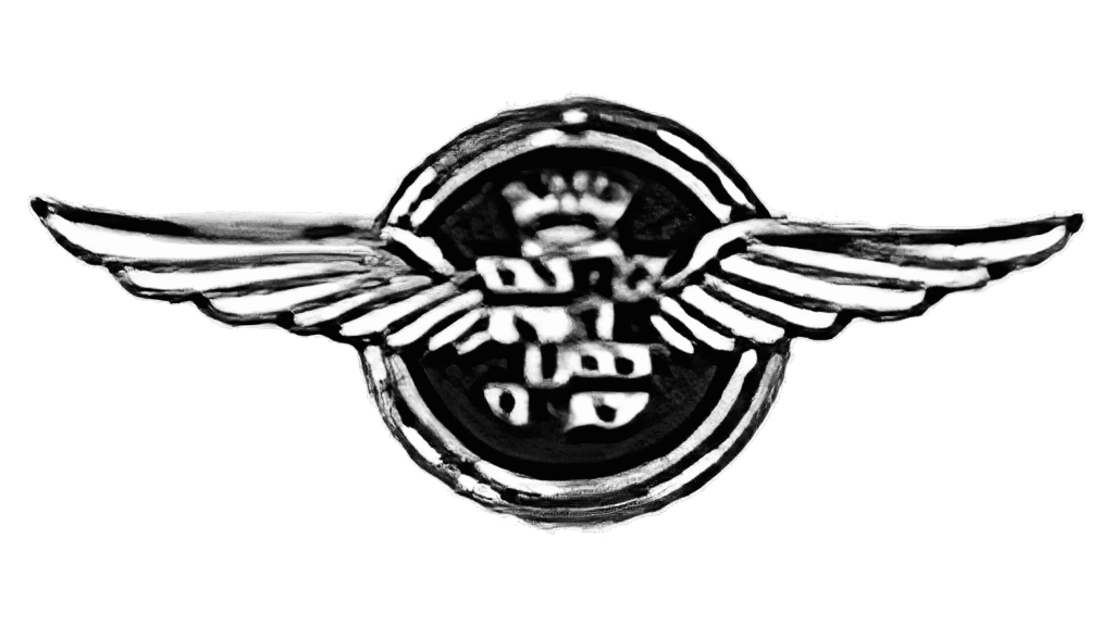
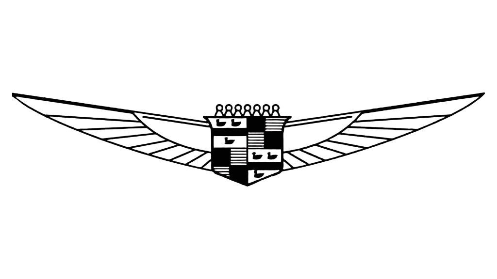
The first “winged” logo was introduced in 1932. The designers used the well-known brand image on a circular base and added thin, long outspread wings. This update took the logo to a completely new level and gave the brand image a new breath.
1933 – 1939
This emblem with minor modifications lasted until the early 30s of the 20th century. During this decade, Cadillac cars began to appear with the “winged” emblem. The main version about the origin of that image is the fact that the company, regardless of the situation in the country and the world, still works and produces cars.
1939 – 1942
In the late 30s of the 20th century, the Cadillac was still true to itself. The same coat of arms served as the logo for the brand, but it got a golden hue.
1942 – 1947
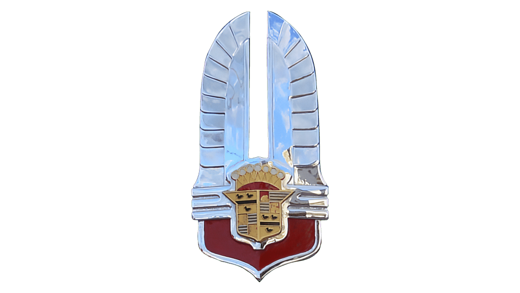
The 1942 Cadillac logo was an amazing example of Art Deco style in logo design. The spine was placed on a wider one, with smooth sides and a pointed bottom. Two stylized white wings were spread out from a larger gray crest, forming an interesting elongated shape to the top, resembling a feathery crown. It was something completely new not only for the brand, but for the whole world. That logo remained in Cadillac for only five years.
1947 – 1949
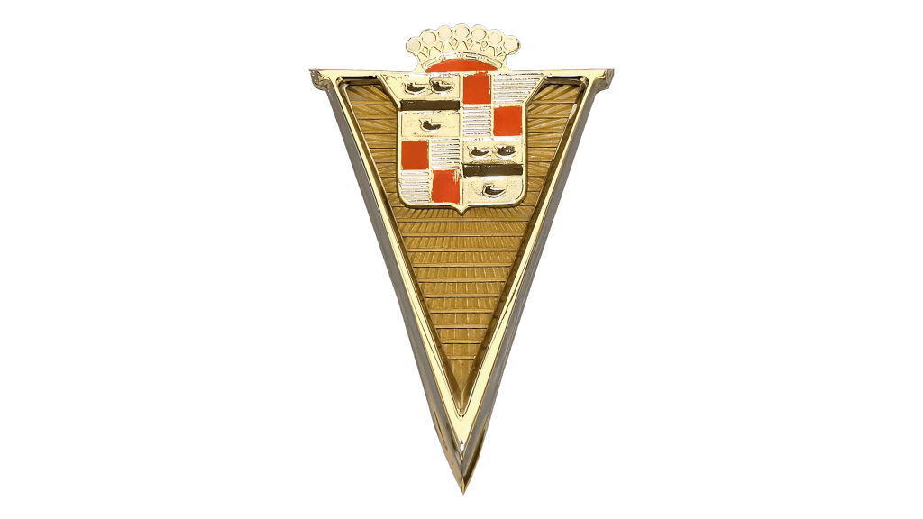
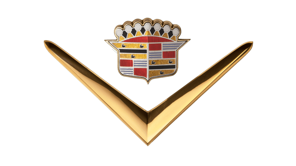
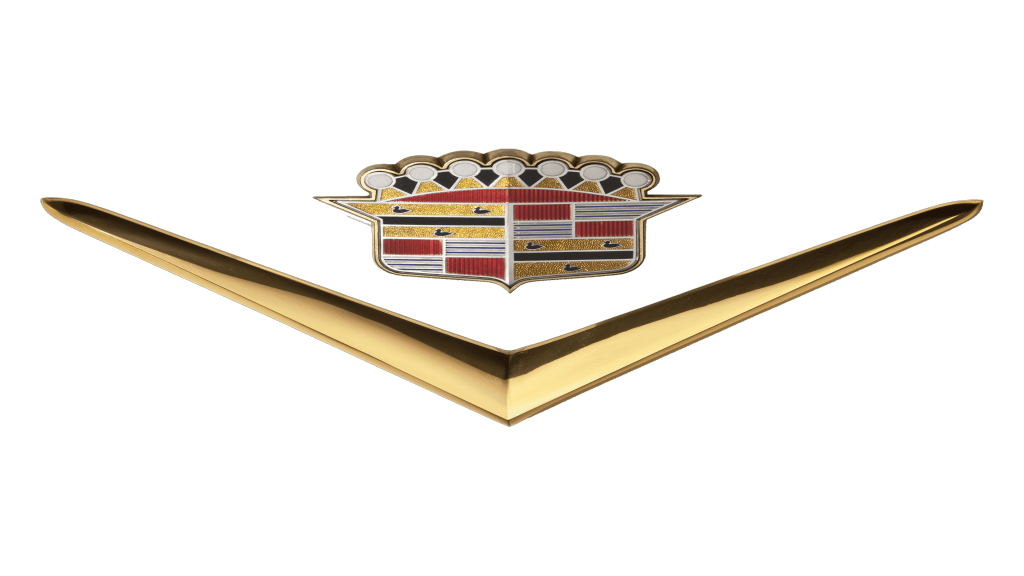
In 1947-1948, the automobile brand started to produce cars with high-power V-engines. This immediately became a huge success among motorists. At the same time, the Cadillac logo was updated — a letter V enclosed the main logo. This emblem existed in different interpretations until the mid-50s.
1949 – 1952
Then it was replaced by the classic coat of arms with a crown again. And throughout the 20th century, the Cadillac emblem changed but retained in its features the first logo of the company.
1952 – 1953
The history of the Cadillac logo continued to change. The letter “V” appeared on the radiator grille, which marked 8-cylinder engines of that shape. In addition to the letter “V”, a circle was depicted on the logo at that time. There was a coat of arms with a bouquet of 7 tulips on top inside it. The years 1902-1952 were indicated on each side. The name of the word “Golden Anniversary” was written under the coat of arms.
1953 – 1956
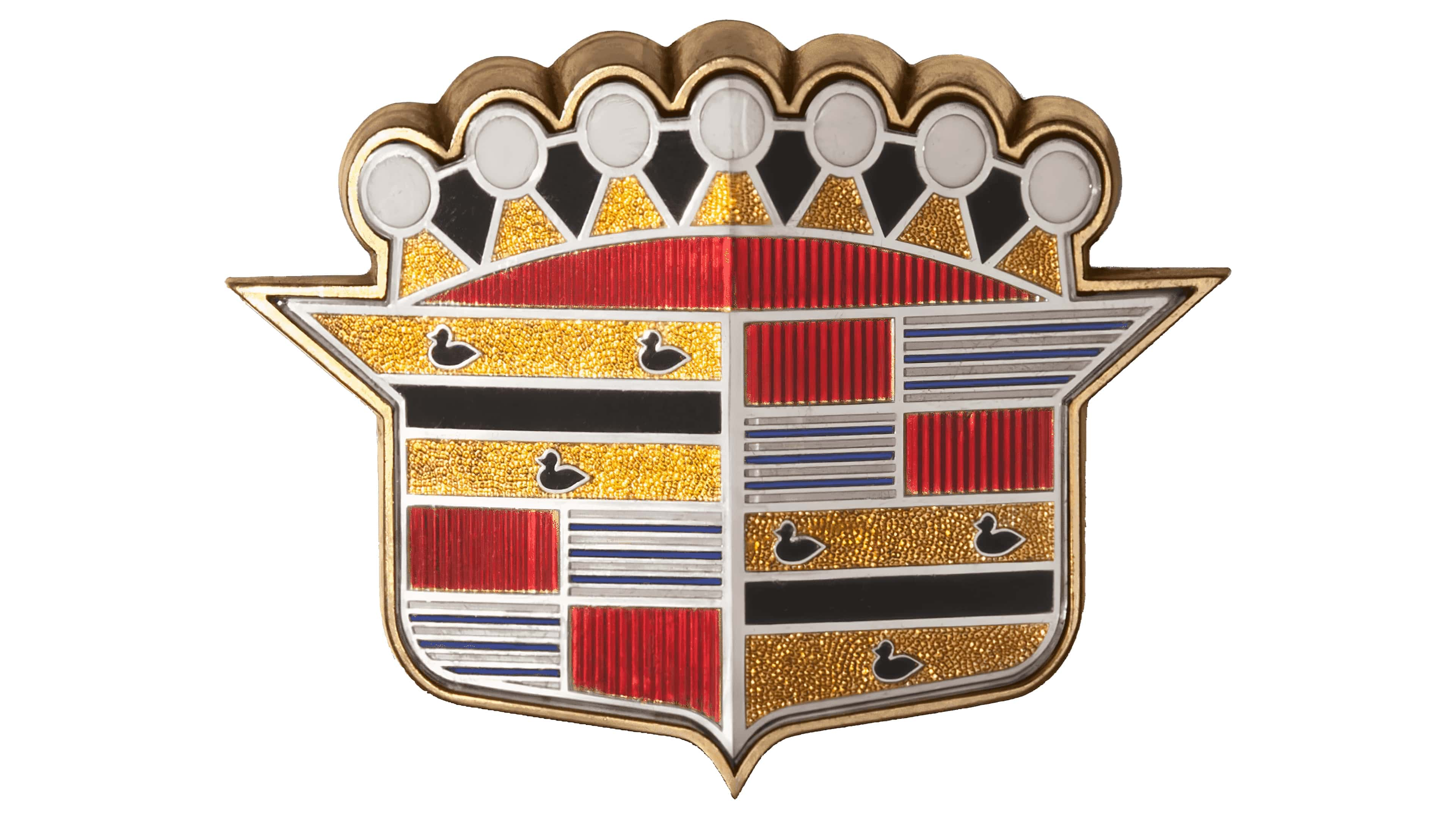
It is not surprising to see the company use a logo that looks a lot like a colored version of the original. After all, it is a sign that the company is trustworthy and loyal not only to its values but also to its customers. Actually, it was identical to the logo introduced in 1949, only without the “V” shape. The bright, metallic color palette and three-dimensional look of the emblem gave the brand a luxurious feel.
1956 – 1960
In 1957, the V-shaped logo was changed. It became wider and acquired a more luxurious style due to the modification of the spine. The crown was completely changed, as were the images of the coat of arms. Swans were no longer readable. The frame of the shield became bolder and more elegant.
1960 – 1963

The new logo was metallic silver with black elements. It looked like the coat of arms was blended with the “V” shape. The only thing that was left from the crown were seven circles that were placed along the top of the “V”. The emblem resembled a radiator cover.
1963 – 1964
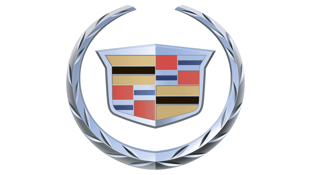
The most famous Cadillac logo was created in 1963 and remained with the brand for more than 40 years. It consisted of a colorful coat of arms framed with a silver wreath. The coat of arms was made in yellow, fuchsia and blue colors with white and black details, which gave the logo a creative and modern look.
1964 – 1965
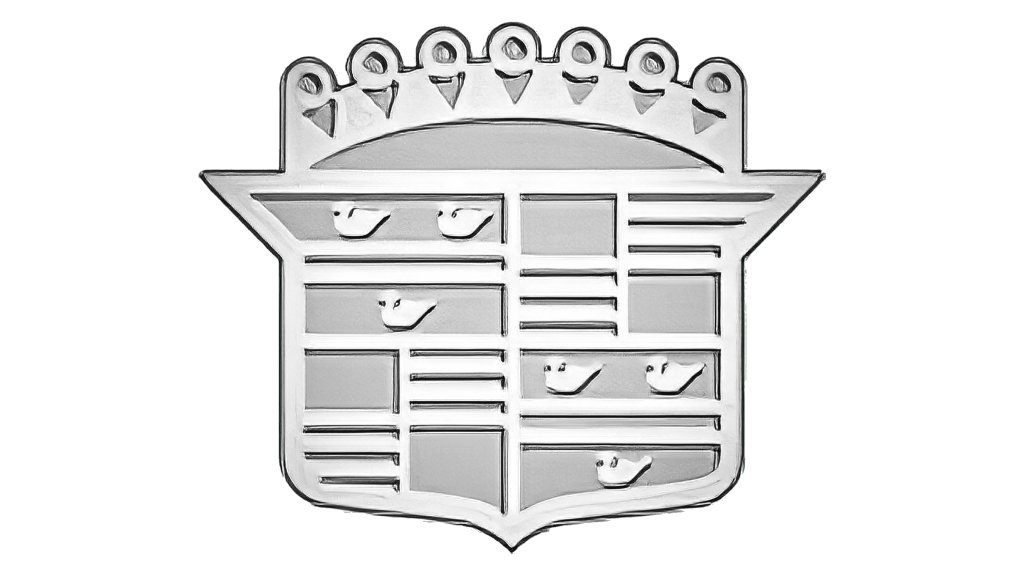
A silver color palette gave this logo a stylish look. As the company has done many times, the updated logo was just a mere modification of what the company already had. This time, it looked like a silver version of the logo introduced in 1953. However, they did not just change the color palette, but also redrew some of the details, such as the crown, and made the emblem appear flat. Although the logo turned out quite great, it was used only for a little over a year.
1965 – 1971
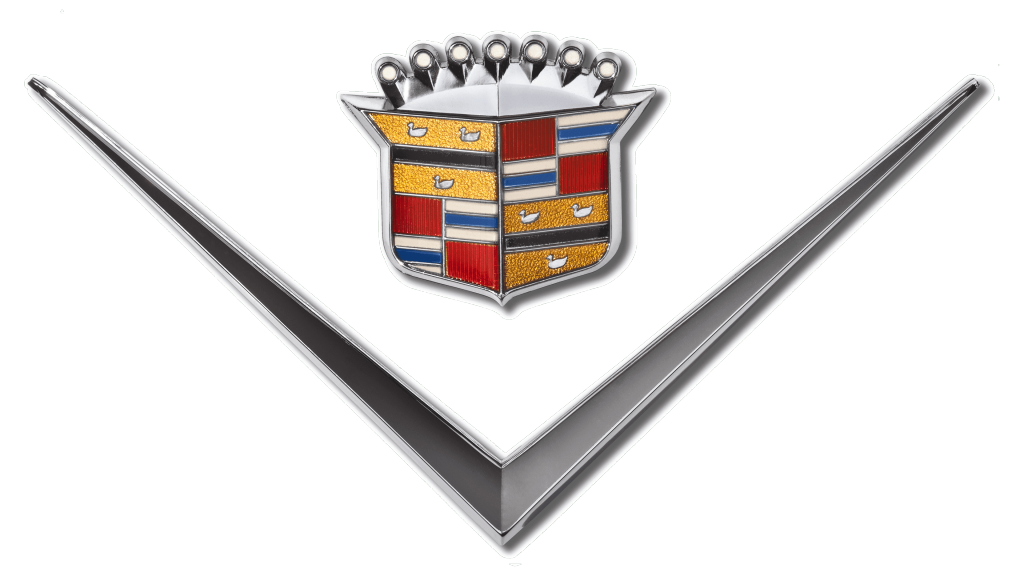
It was not long before the Cadillac brand introduced a new look. A new is probably an overestimation as the designers once again worked with elements already featured in other logos. These were the shield with a crown and the “V” shape. Both the crown and the border around the shield got silver. The silver theme was continued in the color of the “V”, although it had a darker shade. The final result resembled a silver variety of the 1949 logo with a few modifications.
1971 – 1980
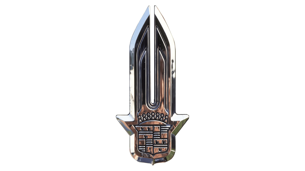
The vertical logo of the 1940s was brought back in a more stylish and elegant variation. The whole emblem was silver chrome and had a 3D appearance. There were no feather details, so the top looked more like a spear than wings. The pointed upwards shape of the logo represented growth and innovation. The logo appeared strong and sophisticated.
1980 – 1985

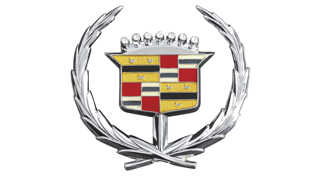
The new logo was a representation of an innovative and at the same time responsible and stable company. It featured a shield with a crown framed by a wreath. For many years, the company did not have any inscription accompanying its emblems, and this logo is no exception. The designers continued to lean towards silver and used it for the wreath, adding more silver to the shield as well. This color creates a sleek, refined, and sophisticated appearance, so it is not surprising many automobile brands use it in their logos.
1985 – 1995

Although there were minor changes to the logo details, the main update was the color palette. the silver color was replaced by golden. The latter is also associated with wealth and value, but it gives a much warmer feel. This version was used by the company for ten years, which is quite long considering how often the brand changes its logo.
1995 – 2000

With an exception of a logo used from 1952 until 1953, the Cadillac emblems did not have inscriptions since 1926. The company decided to change that and added a very elegant and delicate label under the emblem. The name was printed in blue using an italicized, cursive font. The accent was also placed on the colored shield, which now looked flat, as the wreath was a mere light gray, flat framing.
2000 – 2009
The logo was refined, and the color palette was slightly changed to more traditional tones. The Cadillac logo of the 2000s was modern and sophisticated; it reflected the elite segment and the confidence of the brand.
2009 – 2014
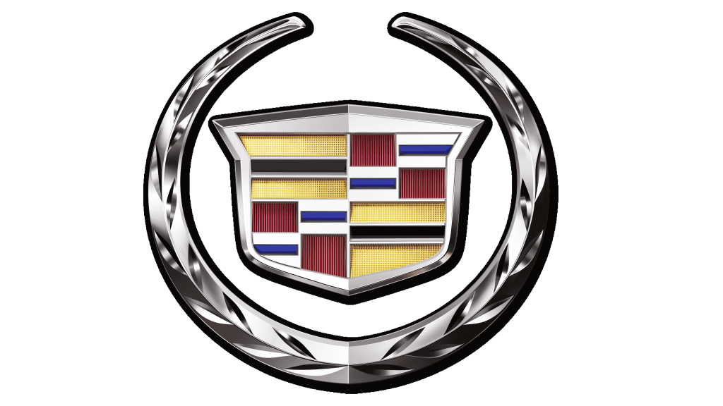
The company never seized to surprise with a variety of logos that could beautifully blend the old and the modern. They made the silver color in the whole emblem darker and the wreath thicker, which created a bolder and stronger feel. The flat colors in the shield now looked metallic and each section acquired some type of texture, which gave the emblem depth and interest.
2014 – 2021
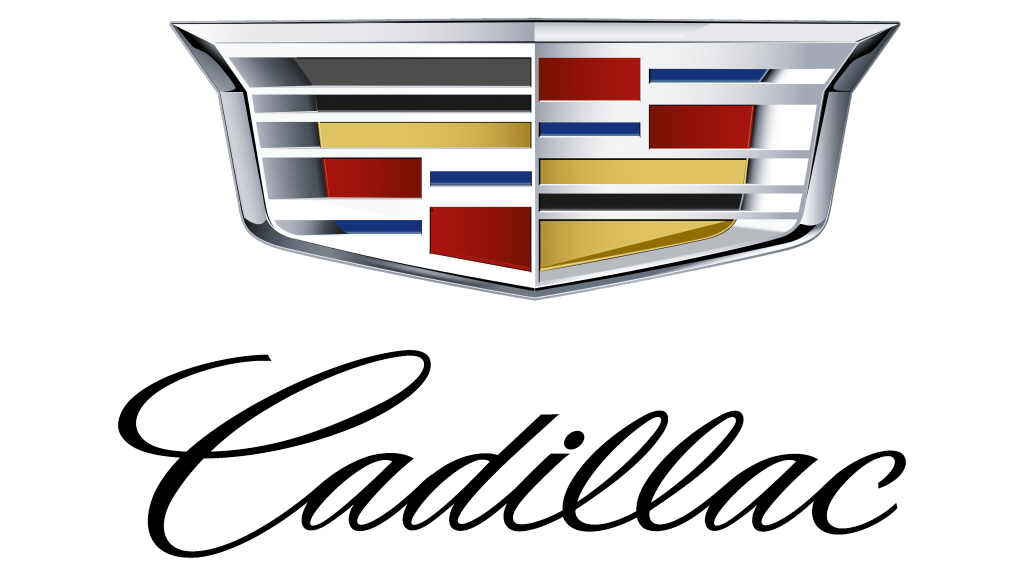
In 2014, the company removes the wreath from its logo. The Cadillac’s visual style consisted of a modernized coat of arms with an elegant inscription in italics below it. The smooth, refined lines of the inscription perfectly balanced the sharp and brutal shape of the coat of arms.
2021 – Today
The logo was the same coat of arms, only in black and white.
Interesting features of the logo
The black color on a gold background is a symbol of wisdom and wealth. The red field is considered a symbol of courage and valor, the stripe, made in silver, is a reflection of mercy, wealth, and virtue. And blue symbolizes knightly honor.
The second and the third quarter were added to the coat of arms after extensive possessions joined to the family. So the Cadillac logo has a very noble origin, and the meaning of each element is quite logically explained.
The Legends
Cadillac Eldorado’30
In the 1950s, a special manner of car styling called “Detroit Baroque” emerged in America. The Eldorado model became almost a reference of that time thanks to its brightness and chic: rich colors, an abundance of sparkling chrome, and, of course, the highest and the incredibly long tail “fins”.
Fleetwood 75
For that time Fleetwood 75 was very expensive but also had unique characteristics. The interior was inlaid with real pearls and had gold plating, and the headlights, wheels, and grille were made of pure gold.
The car was so chic that it was bought by the production company RCA Records to travel around the states, advertising the legendary Elvis Presley and his creation.
The Concept Cars
Cadillac Urban Luxury (2010)
This model was conceived and designed in Los Angeles, where drivers had to deal with very tight parking areas daily. Therefore, the developers had to introduce characteristic design elements into the shape of the car, making it atypical in order for the new model to meet the requirements of urban motorists.
Cadillac Ciel (2011)
This is a large four-seater cabriolet with a luxurious interior. It could be considered that the Americans tried to revive interest in the Cadillac brand and create a new “style icon” with the Ciel concept.
Cadillac Elmiraj (2013)
Balanced lines and a few interesting details, but without over-embellishment: this is how Cadillac imagines a luxury coupe for the near future. At the same time, the Elmiraj concept was created with an eye to both the classics (the Eldorado coupe of 1967) and futurism (the conceptual Ciel cabriolet of 2011).
Cadillac Escala (2016)
Escala, which means “scale” in Spanish, represents a new stage in Cadillac’s design. It is the exceptional combination of technology and elegance in interior design that makes this model of Cadillac so recognizable.
