BYD Logo
Tags: cars that start with b | China cars | Red Car Brands
BYD (Build Your Dreams) is a Chinese car manufacturer, one of the largest in general, and the largest when it comes to electric vehicles – only Tesla is bigger in the world.
Meaning and History
![]()
The name BYD stands for the slogan “build your dream.” Throughout its history, the logo has undergone only one major transformation.
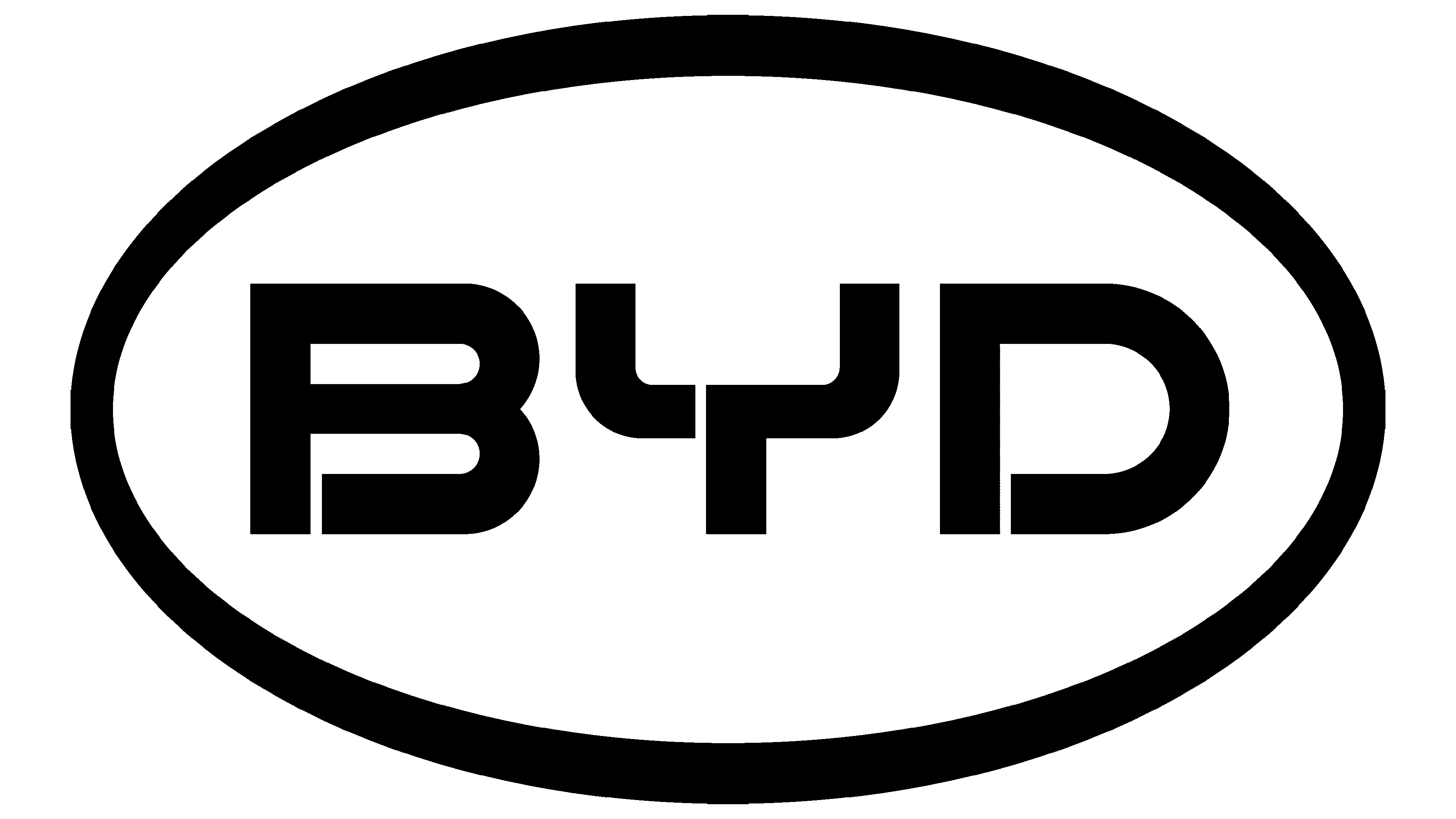
2003 – 2005
![]()
The first company logo was in the shape of an ellipse with a thin black rim around it. Inside it was another ellipse, horizontally divided into two parts. The top was painted in blue color and the bottom in white. The company acronym in white color was placed under the smaller ellipse.
2005 – 2022
![]()
A new version of the logo appeared in 2005 and also consisted of an ellipse, but in red color with a thick rim around it. Inside it was the abbreviation of the company, also in red color.
2021
![]()
As often happens, the designers are tasked to create a modern emblem while preserving the familiar brand image. This logo shows that it can be successfully achieved. First of all, they worked with the font. Although the new font still had wide letters, slits in each letter, and a unique way of writing the “Y”, there were no more diagonally cut corners. Instead, the letters featured smooth curves and thinner strokes that were more pleasing to the eye. The bright red was muted a bit. The new darker color actually gives the company a more professional and serious look.
2021 – 2022
![]()
The redesign of 2021 has removed the oval framing from the BYD logo, leaving just the solid red lettering written against a plain white background. The inscription was significantly modified: now the “B” and the “D” had no vertical bars, while the “Y” remained almost the same. All three characters got stretched horizontally, and their bars became thinner.
2022 – Today
![]()
In 2022 the company introduced a new version of the logo, with the lines of the characters thickened up, and the shapes slightly narrowed horizontally but extended vertically. The deepened shade of red makes the whole composition look more confident and evokes a sense of excellence.
Emblem and Symbol
A feature of the first emblem was the use of blue color in combination with black and white, which symbolized the carelessness of the company, its unity and dedication. Later, the company undertook major changes and announced its pioneering and leadership, using the emblem in exclusively red color.