Buell Logo
Tags: Harley-Davidson | motorcycle | USA
The history of Buell dates back to 1983, when Harley-Davidson engineer Erik Buell, a former mechanic, and customizer, started the production of racing motorcycles based on the Harley-Davidson XR750 sports motor. Until 1990, the company worked to order, but since 1993, Harley-Davidson becomes the owner of the majority shareholder of Buell Motorcycle Co. and builds a new, state-of-the-art Buell plant in Milwaukee, bringing down prices and increasing the quality and quantity of motorcycles produced.
Meaning and history
The company has a long and complex history, and its logo has gone through many changes and improvements.
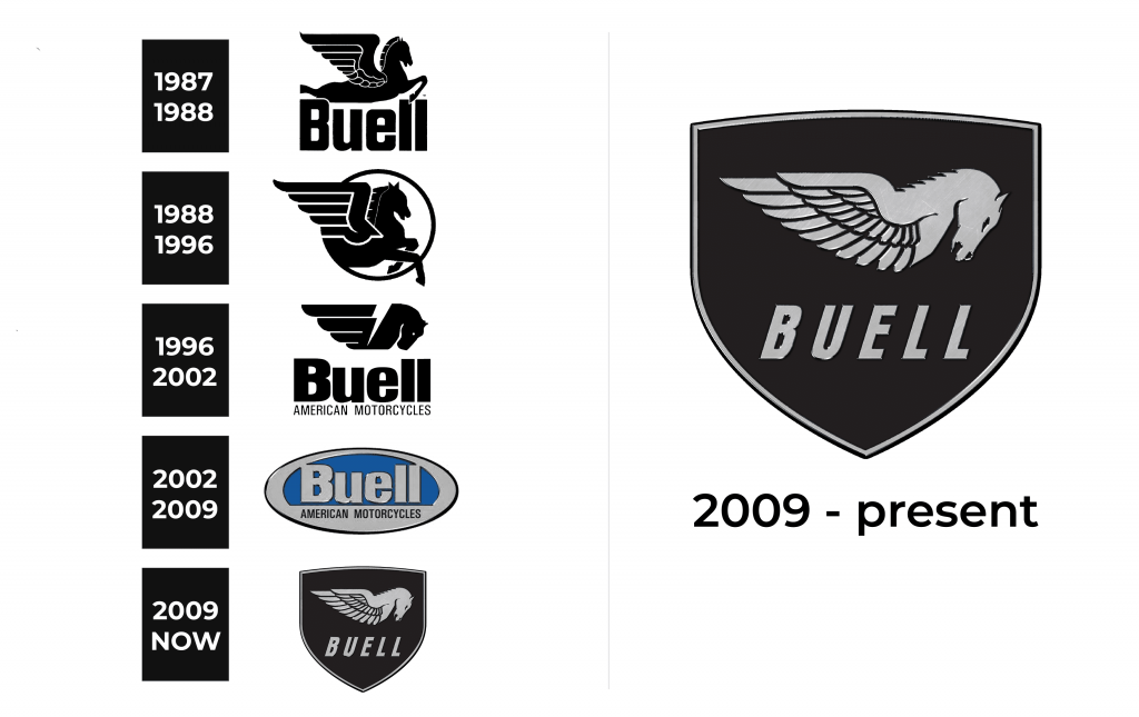
1987 – 1988
The first company logo consisted of two parts. The name of the company was written in bold black, and above it was a jumping Pegasus.
1988 – 1996
In these years, the image of the Pegasus was placed in a circle, and the company name was on the right side. Under the name of the company was the inscription ‘American Motorcycles’.
1996 – 2002
In 1996, the image of Pegasus was simplified, the circle was missing and the animal was again at the top of the logo. Beneath the silhouette of Pegasus was the company name (no incline), under which the ‘American Motorcycles’ wordmark was again located.
2002 – 2009
In 2002, there were major changes and the logo was now oval in blue with a thick silver rim around it. Inside the oval was the name of the company, also in silver, and the inscription ‘American Motorcycles’ was on the rim around the oval.
2009 – present
In 2009, the logo was modernized and now has the shape of a black shield with a thin rim around it. Inside the shield, the silhouette of a gray Pegasus reappeared, and underneath the name of the company is written in capital letters with a slight incline.
Emblem and symbol
The company’s symbol is Pegasus – a mythical winged horse, a symbol of strength, stamina, and inspiration, which was present on all 4 of the 5 company logos.


