Alfa Romeo Logo
Tags: Blue Car Brands | cars that start with a | Italian cars
Alfa Romeo is one of the oldest car manufacturers in Italy. They were founded in 1910 in Milan simply as ALFA, which in English stands for ‘Anonymous Lombard Factory of Automobiles’. This dedication to their birthplace is actually represented on their logo as well, which includes a lot of traditional Milanese symbols.
Meaning and history
Right from the start, the logo included two historical Milanese images. It was divided into two sides. On the left side there was a red cross on the white background – the cross of Milan. The right side depicted a coiled snake devouring a child, which is an old sign of the rulers of Milan, the Visconti family.
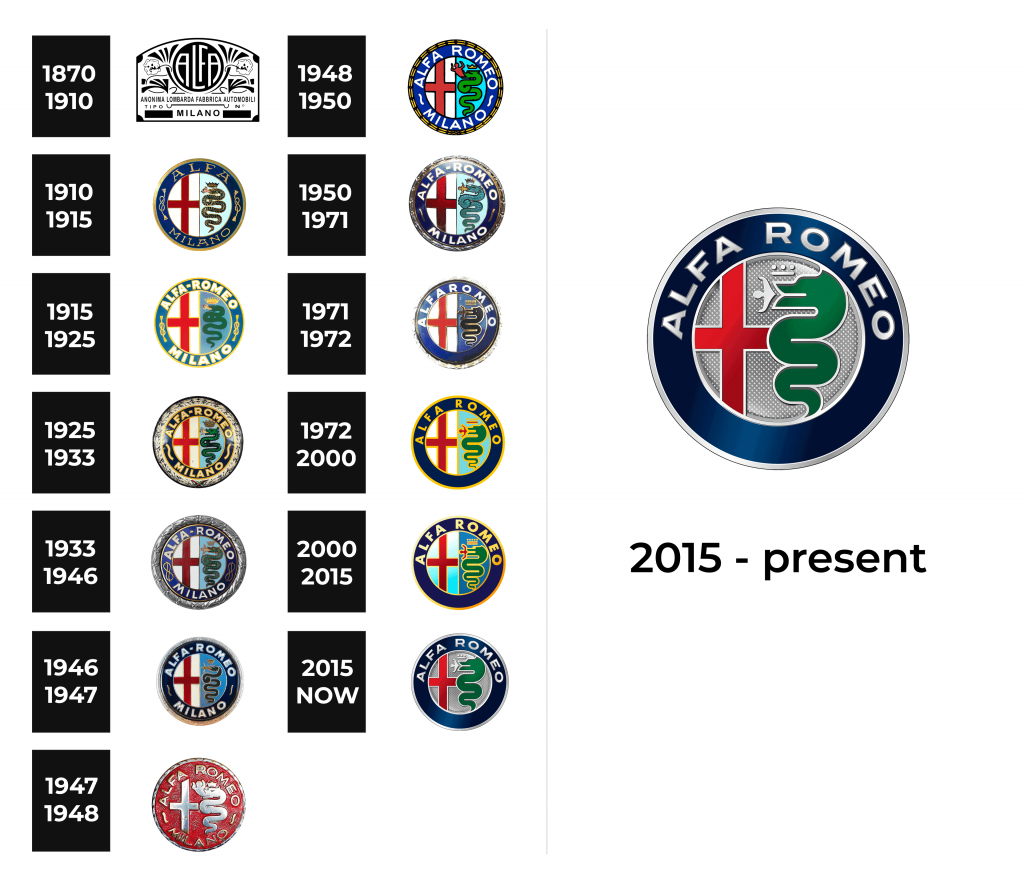
This composition barely changed over the years. It was restyled several times throughout the century, according to different artistic tastes the owners had in different time periods.
1870 – 1910
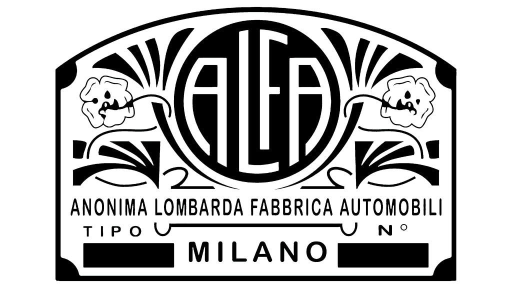
The famous automaker, the pride of Italy, Alfa-Romeo originated from France. In 1910, the famous Milanese aristocrat Cavalier Hugo Stella worked closely with the French automobile company Darracq to import products to Italy. Soon the partnership collapsed and the aristocrat bought the company and “transported” it to Italy, having previously renamed it into Anonima Lombarda Fabbrica Automobili. Therefore, the company’s logo at that time contained a long name without an abbreviation. The logo was executed in black and white.
1910 – 1915
First, the circle around the historic images was dark blue, its surface inscribed with the words ‘ALFA’ on top and ‘Milano’ (Milanese) on the bottom. Between the two words – on the right and left side – there were Savoy knots, the symbols of Italian monarchy.
These were only erased after the monarchy was abolished in 1946. To commemorate the kings, Alfa also put the crown atop the snake, but it, unlike the knots, stays on the logo to this day.
1915 – 1925
In 1915 ALFA was bought by Nicola Romeo, who added his name to the company, since then it was known as Alfa Romeo. On the logo, the word ‘Romeo’ was also added, but here it was written with a dash – ‘ALFA-ROMEO’.
1925 – 1933
In the 1925 Alfa won the Automobile World Championship, which was the huge success for the company. To commemorate it, the logo was further encircled by a silver wreath. All the other details were also changed slightly: the letters became slimmer and the knots have become wider and more visible.
1933 – 1946
In 1933, the wreath was seemingly gilded and all the symbols on the outer frame became noticeably bolder and thicker. In addition, the historic images became more punctuated by the black lines, which separated the images from each other and from the background.
1946 – 1947
In 1946, the knots were replaced with two curvy lines after the monarchy was kicked out from Italy. The colors also became lighter – the black lines were replaces with the white or silver ones. Likewise, the gilded wreath was thinned and switched to silver again.
1947 – 1948
A year later, the logo took a radical turn. It became minimalistic – the borders between the components were erased, the frontal elements became golden, and the back background elements were switched to red. The dash was also dropped and never returned.
1948 – 1950
The experiment didn’t work, and in 1948 they returned the previous design, giving it brighter color scheme. The distinct black lines made a comeback. The logo of this period was particularly detailed: the person in snake’s mouth was very distinct, as well as many other elements.
1950 – 1971
Since 1950 the elements were only slightly changed. There was a period between 1950 and 1971 when the cross didn’t touch the ends of its background, the snake was massive and had a still fairly detailed red person stuck in its mouth. The more complex details were omitted, however.
The wreath was also reduced to being nothing more than a yellow ring around the actual logo. Everything started to become less detailed from then on.
1971 – 1972
Then in the 1971, the word ‘Milano’ was dropped and all the images got the form they have today. The snake has acquired a spring-like form, in contrast to the previous cone-like shape. The person is now depicted horizontally and symmetrically, which makes them look like a plane.
The crown was thinned and widened, and the ring was returned to its original wreath look, but not for long. The following iteration had it completely removed. But the rest of the images were only slightly changed over the years, and they retain their composition from the 1971 even now.
1972 – 2000
A year after the new look was introduced the company changed the silvery lines that marked the edges (they replaced the black ones in 1971). Now all the edges of all the images were golden, as was the text.
The wreath was now just a line around the logo, and it was also yellow.
2000 – 2015
In 2000 the company decided to add just a bit of tint: the cross, the snake and the background behind them now had a shade that increased the lower you look. The same happened to the outer elements – including the blue frame, the ‘wreath’ and the text – here, however, they became darker from left to right.
2015 – now
The latest iteration lost its yellowness. All the edges and the text were now silver. Additionally, the person and the crown were further minimized and given a white color. The most noticeable change was, however, the unification of background.
Where the left part of it was light blue before, and the right was darker blue at that point, now they are both silvery grey, and there’s no border between them. Thanks to it, the snake has lost some of its coils, became bigger and more distinct, occupying some of the space previously held by the cross’ background.
Thanks to this change, the logo of Alfa Romeo has finally become clean and highly distinguishable without sacrificing the crucial historical elements.
The Legends
Probably the most legendary line of cars ever birthed by Alfa is their 8Cs. Alfa Romeo 8C is a range of hugely successful 8-cilinder racing cars from the 30s. This time is considered by some to be the golden age of the company, actually.
These cars won a lot of prizes for their creators in a fairly short span of time. As a result, 8C Alfas are viewed by many as the vintage racing Italian cars. It’s no surprise – there weren’t too many successful racing car manufacturers in Italy back then, and Alfa was hugely successful.
The Concept Cars
Alfa scrapped a lot of interesting car designs. For instance, there was a Tonale from 2019 – the first attempt to create a 4-door car by them.
But probably the most interesting Alfa’s experiment was a range of BAT cars. BAT 5, 7 and 9 were attempts to create the cars with the least amount of drag possible. Although the drag on them was low, the cars weren’t really ready to be massively produced.
Nevertheless, they did create a new concept of a BAT car in 2008. They call it BAT 11, it looks stylish, has very little drag and you can even buy it right now – although, it’s not that cheap.
Alfa Romeo Race Cars
Alfa produced a lot of very good race cars before the 30s. Alfa Romeo RL 1922 (the first Alfa after WW1), P1 1923 (the first Grand Prix Alfa) and P2 1922 (the first champion amongst Alfas) are just three examples.
However, the 8-cilinders Alfas were a milestone for racing cars all over the world. These 30s cars won Grand Prix cups every year. 1931 8C 2300 alone won Le Mans 4 times in a row from 1931 to 1934.
And 70 years later they were revived in the form of Alfa Romeo 8C Spider – the 8-cilinder race car that looks a lot like its forefathers from the 30s. There were only built 1000 exemplars of this car, but it’s already considered a racing classic.
