New York Jets are a professional rugby franchise of the East Division of NFL, which was established in 1959. The team won only one Super Bowl in 1968 and since that time they have been trying to repeat their success. Today the franchise is owned by Woody and Christopher Johnson and has Adam Gase as the head coach.
Meaning and history
![]()
For the first two years after its foundation, the team was called the New York Titans, so their initial logo was something completely different from all the following versions. The franchise’s visual identity has undergone 6 major logo redesigns, but all of them, except for the very first one, used one and the same color palette, reflecting the team’s individuality and unique style.
1960 – 1962
![]()
The logo for the Titans, designed in 1960, depicted a running football player in a monochrome uniform with the football in his hand. The bold enlarged wordmark in dark gold and black was placed on the right of the image. This logo only stayed with the team for two years, as well as the name.
1963
![]()
In 1963, after the team’s name was changed to Jets, the logo was redesigned. It was the very first attempt to find a style for the new naming and was composed of a stylized green plane with a bold white “Jets” lettering on it. The plane was facing left and looked solid and bright. However, the experiment didn’t last long and this version only stayed with the franchise for a year.
1964 – 1966
![]()
In 1964 the logo becomes more complicated and modern — the overlapping “NY Jets” lettering is placed inside a green-contoured white football and had a solid green smaller image of the ball in its bottom part.
1967 – 1977
![]()
In 1967 the colors on the logo are switched between each other and all the white details become green, while all the green ones — white. The shape and composition of the logo remain untouched.
1978 – 1997
![]()
The redesign of 1978 brings a new concept to the franchise’s visual identity. The color palette is the only thing that remained unchanged. Now the logo was composed of a bold italicized “Jets” lettering in all capitals, but with the “J” slightly enlarger. The thin and sharp line, stylized as the plane, was coming out of the first letter and pointing to the right, like an arrow, showing the team’s movement and progress. This logo stayed with The Jets for almost 20 years.
1998 – 2019
![]()
In 1998 the team comes back to the logo version of the 1970s, but the football shape is now replaced by the horizontally located oval. The green of the logo becomes even darker, as well as the contours of the letters and the small rugby ball inside the emblem — everything becomes bolder and cleaner.
2019 – 2024
![]()
The logo from 2019 is the mix of all the previous versions. The green color is now lighter again, while the shape resembles a football like it was in the 1970s. The lettering style was changed too — the outlines “NY” monogram is replaced by solid white “New York” inscription placed above the “Jets”, also in white. The football from the inside of the image is slightly enlarged and less detailed than on the previous emblem.
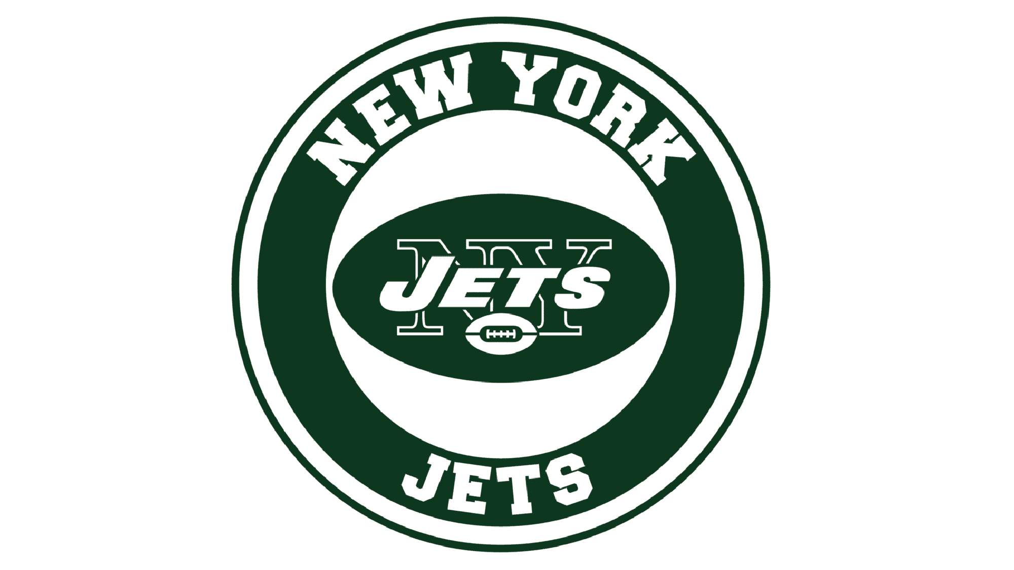
2024 – Today
![]()
The logo is a distinctive and streamlined emblem designed to capture the spirit and energy of a high-velocity team. The most striking feature is the stylized word “JETS,” prominently centered and crafted in a sans-serif, italicized font that seems to be surging forward. The font is reminiscent of the kind used for military insignia, suggesting precision and authority. The lettering is white, set against a background of a rich, dark green oval, which provides a stark contrast and lends an almost three-dimensional effect to the text.
Adding to this sense of motion is the graphic of a jet, depicted as a stylized, elongated white silhouette soaring over the top of the “JETS” lettering. The jet, with its sharp lines and swept wings, gives the impression of ascending rapidly, leaving a metaphorical vapor trail of speed and ascension. This iconography reinforces the identity of the team as both formidable and dynamic, capable of rapid maneuvers and high performance.
The entire logo is enclosed within the elliptical boundary, which contains the kinetic elements and underscores the team’s unity and cohesion. The emblem is more than a mere visual; it’s a symbol of ambition and forward momentum, mirroring the aspirations of the team it represents. The use of negative space around the jet’s silhouette gives it prominence and character, ensuring that the icon is not just seen but felt. This logo is a testament to a team that aspires to soar above the competition with a clear trajectory toward victory and excellence.
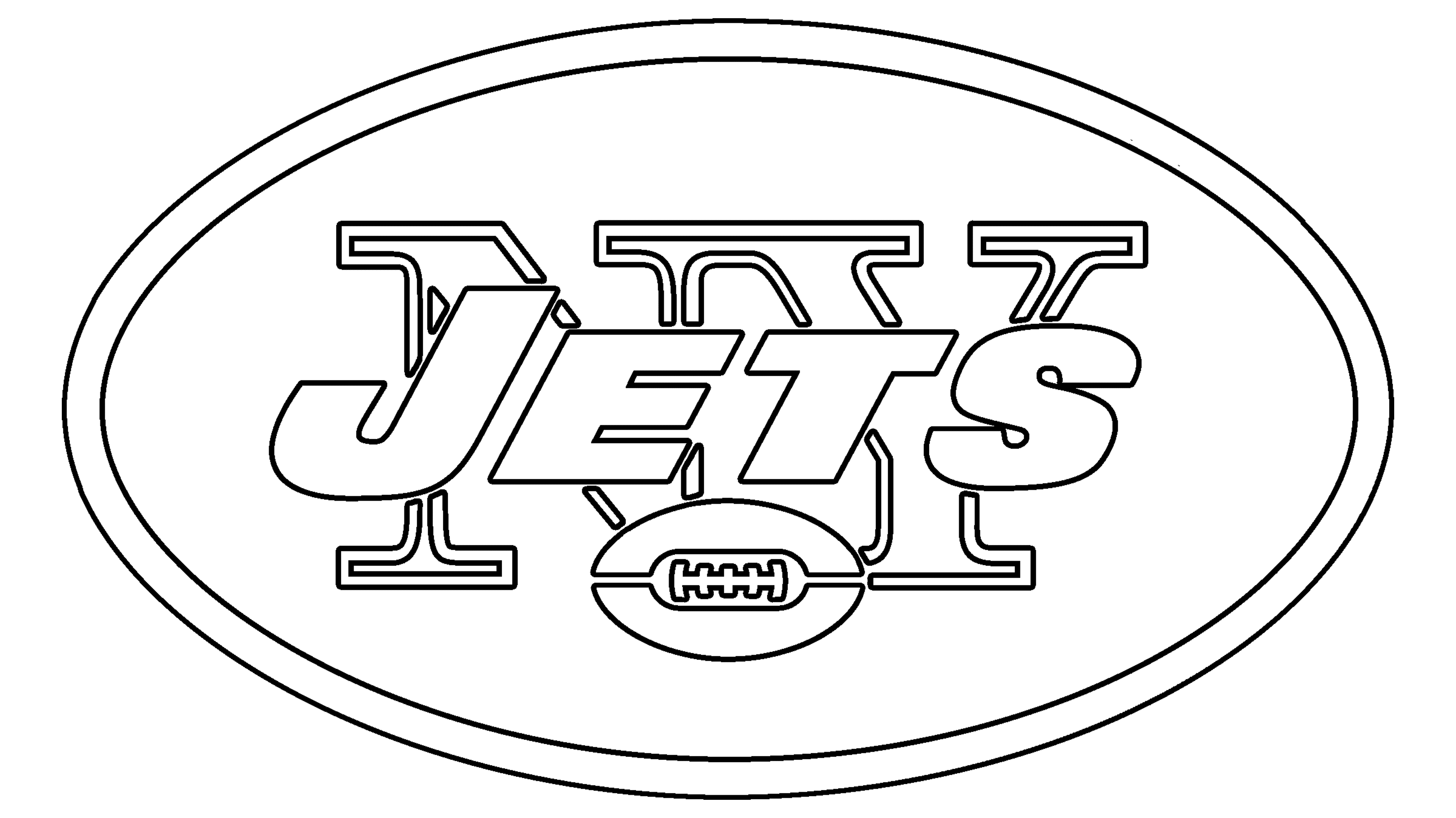
Symbol
The team still uses the horizontal oval with the lettering inside as their secondary symbol. This image is a tribute to the franchise’s roots and legacy and is instantly recognizable across the globe. Due to its simplicity and unique for rugby color palette, the Jets symbol is truly timeless.
Emblem
For the emblem, the team uses the inscription from their official logo, but it can be placed on different surfaces without any oval or football outline, and the white rugby ball on it is more visible.
Another version of the emblem is a solid green football with two white capital letters “N” and “Y”. Simplicity and minimalist approach do not make it less recognizable or memorable.
Helmets
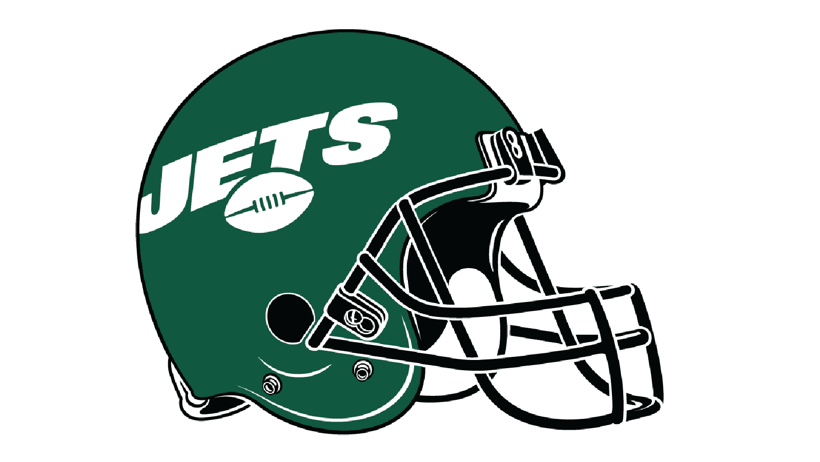
The Jets helmets design is composed of a solid green color with white enlarged “Jets” lettering and a small white football under it. There are no stripes or additional details. As for the grill — it is colored black, which adds a sense of professionalism and seriousness to the whole look.
Uniforms
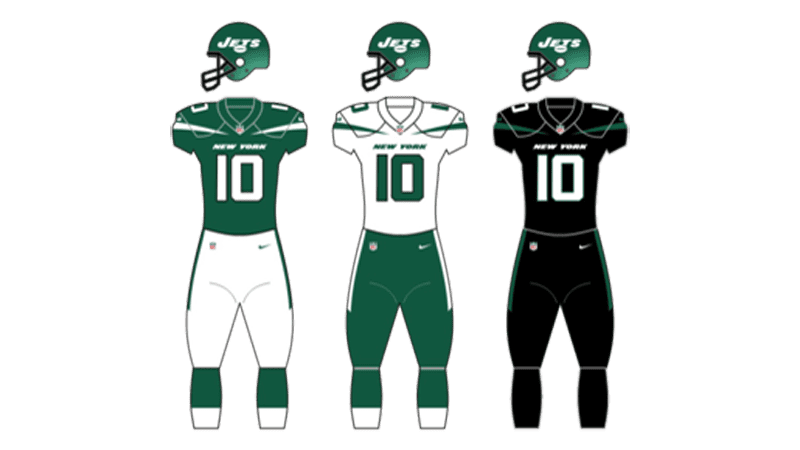
The New York Jets have three different uniform designs — the solid green with white details as their home uniform, snow-white with green decorative elements for road trips and monochrome (black jersey and pants with white numbers and details) as an alternative version. All three outfits make the team instantly recognizable on the field.