Mercury Logo
Tags: cars that start with m | Grey Car Brands | USA cars
Mercury was created in 1938 as a type of low-tier luxury cars produced under the wing of Ford. Obviously, America has quite a lot of such cars already, so the brand was never very successful. Its brother company Lincoln was far more successful and had more fame across the world, despite making much more expensive premium autos.
Meaning and History
Mercury had several secondary logos that were only worn by several models each. The primary company logo was introduced right at the start, although it wasn’t used all the time. It wasn’t until the 90s that the primary emblem became universally used on all Mercury cars.
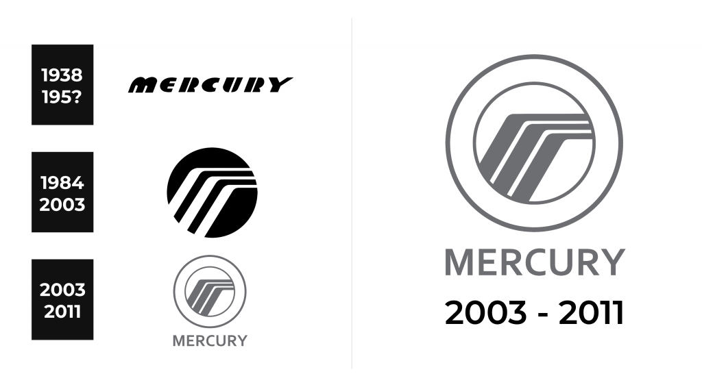
1938 – 1984
The very first logo was a brand name written in a designer font. The letters were black on a white background. And there was such an effect, as if the letters were separated by vertical white thin stripes.
1984 – 2003
Several cars in the earlier years of Mercury used the depiction of the head of god Mercury, who generally is associated with speed.
However, the official logo featured a black badge with three bronze broken lines that change their tilted destination into a completely horizontal shape right above the middle point.
This combination might also be a hint at the namesake god, because for many people these lines are staunchly associated with wings. The winged helmet is a traditional headgear of this mythological character.
2003 – 2011
In 2003, the company introduced a new version of their, by then iconic, logo. The black on the logo was turned white, and the bronze lines became light grey. This entire image was encircled in a grey ring, while the ring was also surrounded by the white space, which was eventually also framed in grey.
Beneath this image they used a writing that said ‘Mercury’ in strict unbending lines.
Emblem and Symbol
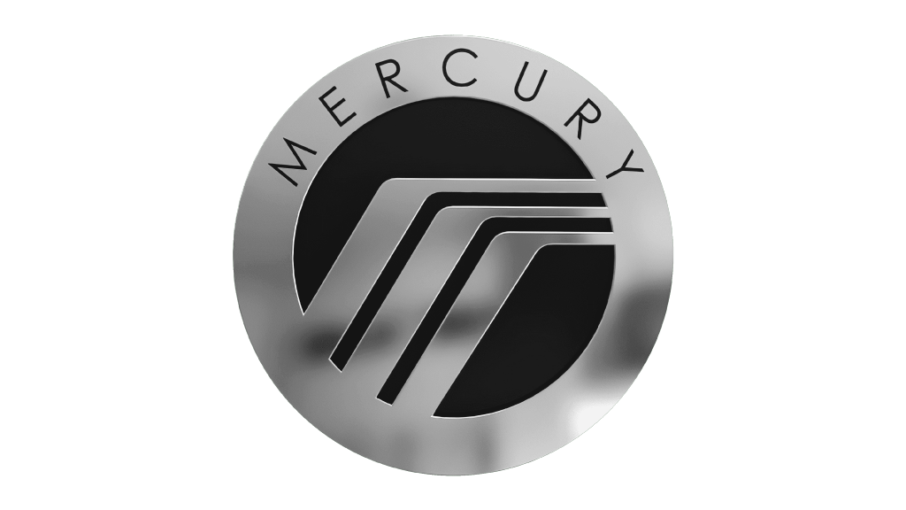
Apart from other small-time car emblems, the brand used to put a specific version of their last logo in the later years of their existence. It was pretty much the same, although the thick white space and the bendy lines were turned into metal, and the inner white background became black. The brand name was also on top in the same strict letters.


