AC Logo
Tags: Blue Car Brands | British cars | cars that start with a
AC Cars is a British car manufacturer that specializes mostly on racing cars. They have gone defunct many times over the course of their 100+ year history, but the company is still independent, alive and has the same spirit. Still, because of the financial difficulties and a narrow focus, not many car enthusiasts have heard about this brand.
Meaning and History

The company was founded by Weller brothers in 1901 in London, and sometime after that they decided to call it ‘Autocars and Accessories’, but the abbreviation ‘AC’ comes from the word Wellers called their cars – the ‘auto-carriers’. The word ‘automobile’ and ‘car’ weren’t strictly decided upon yet.
And in 1911 they renamed the company to Auto Carriers Ltd., which is pretty much the name they have today.
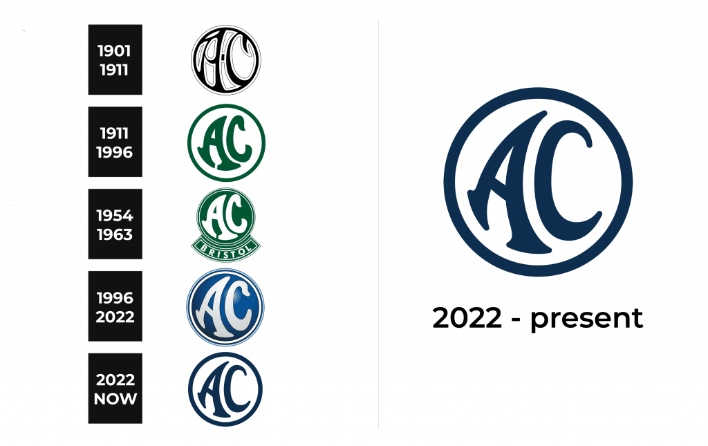
1901 – 1911

The first logo of the brand was a black circle with a thin gray frame. Gray letters “A” and “C” were inscribed inside the circle.
1911 – 1996

This logo was in use for a very long time. It was based on the earlier drafts of the badges for their cars, which did not include the name, but rather the product they made and sold – their auto-carriers. Those earliest drafts were pretty much the same as the modern version of their emblem. The company bosses evidently love stability.
So, the company was renamed in 1911 most likely to better fit their brand and live up to associations (the ‘automatic carrier’ was mostly only their way of saying ‘car’).
The emblem consisted of a grey circle inside the dark green ring outline, as well as two letters of the same color. The letters said ‘AC’. They were pretty slim and fairly deformed.
They were distorted, and as if being sucked towards the top right corner of the circle. The letter A also had two serifs in the bottom, and the upper tip of C was shifted to the right.
1954 – 1963

In the 50s, the company was working closely with another British brand, the Bristol Cars. This partnership resulted in sports cars called Aceca and Ace which were powered with the help from Bristol. This logo was mostly meant for these cars, specifically for Bristol-powered variants, which had stronger engines.
The emblem depicted the same AC logo, but with a different color palette and several minor differences. The circle part was now bright green, while the letters and the outline were white. In addition, the outline now had three thin alternating layers – white, green and white.
Below it was a green arc that stood parallel to curvature of the circle. It continued in the shape of a curvy green plaque with the white writing on it. The word spelled ‘Bristol’ in bold. The area where the word was is fenced off by a thin white line, and the plaque is further outlined in white.
1996 – 2022

In 1996, the company swapped its grey & green logo for this version. It’s pretty much the same compositionally, but the colors changed again.
The changes are, as follows: The letters became white, and they are now closer to the outline, which also was turned white. They’ve also added two more thin lines to the outside of the emblem – a dark blue ring and a light blue one. There is also a big speck of light in the top right area now, which should add to the volume of the emblem.
2022 – Today

The new log had a lot in common with the previous version. However, the similarities consisted of the round shape and unique shape of the letters, which was slightly adjusted in this logo. The designers modernized the logo by removing the shiny, three-dimensional appearance and using solid colors. Here, both the letters and border around the emblem are done in dark blue. It looks professional and stylish. The background of the circle is done in pure white, which creates a feeling of perfection and professionalism.
Emblem and Symbol

AC mostly uses their current logo as a car symbol for the majority of their cars. Some models may get the versions with different coloring – most commonly, the black & white variant.
On some models, the badge also looks like two letters A and C welded together to look like their prototypes from the logo.
The Legends
Besides the Bristol-aided models like AC Ace and AC Aceca, the most notorious product of this company is AC Cobra, which was created in many variations over the years, including the several versions which were in part developed by Ford.
They were all created in many variations over many years – even Ace was remanufactured many times with help from many brands. Cobras were initially created in association with Shelby, who were the subsidiary of Ford.
