Superman is a cultural icon and one of the greatest fictional characters, originating from the pages of a comic book written by author Jerry Siegel and artist Joe Shuster. Superman first appeared in Action Comics #1 in 1938 and instantly won the hearts of readers with his superhuman abilities, moral qualities, and famous suit. The character’s origin, showing his journey from the condemned planet of Krypton to Earth where he becomes a Guardian, turned into a source of inspiration for worldwide fans and pointed the way for the superhero genre.
Meaning and history
The rest is quite literally history, as Superman’s fame took on immortal forms through dozens of comic book series, radio shows, television programs and films. The character’s influence on pop culture has become a beacon of hope, justice and heroism for generations of fans around the world. Most Superman stories deal with the themes of righteousness, justice and heroism. The rest is history, and this character becomes a beacon of hope and a light of inspiration for his many fans. The message behind truth and justice never leaves his personality or the personality of any other character for that matter. Superman’s legacy still captivates people today, proving the value of fighting injustice.
What is Superman?
Superhero is a fictional character developed by Jerry Siejson in collaboration with Joe Shuster in 1938, has been a worldwide icon showing an undivided commitment to justice. Many generations of fans were inspired by his story, described in countless comic books, TV shows, movies, and toys.
1938
The initial Superman logo featured a yellow police badge-like shield with a stylized red ‘S’ almost touching the edges, embodying the character’s strong association with justice.
1938 – 1939
Swiftly evolving, the logo transformed into a more recognizable triangular shape, reversing colors to a red ‘S’ against a vibrant yellow backdrop, setting a pattern for many future designs.
1939 – 1940
The shield maintained its triangular form, but the ‘S’ began to exhibit more flair and curvature, standing boldly over a deeper red background.
1940
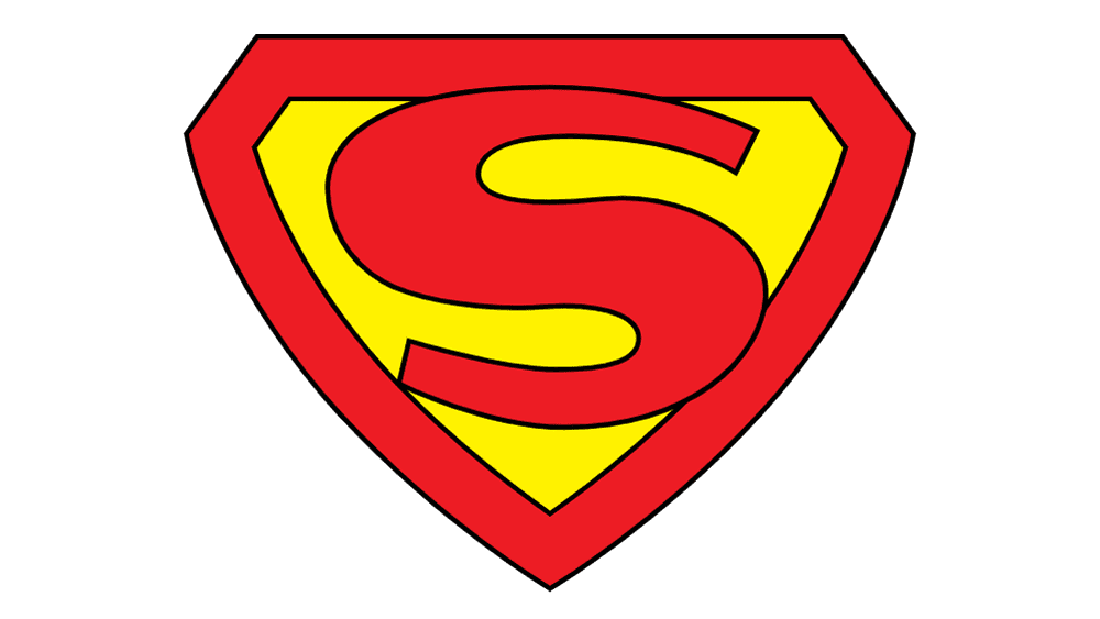
This version of the Superman logo has a strong Art Deco influence, as seen during the 1940s. The ‘S’ is quite stylized with thick black outlines and sharp serifs at the ends of the letter. The shield is a deep yellow with a pronounced, triangular shape, pointing downwards. The ‘S’ is bold, and its classic red fills the shape almost entirely, leaving a thin margin of yellow around it.
1940 – 1941
Transitioning to a diamond shape, the logo framed a yellow ‘S’ within a red border, solidifying a look that would define the character for decades.
1940 – 1946
Retaining the diamond shape, the emblem saw a reversal with a red ‘S’ on a yellow field, giving a contrasting pop to the symbol.
1941 – 1943
This period briefly reverted to a red ‘S’ within a white-bordered shield, maintaining a classic contrast that’s visually striking.
1942
The logo for this year featured a robust yellow ‘S’, outlined in black for added definition against a red background.
1943
A similar design as the previous year, but the ‘S’ fills more space within the shield, gaining prominence in its portrayal.
1943 – 1944
The emblem’s background returned to a solid red with the yellow ‘S’ centrally placed, reflecting a more traditional Superman aesthetic.
1944 – 1955
During this period, the ‘S’ was given a slight tweak in style, retaining its bold and heroic presence against the unchanged background.
1955 – 1986
The ‘S’ evolved to have a more dynamic, muscular appearance, filling the shield’s space more assertively with its curves and angles.
1958 – 1985
Here, the logo maintained the established color scheme but introduced a slimmer, more aerodynamic ‘S’.
1967 – 1978
In this 1967 iteration, the Superman logo has taken on a more rounded, cartoon-like appearance. The ‘S’ is designed with softer curves and a thinner outline, making it more friendly and less aggressive. The shield is also more rounded, losing some of the sharpness seen in the earlier version. The colors are traditional, with a bright red ‘S’ and yellow shield, but the logo has a worn-out texture, giving it a vintage comic book feel.
1968 – now
The logo achieved its classic and enduring look with a balanced, robust ‘S’ framed within the diamond-shaped shield, now an iconic representation of the Superman identity.
1986 – 1988
In this iteration, the shield’s border darkened, adding depth and making the ‘S’ stand out more prominently.
1986 – 1999
A three-dimensional and metallic twist was given to the shield, bringing a contemporary feel to the classic design.
1989 – 1995
The ‘S’ expanded to touch the edges of the shield, filling the emblem with a sense of strength and power.
1993 – now
Returning to the timeless red and yellow, the ‘S’ was rendered with a more pronounced and modern twist, reinvigorating the classic design for a new era.
1997 – 1998
For a brief period, a departure from the norm with a silver ‘S’ on a blue shield provided a fresh, sleek look.
1998 – 2009
The classic colors returned, this time with the ‘S’ featuring a sharper, more contemporary edge, reflecting modern aesthetics.
2001 – 2002
A slight variation saw the ‘S’ return to a bolder, more angular form, reminiscent of the superhero’s traditional strength.
2004 – 2005
The 2004 version presents a more modern take on the Superman logo. The ‘S’ is sleek and has a metallic sheen, suggesting a more futuristic and polished look. The shield is very three-dimensional and dynamic, with highlights and shading that give it a glass-like quality. The colors are rich and deep, with a glossy red ‘S’ and a shield that transitions from a golden yellow at the top to an almost orange at the bottom.
2011
The color palette darkened, suggesting a grittier take on the Superman mythos with deeper reds and a shadowed ‘S’.
2011 – 2012
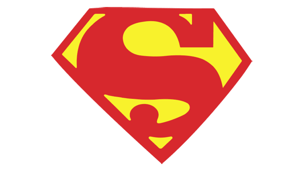
This logo, used around 2011-2012, is a more streamlined and graphic version. The ‘S’ is very large and angular, filling the shield almost completely. The shield itself is a bright, flat yellow, and the ‘S’ is a flat red, creating a striking contrast. The overall shape is a stylized pentagon, which gives it a contemporary and bold look. The lines are clean, and the colors are untextured, giving it a modern graphic design feel.
2012 – 2016
In this most recent design, the ‘S’ was stretched to fill the shield, corner to corner, creating a powerful visual that commands attention.
Font
Throughout the evolution of the Superman logo, the stylized ‘S’ has consistently been at the core of the emblem, with its font often depicted in a bold and dynamic style that implies strength and movement. The ‘S’ has seen variations in its form, ranging from sharp and angular to smooth and curvaceous, each reflecting the era’s design trends.
Earlier versions presented a slender ‘S’ with extended serifs, while later iterations adopted a chunkier, block-style font with no serifs and pronounced curves. The consistent element across all versions is the emphasis on the ‘S’, making it a powerful and recognizable symbol that stands as the central visual element of the brand identity.
Color
The color composition of the Superman logo has majorly been focused on red, yellow, and black. Earliest variations of the logo show the ‘S’ in red over yellow, which makes a strong visual impact of the energy and vibrancy of Superman. Through the years, these colors tend to change in its intensity; some variations even included dulled yellow, silver, and blue colors to represent invincibility and the sky. Sometimes, the logo features black contours and details, expressing the character’s symbol. The colors used while creating the Superman logo represent various aspects: red commonly symbolizes heroism and strength, yellow denotes hope and optimism, and black embodies boldness.


